Search

Setting Text Properties in the Options Bar

  • Thread starter 15Katey
  • Start date
15Katey

15Katey

Member
Joined
May 10, 2021
Messages
130
Reaction Score
0
Points
23
  • #1
The type tools in Photoshop are some of the most popular in the entire application, so I thought I'd discuss a bit about their settings and options in today's post. I'll give you some background as to what's available up in the options bar and how to set a few of those options.

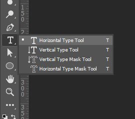
To start off, I created a new blank document. All I'll be doing is typing out a word or two, so I don't need anything fancy. After I created the document, I went over to the left toolbar and selected the Horizontal Type Tool.
horizontal-type-tool.jpg

The moment I select one of the type tools, the options bar above the workspace changes to fit the needs of the tool I've chosen. Let's take a look at that options bar.

type-tool-options-bar.jpg

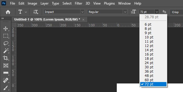
In the options bar, I'll set the font to Impact and the font size to 72pt. Both of these options can be found in drop-down boxes.
type-tool-font-size.jpg

Besides the drop-down box for setting font size, I could just as easily have typed the size that I wanted into the box and hit the Enter key on my keyboard. Or, I could have placed my mouse pointer to the left of the drop-down box where the small and large Ts are located, clicked, and dragged to the left and to the right. This is called using the Scrubby Slider. If I drag to the left, the font size is reduced and if I drag to the right, it's increased. I primarily use this option when it's not critical that I set a precise size. If I need something precise, I'll either type the value in or select it from the drop-down.

To choose a text color, I'll click the color chip in the options bar.

text-color.jpg

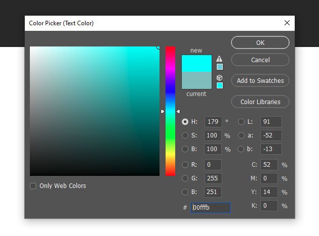
This will open the Color Picker, where I can choose which color I want.
color-picker.jpg

Once I select the color, I'll click the OK button to accept the change. After that, I'll see the new color displayed in the options bar as well as the foreground color in the Tools Panel. There are actually many different methods you can take advantage of for selecting text colors, but this is the most obvious one for right now. I'll get to all those other methods in later posts.

At this point, I'm ready to type. I'll go ahead and type out, "Photoshop Text Tool." When I'm finished, I'll click on the check icon in the options bar to accept the change.

photoshop-text-tool.jpg

After it's typed out, I can still center and justify the text by clicking on the Left Align Text, Center Text, and Right Align Text buttons in the options bar.

align-text-options.jpg

If you ever want to select any text you've ever written, after making the type tool active, you can click and drag over the portion of text you're interested in. From there, you can apply different styles to it, such as color, font, etc...

For instance, I just highlighted the "Photo" portion of the text I already typed and I changed the color of that portion to red. Once I was done with that, I clicked out of the text to accept the change. I did this instead of clicking the check icon. Either method is fine.

red-text.jpg

I'd say that's pretty good for now. If you're using one of the type tools in Photoshop and you can't figure something out, you're welcome to ask questions down below. I'd be happy to help.
 
15Katey

15Katey

Member
Joined
May 10, 2021
Messages
130
Reaction Score
0
Points
23
  • #2

Creating a Simple Typographic Poster​

Have you ever heard of a Typographic or Type Poster? I haven’t either until recently, but I can tell you that I’ve seen them all over the place for most of my life. While I’ve seen them though, I never quite knew that they had a name. If you aren’t sure of what I’m referring to, basically, type posters are pieces of art that play on either one or various styles of typography. They use beautiful, mundane or otherwise jarring fonts to convey a mood or feeling to the viewer. Oftentimes, these posters are used at restaurants to display a menu, at a show or concert to describe the band or at some sort of festival to inform people of what’s going on. Almost everyone thinks these posters are very cool, so I thought I’d put the spotlight on them today. I also want to work through a very simple example of what you can do with one simple area on a blank canvas when it comes to these posters. I’ll work with a few random fonts and perhaps insert some designs that I’ve seen around the web.

If you’d like some examples of some fine type posters, please follow this link to Pinterest. It’s chock full of them.

For this post, I think I’m going to work through the process of creating a type poster using Adobe Photoshop. I’ve looked around a bit and have seen some examples that I like. I’ll use the ideas that appeal to me and I’ll apply them to a poster about heavy metal bands from the 70s, 80s, 90s and beyond. I think this will be fun because I’ll get to focus entirely on different fonts. Of course, they won’t be too out there because I’ll be limited to the fonts that are installed on my Windows computer. I haven’t installed anything fancy beyond that. As you can imagine, typography posters really come alive when interesting fonts are used.

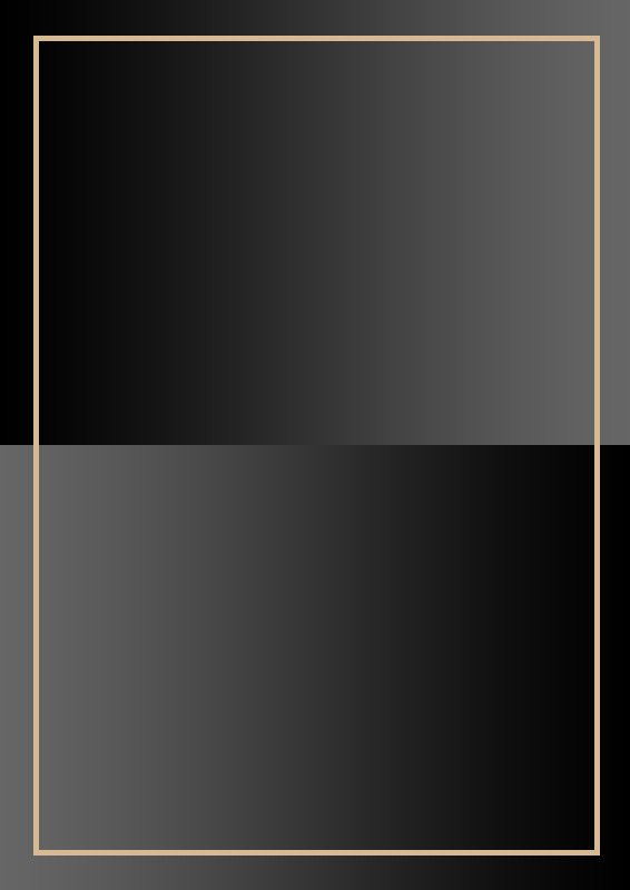
To start things off, I’ll create a file in Adobe Photoshop that’s 566 pixels wide and 800 pixels tall. Then, I’ll fill the background with two rectangles. The one on the top will have a gradient going from black to dark gray, left to right and the same thing, but opposite on the bottom. Then, I’ll create a tan stroke around the outer edge of the document. This is what I have so far. If this was a real poster for print, I’d use different dimensions at 300dpi, but since this is only a sample, I’ll use these small dimensions at 72dpi.

metal-poster.jpg

I know it doesn’t look like much, but it’s a good start for a semi-interesting background.

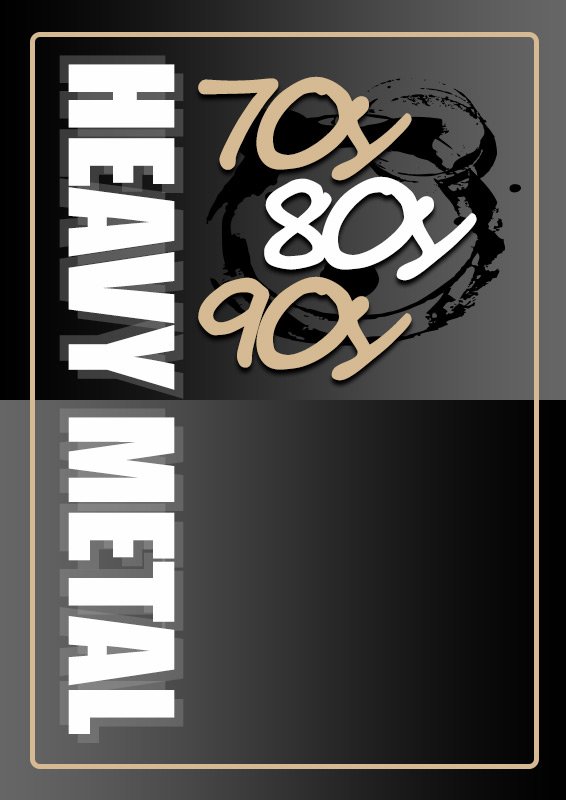
Next, I’ll work on some text that says, HEAVY METAL. I’ll type that out with the Impact font and then I’ll make it nice and large at 133pt. Then, I’ll rotate it 90° clockwise so it reads up and down as opposed to side to side. I’ll keep this font white.

After that, I’ll duplicate that layer twice and reduce the opacity of the duplicated layers to 10% and then shift one of them up and to the left and the other down and to the right. This will create sort of like a blur effect.

The next thing I’ll work on is the 70s, 80s and 90s text. I’ll use the Sage Script font for this and I’ll keep the font size the same as the HEAVY METAL text. I’ll alternate colors for these pieces of text, so one is white while the other two are tan. I’ll also apply a drop shadow to all three.

Finally for this group of steps, I’ll use the Custom Shape Tool to apply a random shape that I thought looked good. I’ll make that black and I’ll add it behind the year text.

Oh yeah, one more thing. I think things will look better if I round the corners of the background outline, so I softened them by 10px in the shape Properties panel. Here’s what I’ve got up to this point. I think it’s coming together.

heavy-metal-type-poster.jpg

I’d say that looks rather 80s. It looks like a poster that a radio station would make.

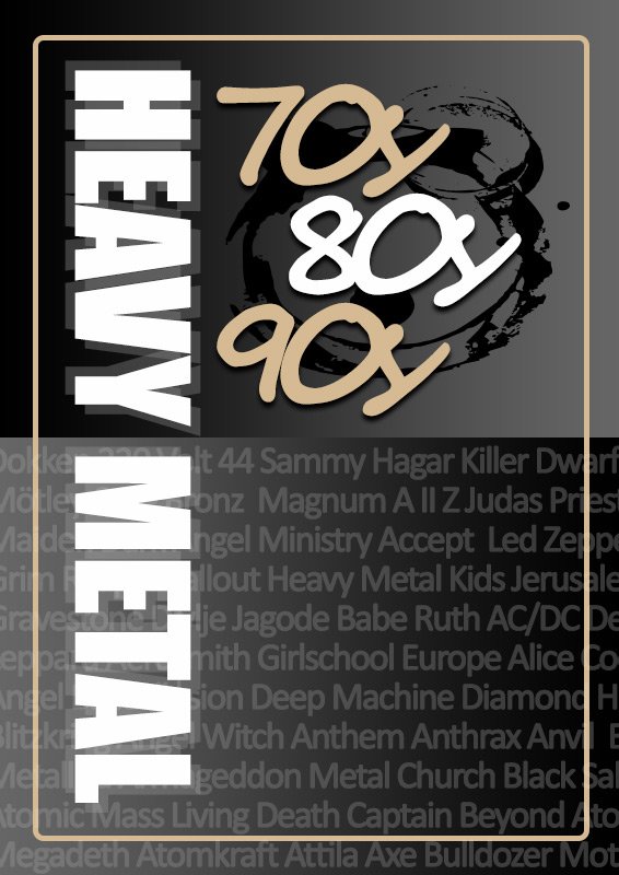
Okay, the only thing I’ve got left is to fill in the bottom with some names of heavy metal bands from the era. I’d like to do this in an interesting way though, so I’ll mix a bunch of band names up and type them out in the empty space, but I’ll also include them behind the poster border as well as the HEAVY METAL text. I’ll use the Calibri font at 35pt. I’ll also use the color white, but I’ll reduce the opacity to 10% so it plays off the gradient background. Let’s see how it looks.

final-type-poster.jpg

I’d say that looks pretty good for a poster that was only made in a few minutes with some basic fonts. If I had some real fonts, I could have made it look much better.

Type posters are fun to make and they can be very simple to put together. The best part is that you can get as creative as you want with them. You can use shapes from a library and all sorts of different fonts, but that’s only the beginning. It really is up to your own creativity to produce something that’s appealing and that stands out from the rest. If you have any questions regarding this process, please ask below. Thanks!
 
15Katey

15Katey

Member
Joined
May 10, 2021
Messages
130
Reaction Score
0
Points
23
  • #3

How Do I Create an Album Cover in Photoshop?​

Question: I’m trying to recreate an album cover with some of my own pix in photoshop. I’m a complete beginner so I’m trying to run before I can walk!
I’ve made a start and have zillions of layers. Suddenly I realised that maybe I should have measured the size of the album cover eg perimeter and make that the canvas size. The image on the cover is about quarter of a cm smaller. I tried to do this when I’d already produced several layers. But a strange black line appeared on 3 sides so I backspaced on the History to get rid of the line as it looked weird.

My question is: Am I on the right track if I were to start again but set the canvas size the actual size of the album cover from the start (as I would have it printed that size so it really looks like an album cover) and the image the same size as the album image? It’s square as you’d imagine. Or if I’m sending it to be printed (if it looks okay in the end) doesn’t it matter and I would just tell the printer to print it 31.5cm square (same size as the actual album cover) – or maybe that would look distorted ie if I don’t set the frame and image size from the outset? Hope that makes sense!

Reply: I am going to make a suggestion here. I suggest that you start the project over. It doesn’t sound like it’s all too complicated, so this may be easier than adjusting everything in an existing document. Here is what I would do first.

1. Get out a ruler and measure the actual album cover.

2. Open Photoshop and choose File > New from the top menu.

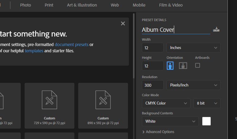
3. From the New Document dialog box that appears, name the file and then set the width and height of the file in inches (your album cover dimensions). Or use centimeters – whatever you measure in. Just don’t use pixels. That’s for web use.

4. Since this project will be going to print, be sure to set the Resolution to 300 dpi. Remember, at least 300 dpi is used for print and 72 dpi is used for the web.

5. Again, since this is going to print, set the Color Mode to CMYK color. CMYK are print colors and RGB are colors that are used on computer monitors. The colors may seem a bit strange on your monitor, but in print, they’ll be wonderful.

When all that is finished, click on the Create button and you should see an empty square in your workspace. Save that file somewhere so you have a saved working document if you have to leave your computer to go do something else.

new-document-specs.jpg

Reply: That’s brilliant, many many thanks. The cover is entirely black and white. Does that change the suggestion re setting the Colour Mode to CMYK? Thank you again.

Reply: Yes, in that case, you can set the Color Mode to Grayscale.

Reply: Superb. Thank you for your super-quick response which is super-helpful too! Much appreciated.

Reply: No problem. Let me know if you get stuck on the next steps. You’ll need to open the photos you need for the project and then drag them over to your album cover workspace. Then, you’ll need to resize them with the Free Transform Tool. Just be sure to hold down the Shift key on your keyboard when resizing. That will lock the aspect ratio in place.

Reply: Thanks. I can see I might have another question down the line a bit. But I’ll see what progress I make over the week. Thank you again. I have tried other blogs – but I can tell you this is much much better than any other forum I’ve ever asked questions on (including completely different topics). The level of helpful detail you’ve gone into is superb and you seem to be able to explain it so clearly. Thank you.
 
Top