CraigHardy
Member
- Joined
- May 11, 2021
- Messages
- 223
- Reaction Score
- 2
- Points
- 18
- #1
During my early years with photography, I did a lot of shooting in various automatic modes. It wasn’t until later that I began exploring the plethora of manual options my camera offered. And while, during those later times, I enjoyed the enormous creativity priority modes and my range of lenses offered, it wasn’t until much more recently that I dove head first into the fine workings of exposure. And as you may have noticed from all the posts on this website, the subject is deep and a lifelong learning endeavor.
While the concepts behind exposure take a little while to understand, they aren’t too challenging to pick up and use in the field. They’re sort of like the learning curve someone experiences when facing a musical instrument for the very first time. They are all thumbs in the beginning, but within a few weeks or months, playing becomes second nature.
There’s a tool in your camera’s exposure settings that many folks shy away from. I’ll admit that I completely understand why that is – because this tool looks a bit intimidating. As you may have guessed from the title of this post, I’m talking about your camera’s histogram. The thing is, the histogram is an immensely valuable part of your camera’s exposure arsenal and gauging from what users of it say, it’s essential to good photography.
I’m going to break this post down into bite sized chunks in an effort to make the topics as easily digestible as possible. First, I’m going to show you how you might find the histogram on your camera and what it looks like. Next, I’ll define the histogram – I’ll tell you exactly what it measures and why that matters. After that, I’ll go over how you can use it in the field and how it can help better your camera’s exposure. And lastly, I’ll offer some real life examples of viewing subjects through a camera, while analyzing the histogram and adjusting exposure compensation to alter the histogram’s output for, as the title of this post suggests, awesome photos.
Finding & Looking at Your Camera’s Histogram
Now, just to be clear, there are a few types of histograms that are available on DSLR cameras. The first type and the one most photographers think of when someone mentions the word “histogram,” is for overall brightness display of the photograph. The next type is for primary color (RGB) brightness display. I’ll be covering the meanings of both of these types of histograms in the next section.To show you how to display a histogram, I used my trusted Canon T3i. If you have a different make or model of camera, simply refer to your owner’s manual for instructions on how to review your histogram.
On the camera I used, I chose to view the frame through the LCD screen. From there, I cycled through the various screens until I found the one that showed the histogram. To cycle through the screens, I pushed the “DISP.” button that’s to the left of the viewfinder multiple times. This is what the LCD screen looked like after I metered the camera:
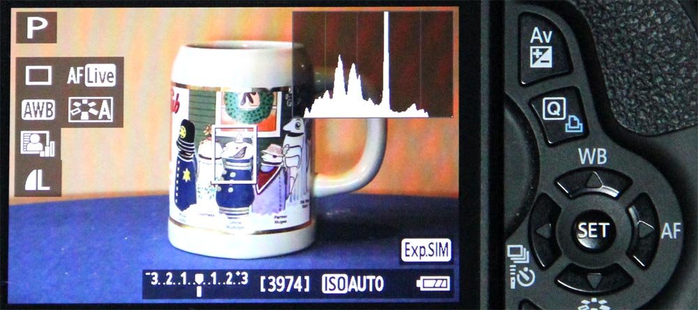
Canon T3i Histogram Display
If you’ll notice the small bar graph in the upper right corner, that’s the histogram.
Now, after I took a photograph, I reviewed it by pushing down the playback button that’s located just outside the lower right corner of the LCD screen. Once the photo I was interested in appeared, I again cycled through the display options by pushing the “DISP.” button multiple times. A few screens were shown, but for this example, I was only interested in two of them.
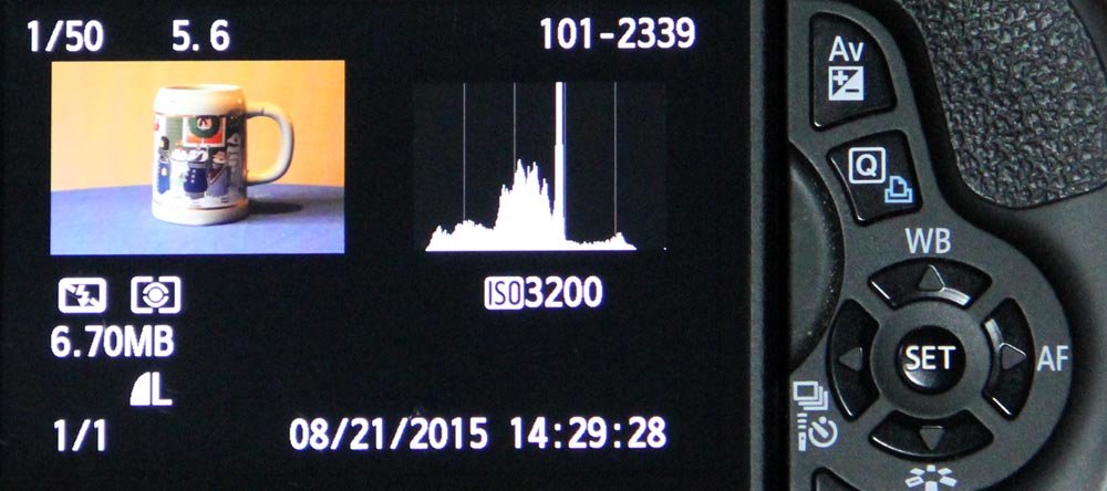
Canon T3i Histogram Photo Review
The above photo shows only the brightness display histogram and the photo below shows the RGB brightness histogram, followed by the brightness display histogram.
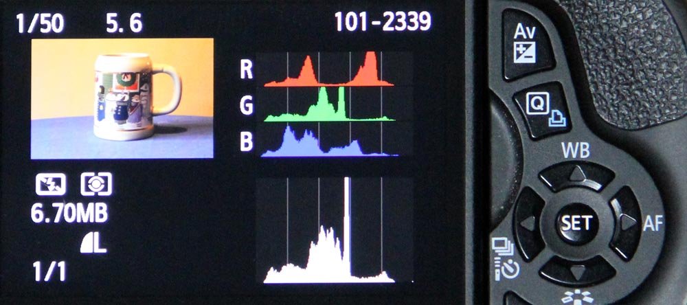
Canon T3i RGB Histogram Photo Review
Again, the bar graphs you see in these photos are the histograms. Now that we’ve reviewed how we can find the histograms and what they look like, let’s move into the nitty gritty of what these things are and why they’re so important in photography.
What Are Histograms & Why Are They So Important?
If you think about it, all cameras do is collect light and transform that light into a representation of what we, as humans, see. And once the light is discovered by the camera (by us pointing it at something and metering), it can give us all sorts of information on it. One such example of information is the brightness level of our frame.What Is a Histogram?
Most every photo you take is going to have a range of bright and dark elements in it. As a simple example of this, pretend that you point your camera at a background that’s pure white with a black square in it. Say the white takes up 75% of the frame and the black takes up 25%. If you’ve got your histogram displaying in your LCD like I showed above, you should see two thin lines. One line will be all the way to the right that reaches 75% of the way to the top of the histogram and the other line should be all the way to the left and reach only 25% of the way to the top. It’s that simple. The brightness histogram merely shows us the range of brightness across our potential photograph. And like I pointed out above, the other set of histograms will show us our brightness levels after we’ve taken the photo.
Take a look at the gradient I created below. This is a very simple example of how the range of brightness is distributed across a histogram. The darkest representation is on the left and the lightest on the right.

Camera Histogram Range
The same is true for the RGB histograms I covered in the previous section. Each one of those histograms displays the brightness of each color, when separated out, of the subject you’re metering. If you’re focusing on a very bright red rose in daylight, the red histogram is going to display a surge over to the right side. Alternately, if you’re focusing on a dark blue car at dusk, the blue histogram is going to display a surge over to the left.
Simply put, histograms give us a graphical representation of the brightness levels of the pixels in our photographs. The brighter they are, the more the histogram will show activity to the right and the darker they are, the more the histogram will show activity to the left.
How Can Histograms Help Us Take Better Photos?
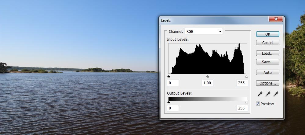
Think about the horizontal axis of a histogram as a scale from 0 to 255. We’ll call that the “safety zone.” If you’re taking normal photos in normal light, each vertical line in the histogram’s scale should be contained within the scale. Take a look at this example of a photo with its corresponding histogram below.
Normal Histogram
Notice how the vertical lines (or wave) are all contained within the safety zone. This would be considered a well exposed photograph.
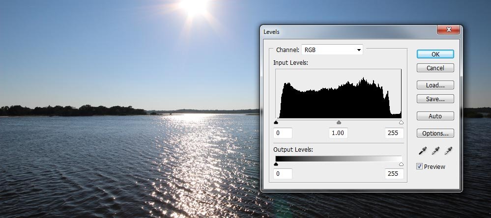
Now, take a look at the following photo. This time, I captured the sun in the photo, which throws the lighting off.
Overexposed Photograph Histogram
Notice how the vertical lines look pretty good, until you get all the way to the right. On the “bright” side, we’ve got a problem. We have a spike of pure white which represents the sun and all the shimmering of the sun’s light reflecting off the water. The spike we see is telling us that the vertical lines want to run off the scale. The photo is overexposed. In this case, however, we know that the sun will cause this, so this type of histogram is to be expected.
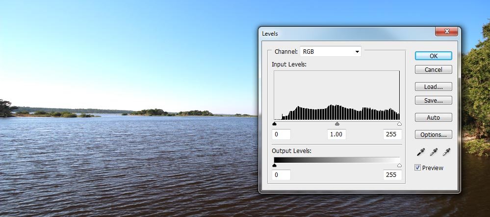
What if, for some reason, our camera wasn’t reading our environment correctly? Say there was something in it that was tripping up our exposure and because of that, the entire photograph was being metered as overexposed. I’ll use the first example photo from above and over expose it slightly. Check out the histogram then.
Overexposed Photograph
From looking at this photo, we can see that it’s overexposed. The whites are blown out and the sky looks a little weird. If you look at the histogram in the photo, you’ll see that we have another vertical line over to the right that’s shooting up where it shouldn’t be. This line is telling us that our photo, if taken, will contain over exposed elements. If we want them there, then fine, but if we don’t want them there, we’ll have to adjust our exposure compensation to deal with it.
So here’s the big question – how can a histogram assist us in taking properly exposed photographs in the field? The answer to that is fairly simple. Pretend that I was looking at the LCD screen on the back of my camera while taking the photographs I used as examples above. As you can see, the day I took those photos was extremely bright. If you’ve ever attempted to look at a screen like those that cameras offer, you surely know that you can’t see very much detail. Even in normal light, the LCD screen doesn’t offer an accurate representation of the lighting of your scene. The primary purpose of an LCD screen on a camera is to give you a larger view of what you’re taking a photo of, not to accurately represent its lighting or color.
By utilizing your camera’s histogram, you can get a much better “picture” of what’s going on, exposure-wise. While you most likely won’t be able to analyze each and every vertical line in the graph properly, you will most likely be able to pick up on if something is far too dark or far too bright. It’s that mathematical communication that cameras can offer that helps immensely. And once you start talking about histograms to other photographers, you’ll begin noticing how the better ones swear by their use.
How the Histogram Helps You Take Better Photos
Remember, your camera’s histogram isn’t a hard and fast rule that’s to be obeyed 100% of the time. It’s more of a tool that can assist you in adjusting your exposure for better photographs. If you have proper exposure, you can enhance your photos in a piece of post-processing software, such as Adobe Lightroom or Photoshop later on. The trick is, you need as much data as possible to be captured by your camera. If you have too many overexposed or underexposed areas in your photo, you might not have the data you need because those areas most likely fall outside of your camera’s dynamic range. Those areas are a challenge to edit later on.In this final section, I’m going to take seven photographs of the same subject while using the histogram for guidance. Each photo will have a different exposure compensation setting to show you how the histogram changes throughout the compensation scale. My purpose for this exercise is to simply display the relationship between improperly and properly exposed photographs and their histograms. In the photos below, notice how the histogram curve leans to the left for the darker (underexposed) photos and to the right for the lighter (overexposed) photos. Also notice how the curve hangs out in the middle for the properly exposed photos.
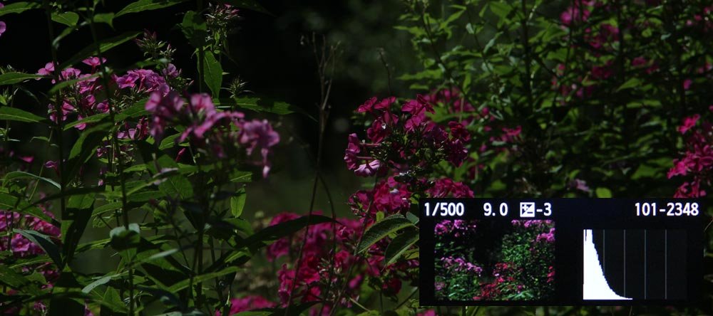
Under-Exposed Photograph by 3 Stops
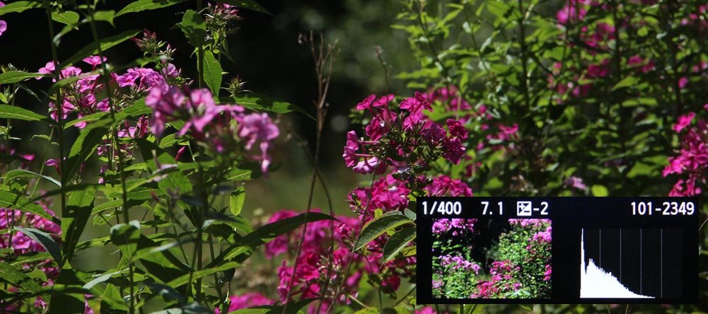
Under-Exposed Photograph by 2 Stops
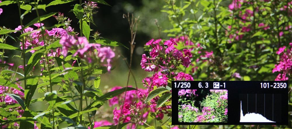
Under-Exposed Photograph by 1 Stop
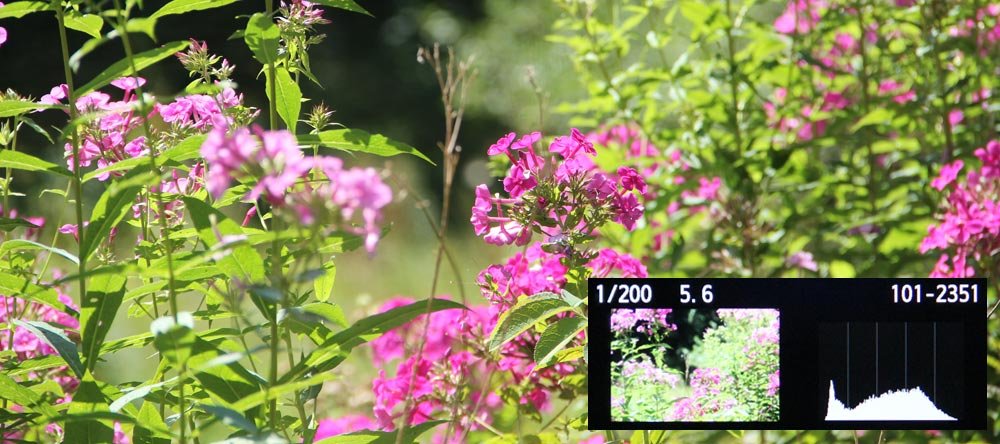
Properly Exposed Photograph
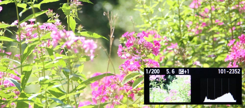
Over-Exposed Photograph by 1 Stop
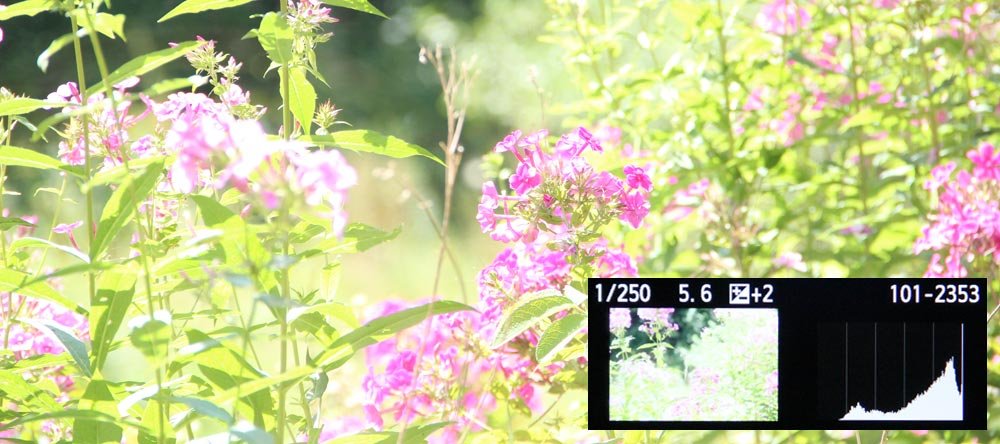
Over-Exposed Photograph by 2 Stops
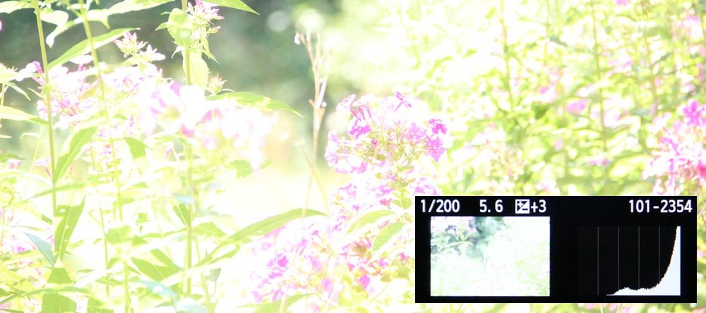
Over-Exposed Photograph by 3 Stops
By reviewing the above photos, one can argue for either the over or underexposed photos by 1 stop or the properly exposed photograph, based on taste and preference. And again, there’s really no rule when it comes to exposure. The primary concern is that the data you’re capturing with your camera falls inside the parameters of what your camera can handle and that it can be used later on in post processing. If your shadows are too pronounced or your highlights are completely washed out, you may end up with an unusable picture.
When taking photos with the histogram in view or reviewing photos while looking at the histogram, it’s important that you get a “feel” for what the shape should be for your particular scene. While every picture won’t have a pretty “bell shaped” histogram, it will have a curve that coincides with the best exposure you’re going to get. The trick is to practice and learn what good histograms look like. Once you get the hang of it, you’ll likely fall into the category of photographers who shoot photos with proper exposure and who swear by the histogram.
