15Katey
Member
- Joined
- May 10, 2021
- Messages
- 130
- Reaction Score
- 0
- Points
- 23
- #1

The Curves tool in Photoshop is one of those areas that’s widely misunderstood. Not only is it misunderstood because editors don’t know what it can accomplish, but many folks also don’t know how to use it. While it does take some practice, it can actually do a lot. There are a few other tools to can accomplish similar tasks, but it’s always good to know everything within the program you’ve decided to earn your livelihood with.
In this post, I’m going to lightly touch on the Curves tool. This same tool, or others very similar to it, can be found in multiple applications, so life can become exponentially easier if we become more familiar with what it is we’re looking at. My goal today is to erase some of the mysticism that surrounds areas like this. This won’t be thorough coverage, but more of a brief overview that’s designed to simply allow you to become more acquainted with this panel.
What is the Curves Tool?
In Photoshop, using the Curves tool is a very powerful and effective method for adjusting tones to brighten, darken, add contrast and shift colors. Despite all this, many editors shy away from it. Let’s take a look at how we can enable the panel.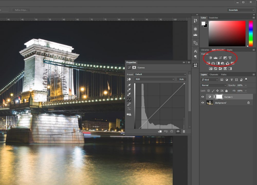
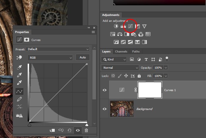
If you take a look at the screenshot above, you’ll see that I circled an icon that resides in the Adjustments panel. If you don’t see this panel, head up to Window > Adjustments and select from there. Once you do that, you should see the panel appear. Go ahead and click the icon I circled. If you’re not sure which one it is, hover over it and wait for the Create a new Curves Adjustment Layer popup info box. If you see that, you’re in good shape.
After you click the icon, you’ll see two things happen. The first thing you’ll see is the Curves panel appear to the left (or right – depending how you have your workspace set up) of the Adjustments panel. The second thing you’ll notice is a new layer directly above the layer you had selected in the Layers panel. This new layer is called an Adjustment Layer and it’s where all your changes will take place. The nice aspect of Photoshop creating a new layer for this is that you get to preserve your original layer. If you decide against your changes, you can always delete the adjustment layer and go back to the beginning.
Now, there is another method of going about the same task. While you’re in the Layers panel, you can go down to the bottom and click the small white and black icon to make the adjustment layer menu appear.
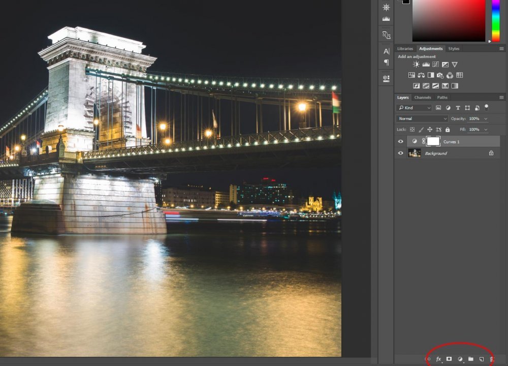
When you see the menu, you merely need to select which type of adjustment layer you’d like. In this case, I would choose Curves.
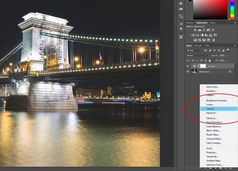
This second method will give you the same result as the first.
Activating the Adjustment Layer
This is just an FYI. If you ever close the Properties panel (where the Curves function is held), you can reopen the panel by double-clicking on the small half-half circle icon that’s in the layer itself.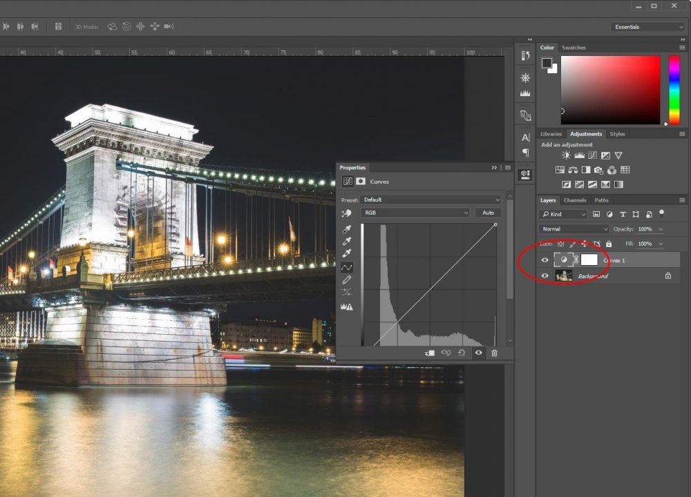
The Curve Line
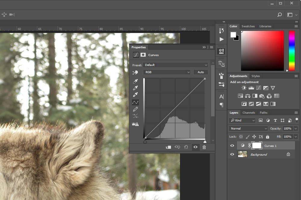
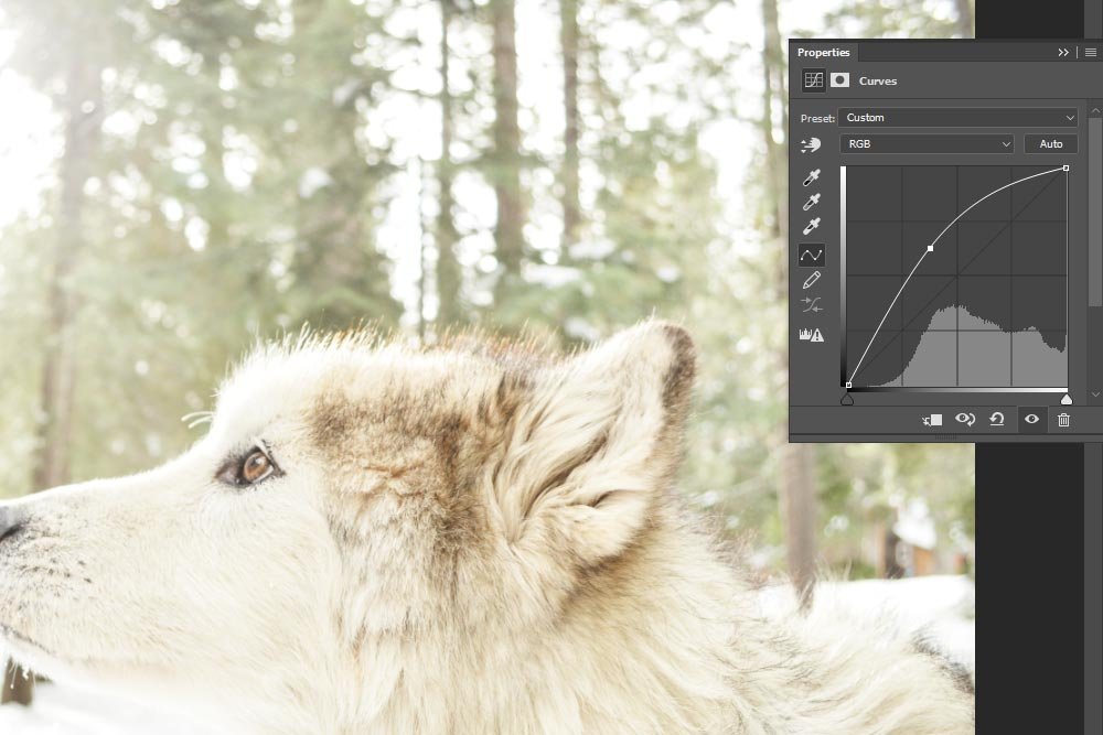
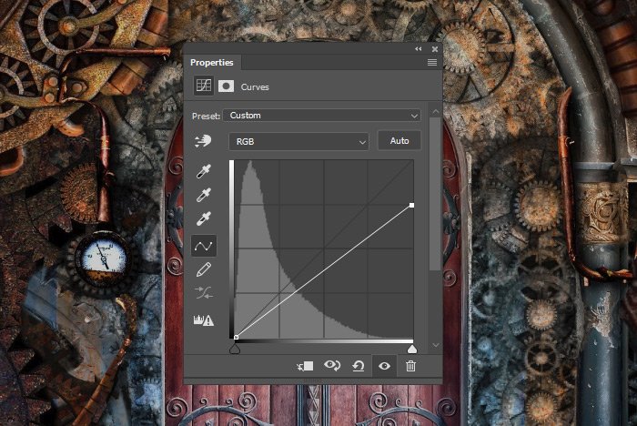
This is the section you need to read clearly. This is where I explain the basics of how the curve line is set up. If you look inside the panel (which I’ve undocked to see more clearly), you’ll see my sample photo’s histogram.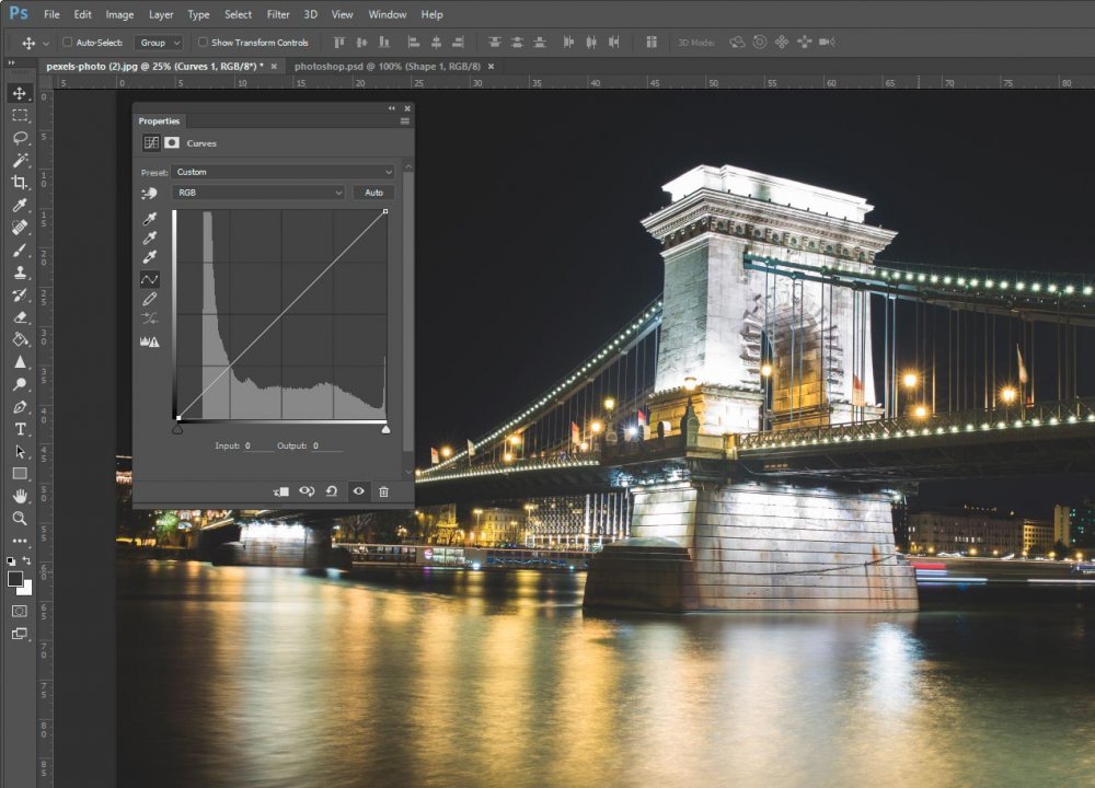
This histogram represents the tonal range of my photo. If you’ve read the previous posts that talked about histograms, you already know what I’m referring to. If you would like, you can review those posts here:
How To Use Your Camera Histogram For Awesome Photos
Using the Levels Adjustment in Adobe Photoshop for Photography
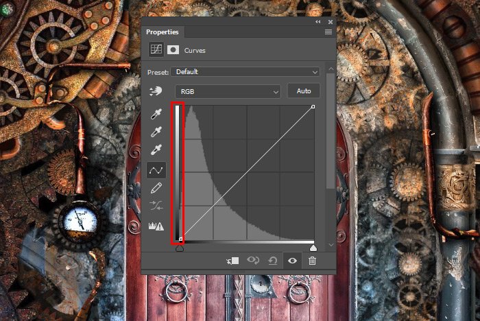
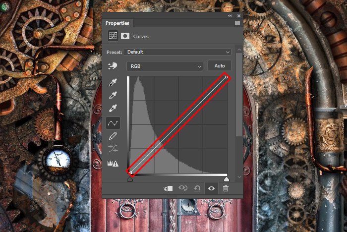
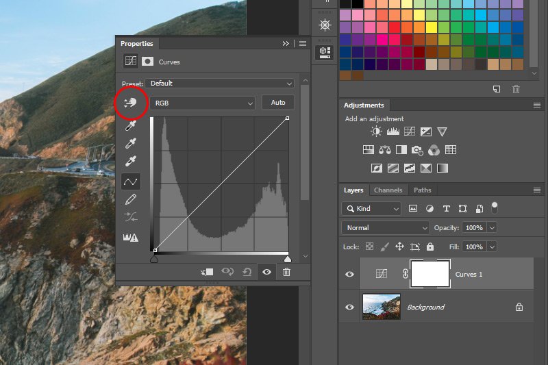
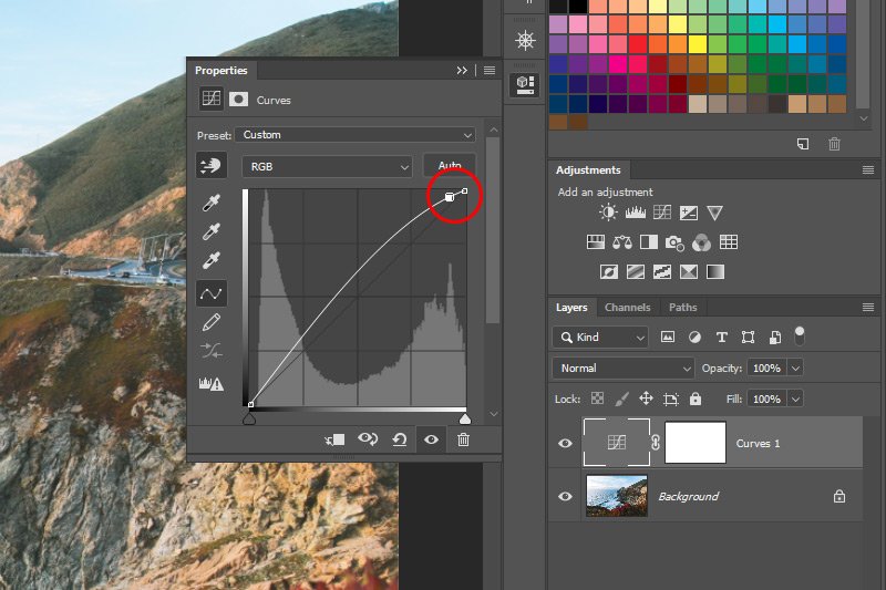
Inside the Curves panel, there are two axes. The horizontal axis represents the tones of the original image (the input) and the vertical axis represents the tones of the values we create by editing inside this panel (the output). They both begin dark in the bottom left corner and lighten as they move toward the upper right. The diagonal line that begins at the bottom left and continues to the upper right is where we can add control points, which we can push and pull to adjust and alter the curve of the line, which, in turn, will adjust and alter the tone of the image. While it’s common to add only a few control points, it’s possible to add up to fourteen of them. Simply put, inside of the Curves adjustment, editors have the ability to adjust points throughout a photograph’s tonal range.
It’s important to note that as you add and remove points (which we’ll cover next) to and from the adjustment line, the shape of the line has the ability to change. This new shape is considered a representation of the adjustments you made. So, if you hide the adjustment layer, those changes will disappear and if you unhide the layer, those adjustments will appear once more.
Adding & Removing Control Points
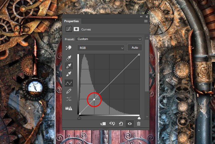
Adding control points is extremely simply. All you need to do is to click on the adjustment line with your mouse pointer. As I said, you can add up to fourteen of them (to end up with sixteen total).
To remove the control points, you can click and drag each point from the line. Just click right on each one of them and drag them out of the Curves panel. In actuality, you can simply drag each point off the line and once it hits a certain distance, the point will disappear, but in practice, it’s prudent to drag each point further. Another method of removing a control point is to select it (so it turns solid) and hit Delete on your keyboard.
PS – I only added the above control points as an example. I already removed them to continue on with example photo in this post.
Adjusting Color & Tone
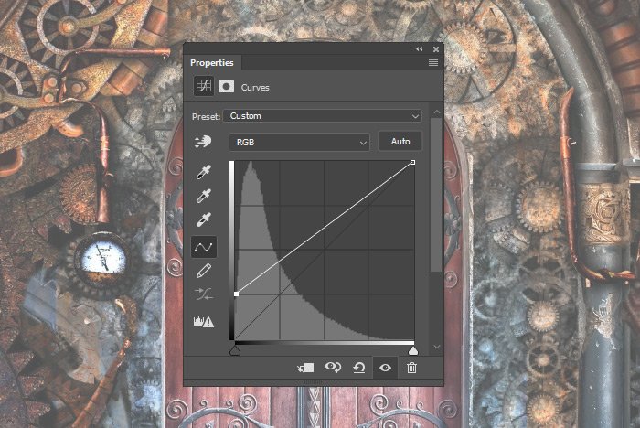
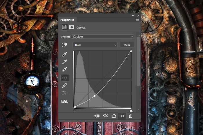
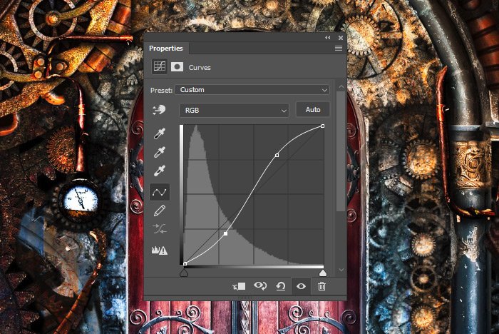
In this next section, I’m going to go ahead and add some control points to adjust the color and tone of my image. I’ll explain what I’m doing throughout. Before I begin, I want to give you a word of warning. When many editors begin using the Curves adjustment tool, they start off by adding a control point and moving it one way or another, not really knowing what they’re doing. They know the goal – to make their image look better, but truly, they’re guessing at what their specific control point and adjustment will accomplish. This isn’t good. Because of this, I’d like to offer a few rules of the game.1. Adding a control point and dragging it up or down will lighten or darken the tonal area you’re adjusting.
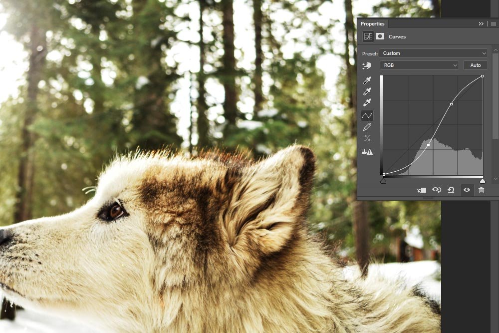
2. Adding a control point and dragging it left or right will increase or decrease the contrast of the area you’re adjusting.
3. The steeper sections of the adjustment line represent areas of higher contrast, while flatter sections represent areas of lower contrast.
So, if you head into this panel and use these rules as a guide, you’ll save a lot of time by targeting exactly what it is that you’d like to accomplish as opposed to flying blind.
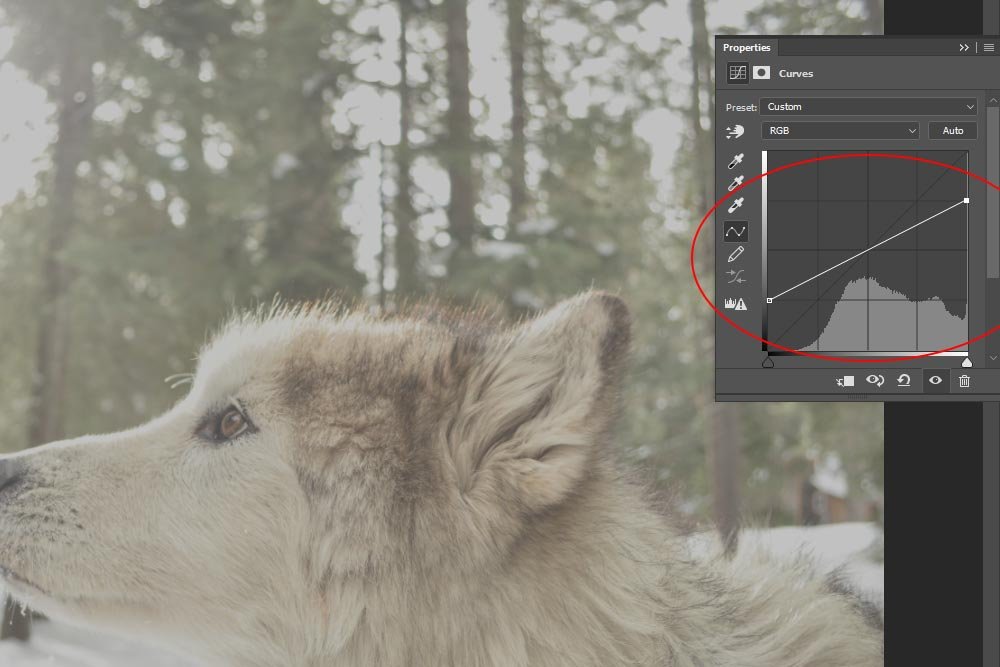
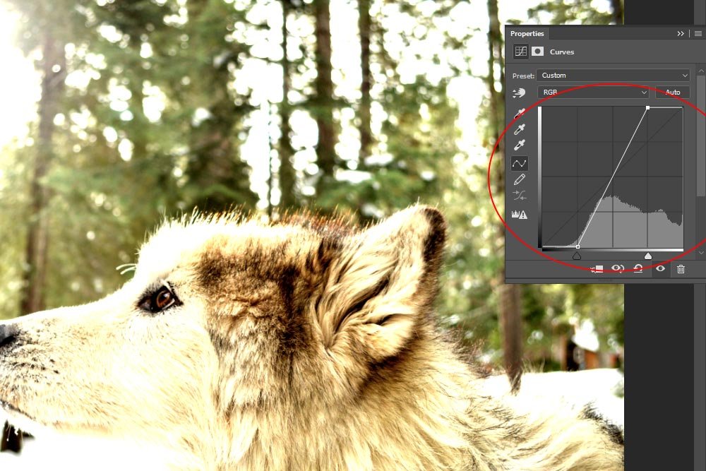
If I look at my example image, I can see that it’s got a lot of darks or shadows in it that aren’t very crisp. It’s also fairly washed out looking, meaning, there isn’t enough contrast. Lastly, it appears that some of the highlights are too high, resulting in an image that has lost detail in that regard. It’s because of these attributes that I chose this particular photograph.

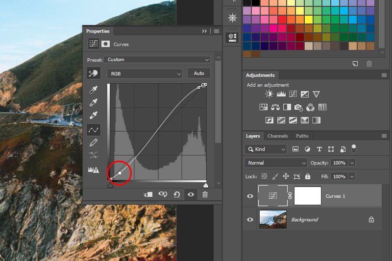
The first area I’m going to tackle is the washed out looking black ones. I can see that my histogram abruptly ends over towards the left, yet the adjustment line continues past it. I think it may be beneficial to increase some of the contrast by dragging my existing bottom control point to the right.
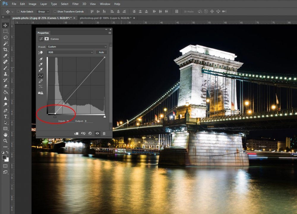
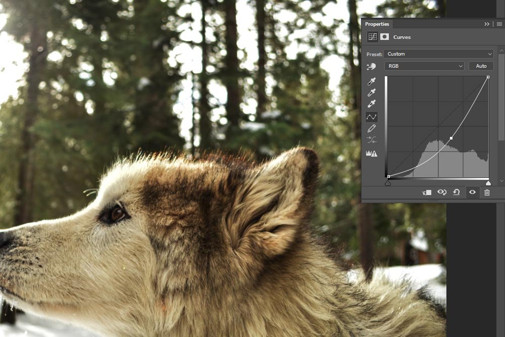
As you can see, the image is already looking a lot better. If I add a control point a bit higher on the adjustment line and pull it down, I think I can darken the shadows even more and also add some detail – all in one fell swoop.
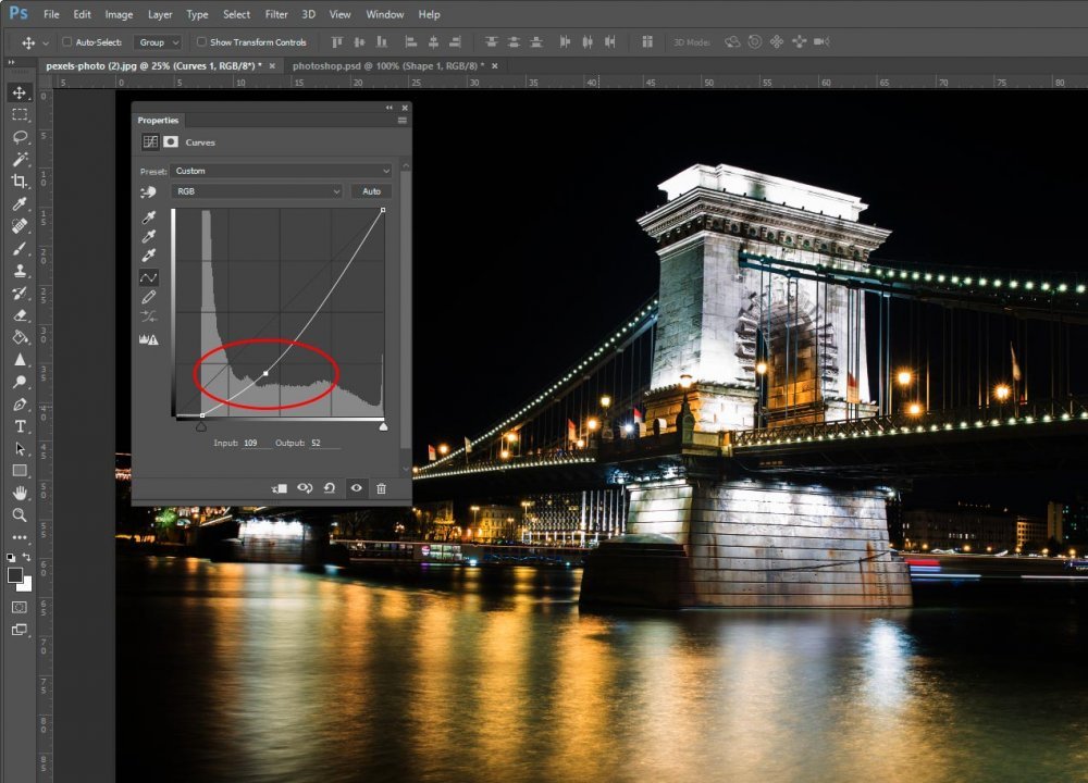
By simply moving the lowest control point to the right and by adding a control point to the adjustment line and dragging down and to the right slightly, I was able to darken the sky, reduce the glow around the lights on the bridge and add detail to the ripples in the water. Not bad.
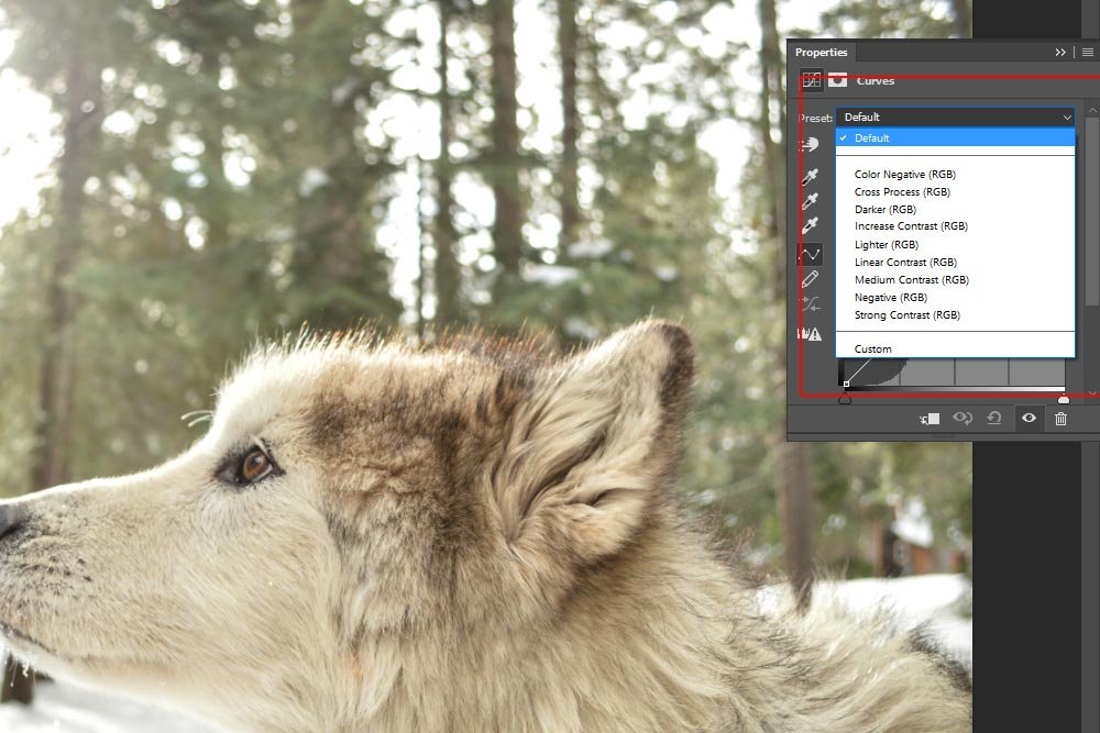
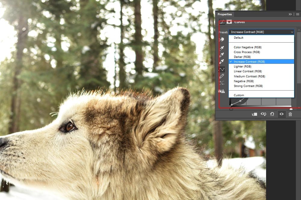
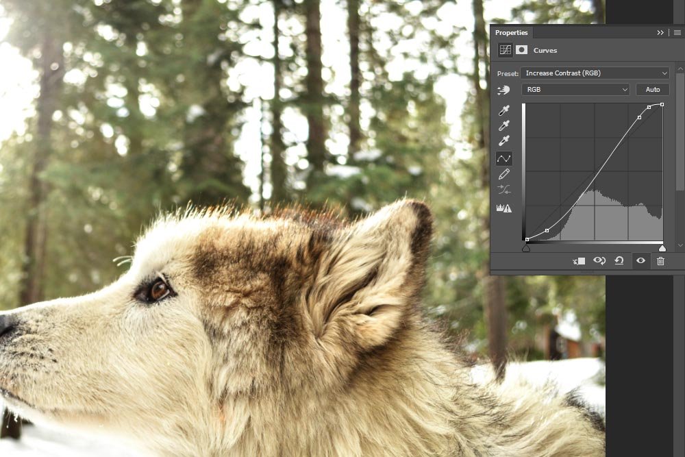
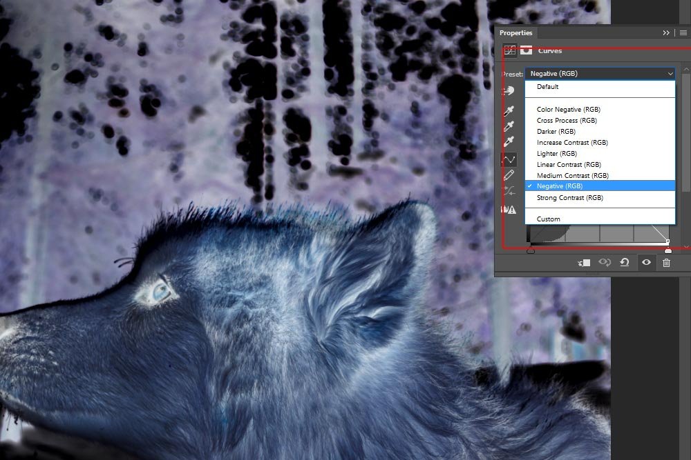
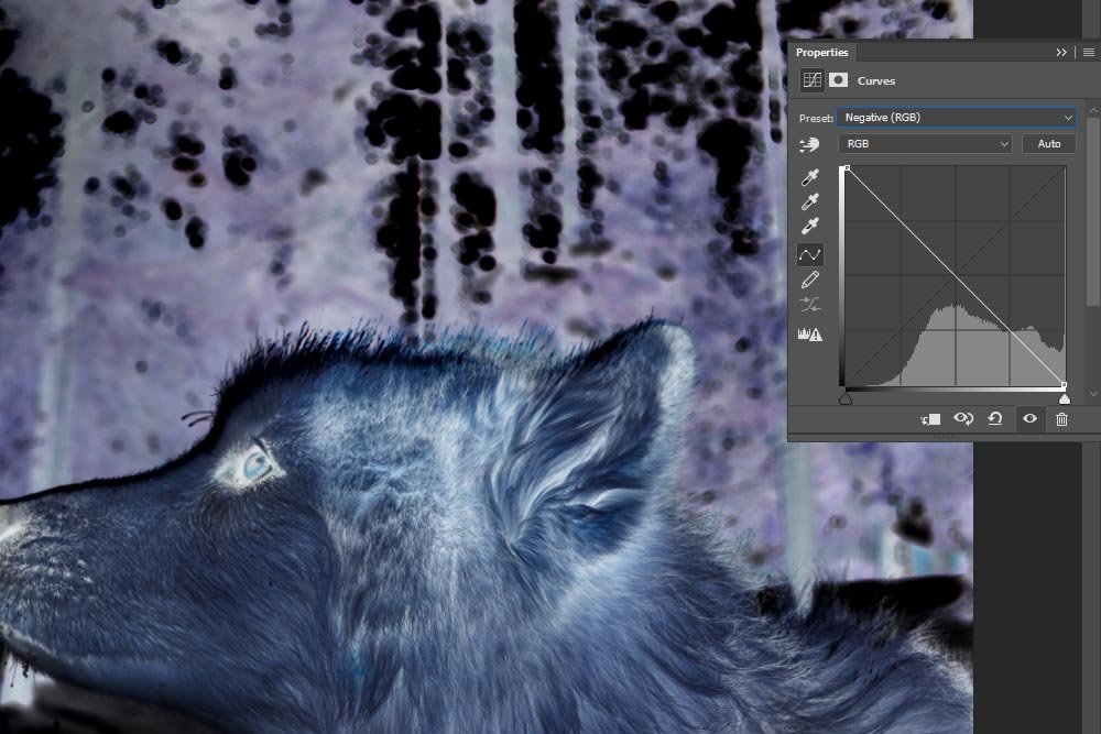
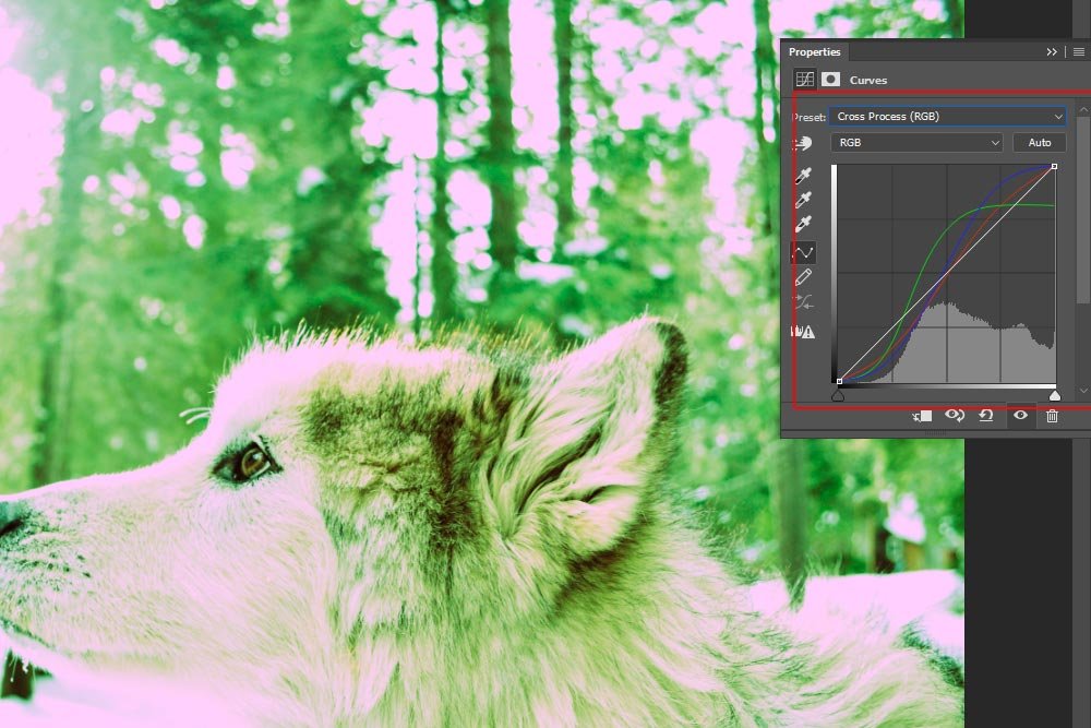
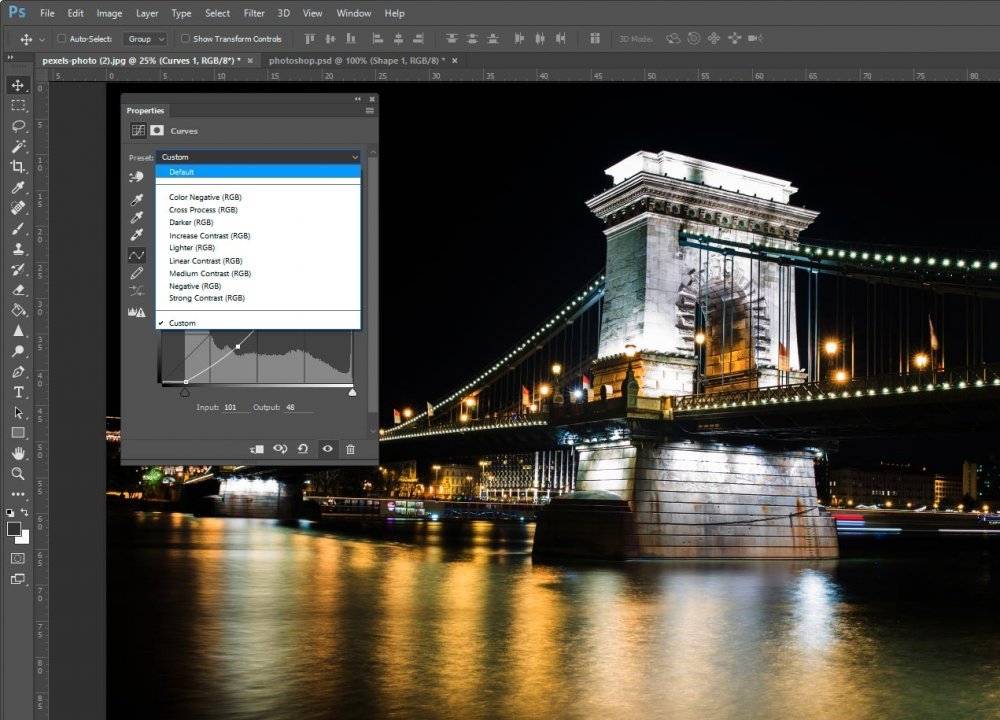
Behind the scenes, I’m adding control points, adjusting then and removing them. It appears that I’ve hit the end of the road with what I have been working on. I’m actually going to stop here. I do want to let you know, though, that there are a series of presets available to us in this panel. For instance, if I click the top drop-down box, I can flip through these choices and select something that fits what I’m working on. At the very least, if I select a preset that improves my image, I can use that as a starting point.
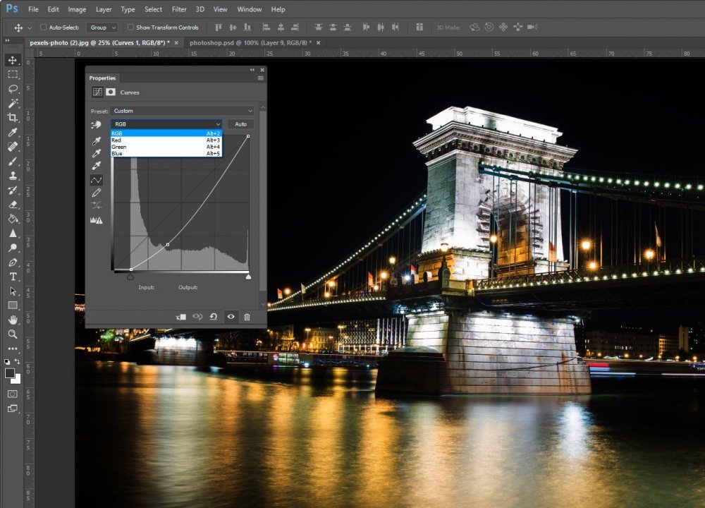
Also, we have the ability to alter the overall color of an image, by clicking on the drop-down directly below the preset drop-down. Above, I was working in RGB mode, but if I clicked this drop-down, I could have easily chosen Red, Green or Blue to work on and adjust.
Please let me know your thoughts on this tool. I don’t use it all too much because I feel that other tools have more forgiveness as well as flexibility, but it’s good to know it’s there. If you do use it frequently, please leave your thoughts in the comment section below.
——
If you’ve enjoyed today’s post and found it helpful, please share it with a friend. Thanks!


