Search

Adding Color: Blend Modes & Adjustments in Photoshop

  • Thread starter CaptainDan
  • Start date
CaptainDan

CaptainDan

Member
Joined
May 9, 2021
Messages
113
Reaction Score
0
Points
16
  • #1
adding-color-blend-modes-adjustments-adobe-photoshop.jpg

A few days ago, I posed a challenge to myself. I wanted to see if I could take an interesting, but dull, photo and liven it up color-wise. The challenge was to do it completely in Adobe Photoshop – without any assistance from Camera Raw or another processing application. Also, I wanted to see how fast I could accomplish the task. I gave myself 1 minute to get the job done.

Guess what. I did it. I took a photo and made it pop. I didn’t use saturation or contrast or any of the typical solutions folks normally turn to. What I did was use some of the tools I covered in recent posts to transform the photo. More specifically, the posts I referred back to are:

Using Adjustment Layers​

How To Adjust Brightness & Contrast In Adobe Photoshop

Using the Adobe Photoshop Curves Tool For Photography

Using the Levels Adjustment in Adobe Photoshop for Photography

Using Blend Modes​

What are Blending Modes in Adobe Photoshop?

Learning the Difference Between Blending Modes in Adobe Photoshop

Exploring Layer Order with Blend Modes in Adobe Photoshop

Of course, I didn’t take advantage of everything I talked about in these previous posts. I listed them above so you have something quick to look back to, should you decide to venture out on a project like this yourself.

In today’s post, I’m going to go through the steps I took to add some extra, yet very controlled, color to a photograph. I’ll show you the original photo, demonstrate the steps I took to liven things up and then display the final product. So, if you have an interest in adding colors of a varying degree to your own photography, read on because this is an interesting topic with many possibilities.

Original Photo​

I’m going to show you the original, untouched, photo below. The only thing I did to this was to resize it for online use.
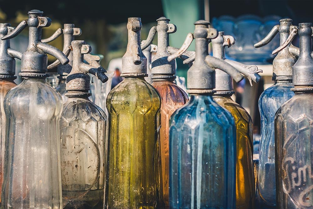
original-photo-bottles.jpg

My goal for this project is to add an adjustment layer that will do a good job at adding color where I want it, not to the overall photo. I need some granular control. Next, I’d like to take advantage of a blend mode to add some sort of an effect to the adjustment layer. Oftentimes, adjustment layers can be harsh. I’d like to dampen that. And finally, depending on what I think of the photo, I’ll lessen the opacity of the adjustment layer to the point of the photo looking natural.

Adding An Adjustment Layer​

The first thing I’m going to do is apply the Color Balance adjustment layer to the photo. The reason I like using this adjustment is because I have control over which colors get used for the shadows, midtones and the highlights. If I don’t need to apply any color to a specific type of lighting, I leave it be. If I want to add more blues or reds to the shadows or highlights, I can easily make an edit. It’s a wonderful tool to use when playing with colors in a photo.

To learn more about what Adobe has to say about the Color Balance adjustment, you can take a look at this resource:

Photoshop Help / Apply the Color Balance Adjustment

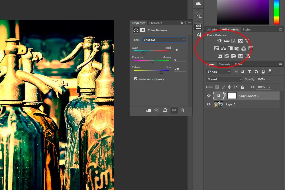
In the next three screenshots, I’ll show you the adjustments I made for each tone in the Properties > Color Balance panel. In the first screenshot, I circled the Color Balance button inside the Adjustments panel, so you know how I opened the Properties panel.

These are the adjustments I made to the Shadows.
color-balance-tone-shadows-adjustment-adobe-photoshop.jpg

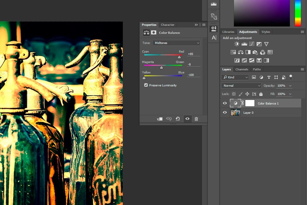
These are the adjustments I made to the Midtones.
color-balance-tonemidtones-adjustment-adobe-photoshop.jpg

These are the adjustments I made to the Highlights.

color-balance-tone-highlights-adjustment-adobe-photoshop.jpg

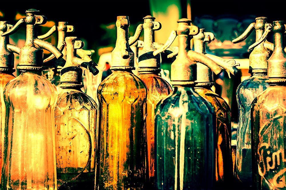
And this is the photo at this point. All that’s been done is the addition of the adjustment layer.
color-balance-adjustment-applied-to-photograph-adobe-photoshop.jpg

Now, I know the colors look a little funky at this point. That’s why I’m going to turn to the blend modes. They can offer some remarkable enhancements.

Adding a Blend Mode​

I’m going to apply a blend mode right to the adjustment layer. Remember what I mentioned in my previous post? Blend modes need to be applied to the layer on top to have any effect.

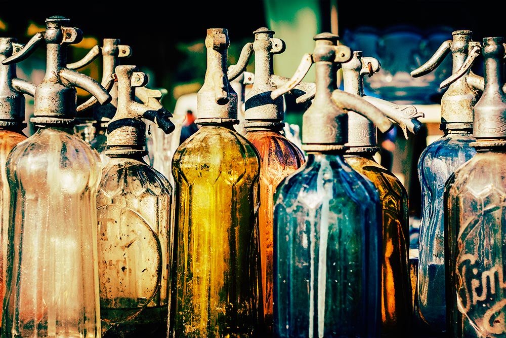
I flipped through all the modes and decided that Soft Light gives me the most pleasant, realistic look. Here’s what Adobe has to say about this particular blend mode:

Soft LightDarkens or lightens the colors, depending on the blend color. The effect is similar to shining a diffused spotlight on the image. If the blend color (light source) is lighter than 50% gray, the image is lightened as if it were dodged. If the blend color is darker than 50% gray, the image is darkened as if it were burned in. Painting with pure black or white produces a distinctly darker or lighter area, but does not result in pure black or white.

Let’s have a look at the photo after this mode has been applied.
soft-light-blend-mode-adobe-photoshop.jpg

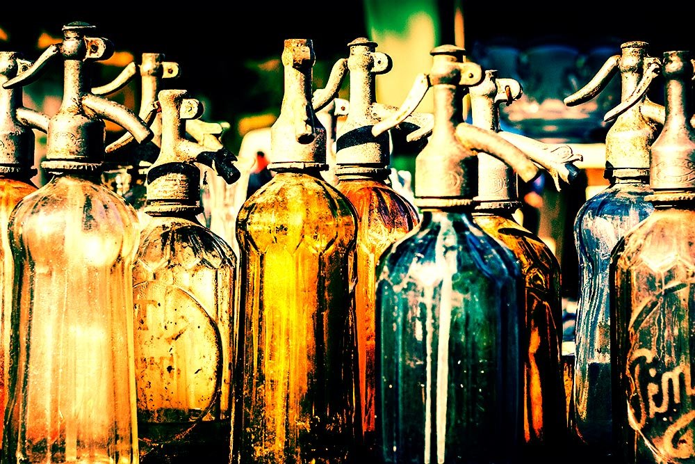
Now, it was a toss-up between Soft Light and Overlay. The Overlay mode is much stronger, but looks pretty cool.
overlay-blend-mode-adobe-photoshop.jpg

Adobe’s definition of the Overlay blend mode is:

OverlayMultiplies or screens the colors, depending on the base color. Patterns or colors overlay the existing pixels while preserving the highlights and shadows of the base color. The base color is not replaced, but mixed with the blend color to reflect the lightness or darkness of the original color.

This mode isn’t too far from the photo with only the adjustment layer applied. Perhaps the blacks are a bit blacker, but not much more was done.

Adjusting the Opacity​

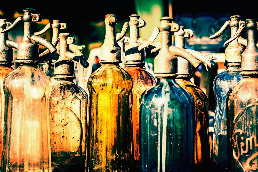
If I were to go with the Soft Light blend mode, I’d leave the opacity alone and call this a finished project. If I were to go with the Overlay blend mode, I’d dampen the colors down a bit by reducing the opacity. I thought I’d show you what that would look like if I lowered the opacity to 75%.
lowered-opacity-adobe-photoshop.jpg

It sort of takes the edge off. Here’s the before and after:
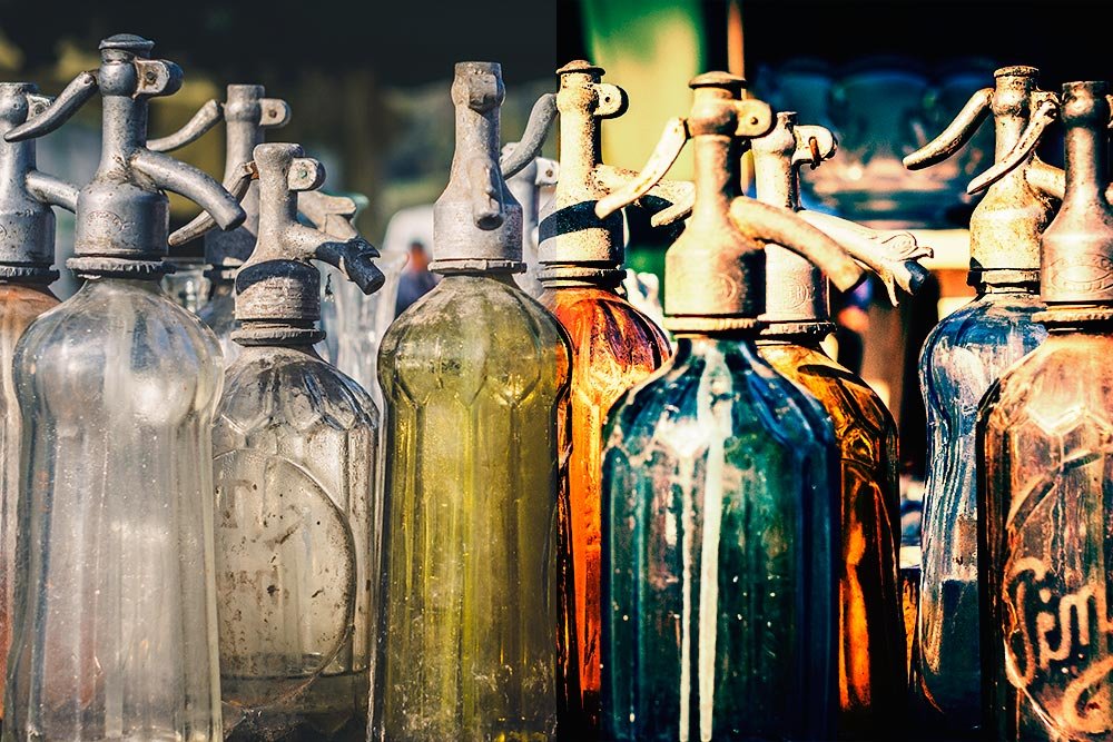
adding-color-blend-modes-adjustments-adobe-photoshop.jpg

I know this post took a while to read, but I’d like you to give this type of project a shot. Once you go over it, you’ll be able to whiz through it in under a minute too. Let me know what you think.
 
CaptainDan

CaptainDan

Member
Joined
May 9, 2021
Messages
113
Reaction Score
0
Points
16
  • #2

Adding Advertising Impact to a Photograph with Adobe Photoshop​

I’m sure you’ve seen all types of ads in magazines and the internet where photographs have been manipulated in many different ways. As a matter of fact, no “original” photo has probably ever been used in an ad. Something has always been done to each and every one. Whether it be simple color correction to more involved color alterations, something has been done. I’m referring to professional ads here, not simpler graphics that are created by those who aren’t in the industry.

In today’s post, I’d like to cover some easy things you can do to add some emphasis to objects in an image using Adobe Photoshop. With my demo photo, I’ll first select the primary object and then I’ll alter its color. Then, I’ll desaturate the remainder of the image to make the object stand out more than it originally had and then finally, I’ll reduce the visibility of the desaturated area of the photo so the object really stands out. You’ll see this type of technique used in magazines and print publications where something very specific is for sale or where a particular message is being conveyed. The purpose behind this is to get the reader to see, but mostly ignore most of the image and to focus their eyes on the actual product. This is about reducing noise in an photograph.

The Demo Photo​

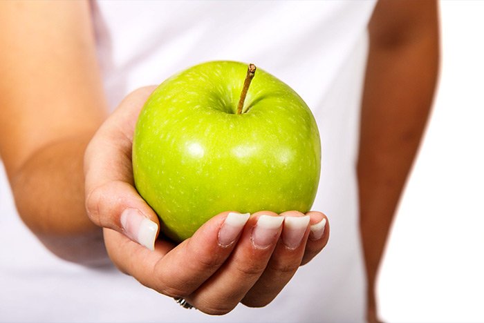
I chose this photograph because it’s obvious what the product is. It may be the apple, but it also might be a message the apple is trying to convey. Something like, “This is the epitome of health,” or “Take care of what you treasure.” It could be anything, but the apple is definitely the focus of the image.

girl-holding-apple.jpg

Selecting the Apple​

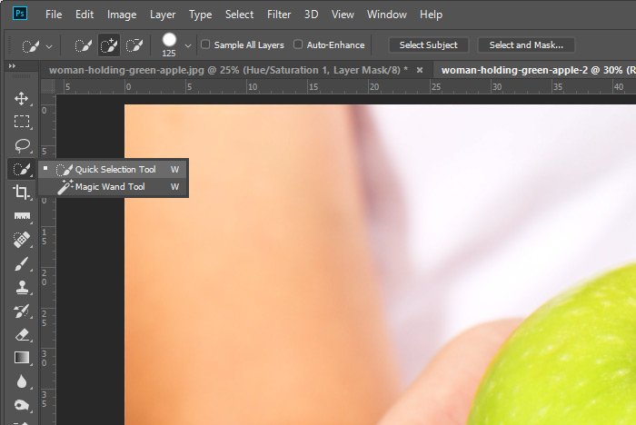
First things first. To start off with, I’ll go ahead and select the apple using the Quick Selection Tool.

quick-selection-tool.jpg

I’ll size the tool and then configure it properly for my use. Then, I’ll trace the inside of the apple until I see everything I want selected. If there’s something I don’t want selected, I’ll hold down the Alt key on my keyboard to deselect that area.

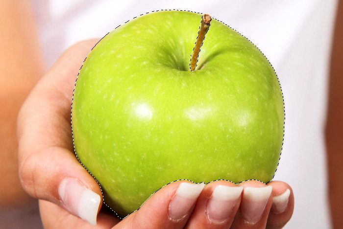
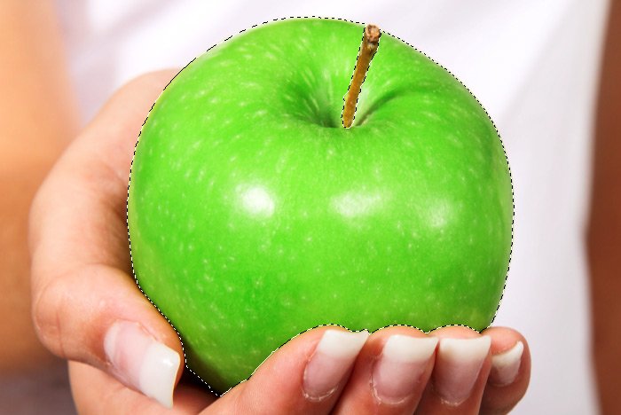
Here’s the selection.

selected-apple.jpg

Changing the Color of the Apple​

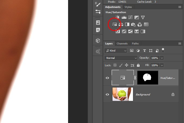
Now that I’ve got the apple selected, I’d like to make it a bit more green than it currently is. I want it to stand out more. To accomplish this, I’ll go into the Adjustments panel and click on the Hue/Saturation icon.

hue-saturation.jpg

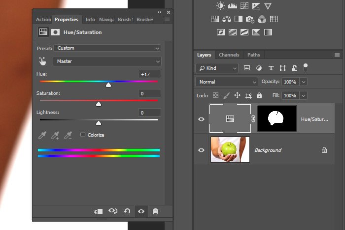
Once the associated Properties panel is opened up, I’ll push the Hue slider until I find a color for the apple I like.

properties-panel.jpg

There, that should do it. I could even make the apple red if I wanted to, but I decided to stick with the green.

green-apple.jpg

Duplicating the Mask​

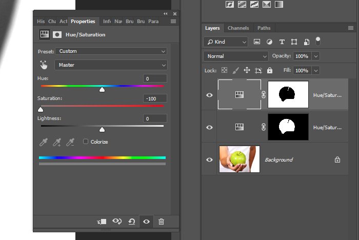
Since I already have the selection made, most of the work for this project is completed. Selections are usually the most complicated challenges of a project. My next goal is to remove the saturation from the remainder of the photograph. To do this, I’ll click on the adjustment layer that I already created and then I’ll use the keyboard shortcut of Ctrl+J to duplicate it. Once that’s done, I’ll click on the new mask and I’ll use the keyboard shortcut of Ctrl+I to invert it. So now, instead of any changes being applied to the apple, they’ll be applied to everything except the apple. I’ll also notice my previous edits being applied to this area, so I’ll reposition the Hue slider so it’s back at the center. Then, I’ll push the Saturation slider all the way to the left, so there’s no color remaining in this part of the image.

desaturate-invert-mask.jpg

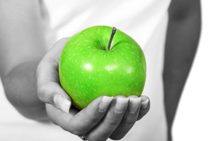
This is what the photo looks like now. See how much the apple stands out?

pop-apple.jpg

Reducing the Visibility Even More​

With this step, I’d like to reduce the visibility of the girl in the photo even more than I have. I’d like to place somewhat of a semi-transparent overlay on top of her. To accomplish this, I’ll press the Ctrl key on my keyboard and then click on the inverted mask in the Layers panel. That will activate the selection once more. The selection of everything but the apple, that is.

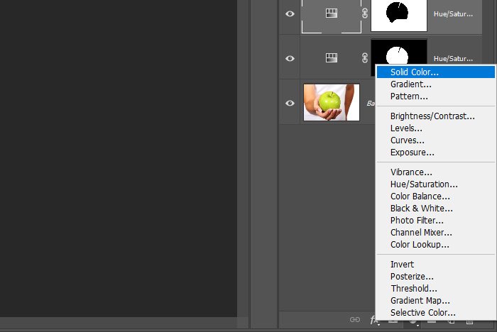
Then, I’ll head down to the bottom of the Layers panel and I’ll click on the Create New Fill or Adjustment Layer button. When the menu pops up, I’ll select Solid Color from the available options.

new-solid-color-layer.jpg

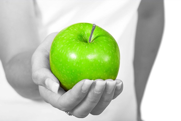
When the color picker appears, I’ll choose white and then I’ll close that out. Finally, I’ll head over to the Opacity slider in the Layers panel and I’ll reduce the opacity to 25%. This is what I’ll end up with.

final-image-1.jpg

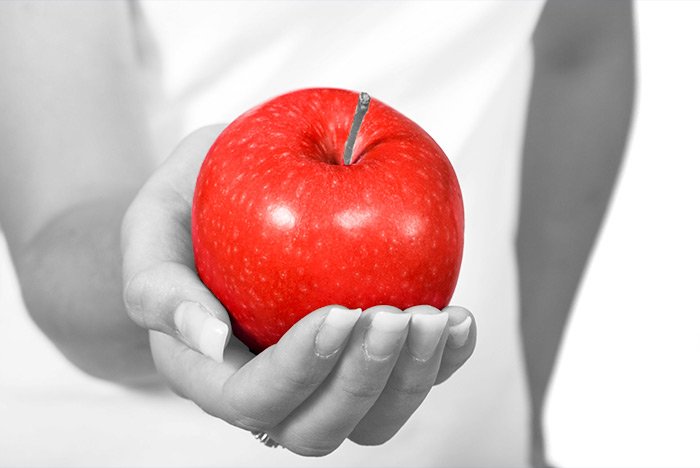
Now, like I said, I could have gone with a red apple…

red-apple.jpg

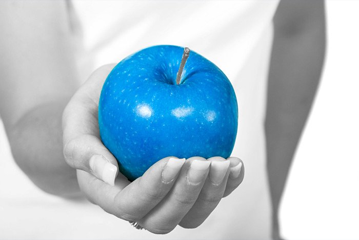
Or maybe even blue.

blue-apple.jpg

I actually kind of like that blue apple. You get the idea.

And that is how to make an object in an image stand out. I hope I explained everything clearly and remember, this is just the beginning. Graphics like this will usually have text accompany them so they make sense.

If you have any questions regarding this post, please let me know in the comment section below. You can also ask any question you’d like in the discussion forum as well. Thanks for reading!
 
CaptainDan

CaptainDan

Member
Joined
May 9, 2021
Messages
113
Reaction Score
0
Points
16
  • #3

Colorizing Objects with the Hue Blending Mode in Adobe Photoshop​

Have you ever wondered how websites that sell clothing and others that sell cars change the colors of whatever it is they’re selling? You know what I’m referring to here. Pretend you’re looking at a Honda Civic on the Honda website and the default color is gray. Below the photo of the car are alternative colors. Click the small square and the same exact car changes color. Neat, huh?

Years ago, before I got into all this design and photography stuff, I wondered how the vehicle manufacturers pulled this little trick off. I thought, “Well, they must roll a differently colored car into the studio and take new photos of it.” That idea never squared with me because, I’m telling you, it was the same exact car – just in different colors. I was dumbfounded.

Now that I’m much more immersed in design and Photoshop and all that goes along with that, I know that, yes, it was the same car or the same sweater or the same pair of pants every time. The company that was selling them used some fancy software to change the colors. I’m sure they have their methods that I’ll never truly know, but I can tell you that we can do something very similar in Adobe Photoshop.

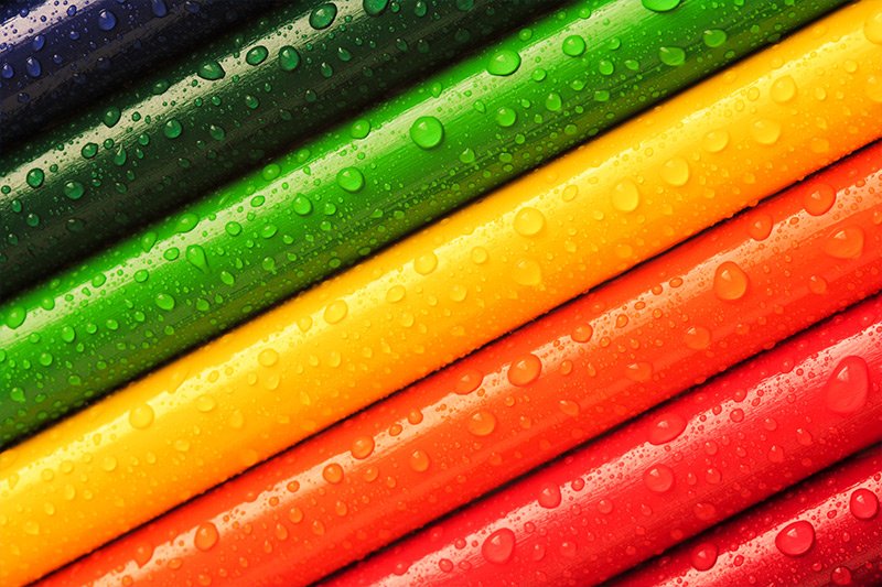
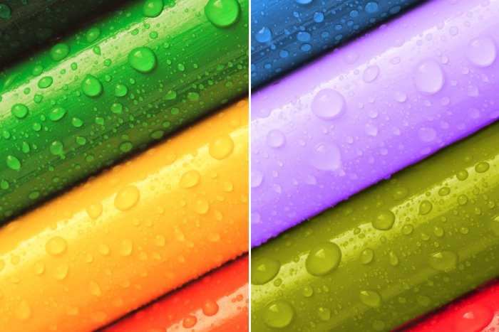
In today’s post, I’d like to introduce you to a blending mode that hardly anyone ever uses. It’s the Hue blending mode and when it comes to changing the color of an object, it comes in extremely handy. In the post below, I’ll select one of the colored pencils in the demo image and then I’ll apply an entirely different color to it. I think you’ll be impressed with the results. You’ll never even know that the original color was, well, the original color.

colored-pencils.jpg

What Does the Hue Blending Mode Do?​

I’ve talked a lot about blending modes on this website, so I can say that I’m rather comfortable with them. This one though, as I admitted above, hardly gets any use. Whether that’s because I don’t change colors of objects very much or it’s because I forget about it, I’m not sure. Perhaps after today’s post, I’ll give it some more love.

So, what exactly does the Hue blending mode do? Well, it allows a color to overlay an object, while maintaining the luminance and saturation of the object’s base color. Instead of simply “colorizing” the base color in a blunt and primitive way, it sort of allows the new color to “absorb” into the underlying one in a much more natural way.

Making a Selection​

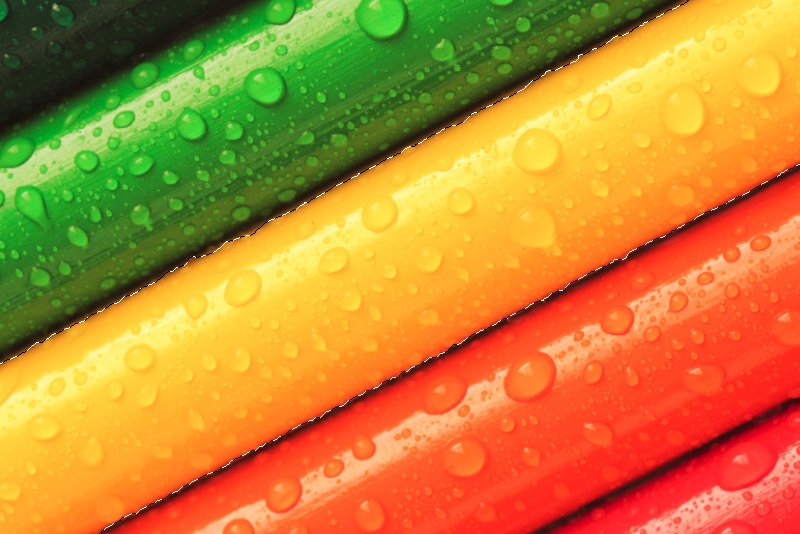
To start things off, I’ll use the Quick Selection Tool from the left toolbar to select the yellow pencil.

selected-pencil.jpg

Now, just to let you know, I’m making this rough selection because it’s the easiest way to do this. I could just as easily paint over the yellow pencil with a color using the Brush Tool and maybe I’ll even clean things up later on using this method. But for right now, to give you the general idea of how to do things, I’ll make a selection.

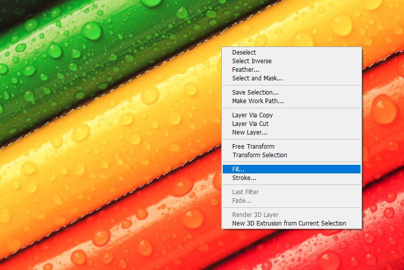
After I make the selection, I’ll head down to the bottom of the Layers panel and click the Create a New Layer button. This will create a new layer while keeping the selection live. With the new layer active in the Layers panel and the Quick Selection Tool still active as well, I’ll right-click inside of the selection. This will open a menu. I’ll choose the Fill option.

fill-menu.jpg

Filling the Selection with Color​

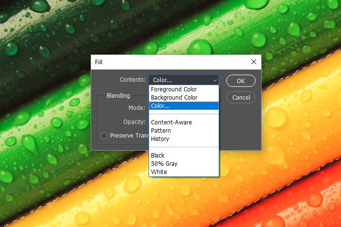
When the Fill dialog box appears, I’ll choose the Color option from the drop-down. This will make the Color Picker appear, where I’ll choose my new color.

fill-dialog.jpg

When I’m finished, I’ll click the OK button for both the Color Picker as well as the Fill dialog. Let’s see what things look like now.

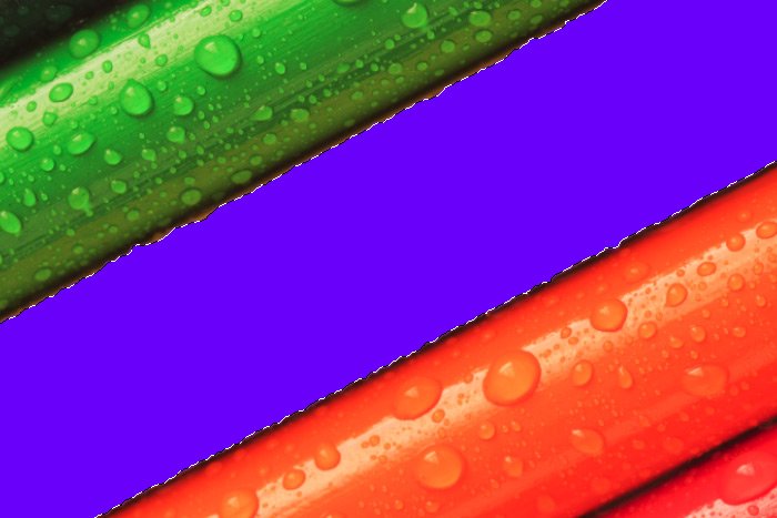
solid-color-overlay.jpg

Ah, now we have a beautiful solid purple color. Just as I wanted.

Applying the Hue Blending Mode​

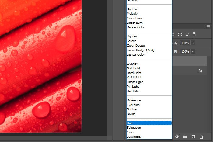
At this point, since I have a solid color that’s shaped like a pencil in its own layer in the Layers panel, all I need to do is change the blending mode for that layer. I’ll head to the blending mode drop-down in the Layers panel and I’ll choose the Hue option.

hue-blending-mode.jpg

Let’s see what that accomplished.

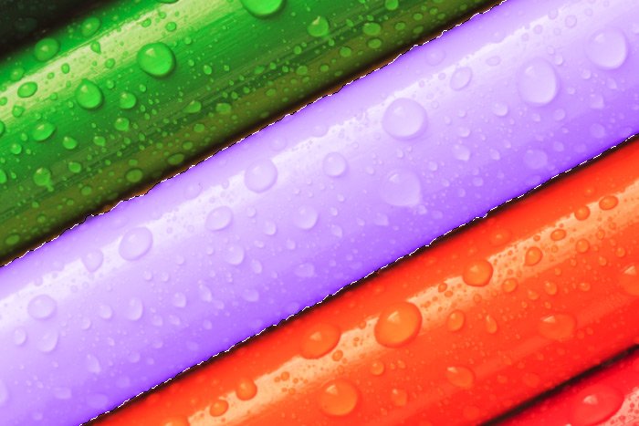
purple-pencil.jpg

As you can see, the new color has changed the pencil from yellow to purple. As a reminder, the luminance and saturation are maintained from the original color, so that’s why this purple is so light. To give you a better idea of how this works, I’ll recolor a few more pencils quickly by following the same exact steps as I laid out above.

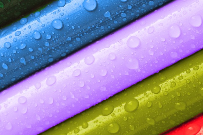
colorized-color-pencils.jpg

As you can see, we went from green, yellow, orange to blue, purple, green. That’s pretty cool and that’s all there is to it. Again, to clean the edges up, you can easily do that with the Brush Tool set to the original color. Simply paint the edges until they blend in with their surroundings well.

before-after.jpg

I hope I clearly explained how to colorize objects using Adobe Photoshop and the Hue blending mode. If you have any questions regarding this post, please ask in the comment section down below or in the Adobe Photoshop user’s forum. Thanks for reading!
 
CaptainDan

CaptainDan

Member
Joined
May 9, 2021
Messages
113
Reaction Score
0
Points
16
  • #4

How to Change the Color of Something in Photoshop​

Have you ever wanted to change the color of something in a photograph? If you’ve been involved with graphic design or photography for a while, I’m sure this task has crossed your mind at least once or twice. Changing the color of the clothes people are wearing, the color of cars, bicycles, houses, you name it – there are tons of different reasons you might want to do something like this.

The process for accomplishing this task is actually very simple. The trick is getting it to look as natural as possible and that’s going to take the preservation of the original color saturation as well as the luminance. If these two things aren’t preserved, then you’re going to end up with something that looks more fake than anything else. And no one wants that.

Method #1

The process goes like this; select the object in the photo that you’d like to change the color of using one of the many selection tools in Adobe Photoshop. Then, create a new layer in the Layers panel. Be sure to make that new layer active by clicking on it. Then, right click inside of the selection in the work area while still using the selection tool you used previously. When the menu appears, select the Fill option. Then, when the Fill dialog appears, choose the Color option from the Contents drop-down. Press the OK button to accept that change. What you’ll be left with is a completely colored over selection, which is good (albeit weird looking), but it’s not finished yet.

The colored area should be in its own layer. To make it appear natural in the image, you’ll need to change the blend mode of that layer to Hue, so head up to the blending mode drop-down in the Layers panel to do that. Once that’s completed you’ll be finished. For a more thorough explanation on how to change the color of something using Photoshop, please check out my recent blog post on the topic.

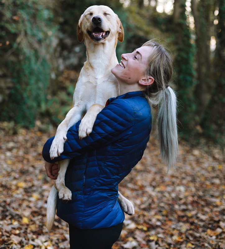
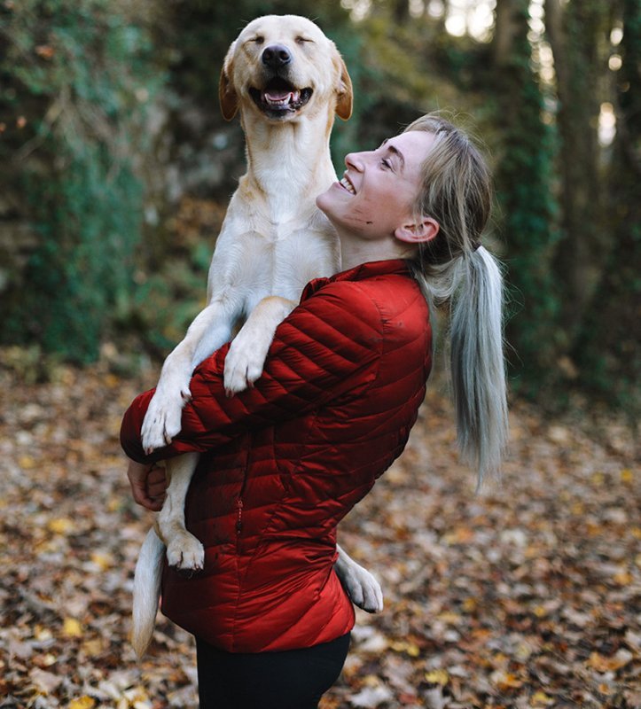
Here’s a great example of this technique. The first image where the girl is wearing the blue jacket is the original and the second where she’s wearing the red jacket is the colorized one.

girl-blue-jacket.jpg girl-red-jecket.jpg

Do you see the way the saturation and luminance of the original has been maintained? That’s the way it’s supposed to be.

There is a second method for taking care of the same task. If you wanted to create a new layer before doing anything else and then use the Brush Tool to paint your desired color over the object, you can do that as opposed to first making a selection and then filling it in. Both of these options will get you the same exact thing. They’ll apply a color over something. Then, if you’re using this second method, you can simply change the blend mode of the new colored layer to Hue and you’ll be done with it.

Do you have any other ideas for changing the colors of things using Adobe Photoshop? If so, please leave them below. Also, if you have any questions about this process, leave them below as well. Thanks!
 
Top