Search

How to Arrange Layers in Adobe Photoshop

  • Thread starter 15Katey
  • Start date
15Katey

15Katey

Member
Joined
May 10, 2021
Messages
130
Reaction Score
0
Points
23
  • #1
illustrations.jpg

I’ll start this post off by telling you that my favorite aunt is a very talented illustrator. She’s been drawing and painting for years. I can remember back to when I was a young girl sitting in one of those Radio Flyer wagons, waiting for her to finish painting a picture of me. Believe it or not, I have that picture hanging on the wall not more than ten feet from where I’m sitting right now. She stood on my grandmother’s walkway with her easel and paint and I sat on the edge of the road in the wagon. My legs were so short they didn’t even touch the ground.

Aunt Ruthanne emailed me yesterday and asked for my assistance. She recently set up an Instagram page that shows off some of her illustrations. If you’d like to take a look at those, please feel free. I’m sure she’d be thrilled to share something she’s so passionate about with those who appreciate such things.

Her goal is to take five illustrations and merge them into one document using Adobe Photoshop. The issue is, while she has the illustration part down pat, she’s relatively new with Photoshop. This is where I come into play. She requested that I write up a tutorial that talks about how to accomplish her goal. I’m more than happy to help.

In today’s post, I’m going to take the five files that Aunt Ruthanne sent over to me last night and take a step by step approach to putting each of these in a new document, cropping them and arranging them so they make sense. Hopefully by the end of this post, I’ll have something that looks like the lead-in image up top.

Creating a New Document​

The first thing I’m going to do (after launching Photoshop) is create a new document. To do this, I’ll head up to the File > New menu item and click. From there, the New dialog box will appear.
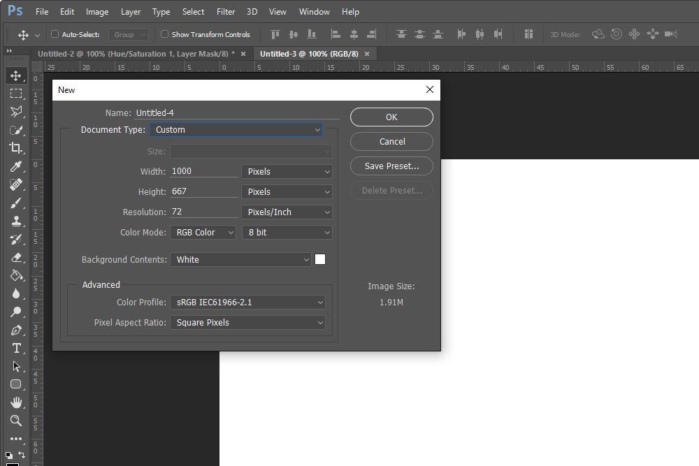
new-dialog-box.jpg

I’ll set the width to 1000 pixels, the height to 667 pixels and the resolution to 72 dpi. The reason I chose these dimensions is because they are what I use for this blog. The ratio is that of a regular photograph taken with a DSLR camera and the resolution is what’s used for the web. If I were creating this image for print, all this would change.

When I’m finished with this, I’ll click OK and a new tab will appear. Now, regarding these tabs, you may see some additional ones in my screenshots for this post. Just ignore those. I’m currently using them for the previously mentioned screenshot. If you’re following along, you should only have one tab open in Photoshop at the moment.

Opening the Illustration Files into Photoshop​

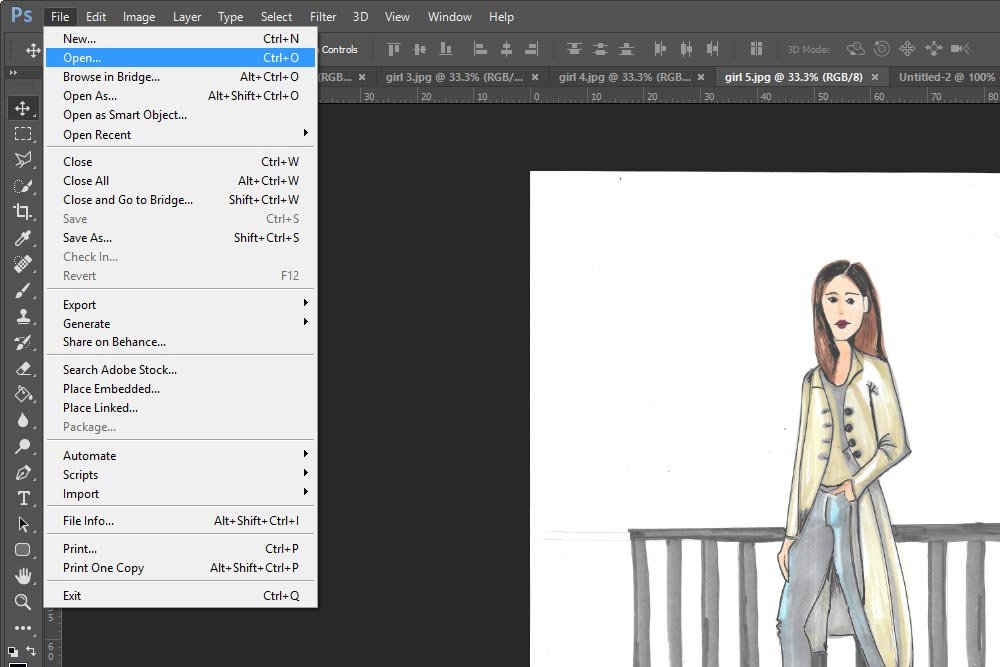
The next thing I’m going to do is open all five illustrations into Photoshop. I’ll head up to the File > Open menu item and click.
file-open.jpg

When I select this menu item, I’ll be presented with the screen that navigates Windows. I’ll find the files, select all of them at once and then hit Open down at the bottom right of the dialog box. This will open all five illustrations in the same workspace in Photoshop. At this point, you should have a total of six tabs. One blank one and five illustrations.

Need a refresher on tabs? Check out my posts on the topic.

How To Arrange the Tabs in Your Photoshop Workspace

Tips For Tabs & Guides in Adobe Photoshop

Making Uniform Illustration Heights​

This is the section where the fun begins. Since I now have all five illustrations open in Photoshop, I can start looking more closely at them. To see what I’m dealing with, I’ll click the Image > Image Size menu item from the top navigation bar.
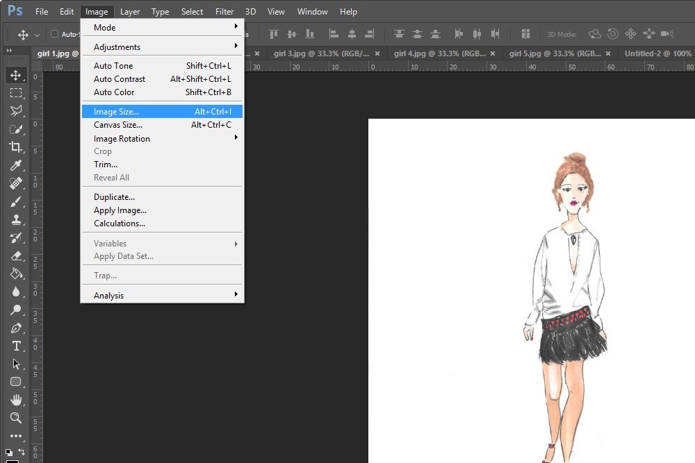
image-size.jpg

When I do this, the Image Size dialog box appears. I’ll take a look at the height dimension for all five files to see if they match.
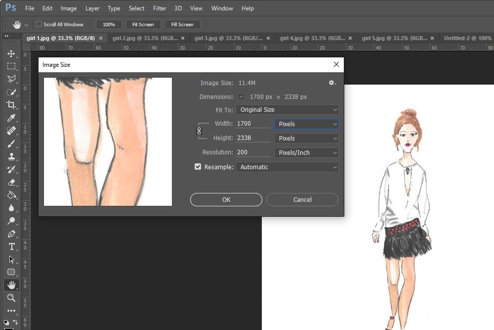
image-size-dialog-box.jpg

It appears that they don’t. If they did and if each drawing was centered the same way all the others were, I could do some batch processing. Since each file is wider or taller than the others, I’ll need to work on them one at a time. The first thing I need to do is trim each image.

Cropping the Illustrations​

In the final composition, I want some white space above the head and below the feet of each model. I’ll keep this in mind when I’m cropping.

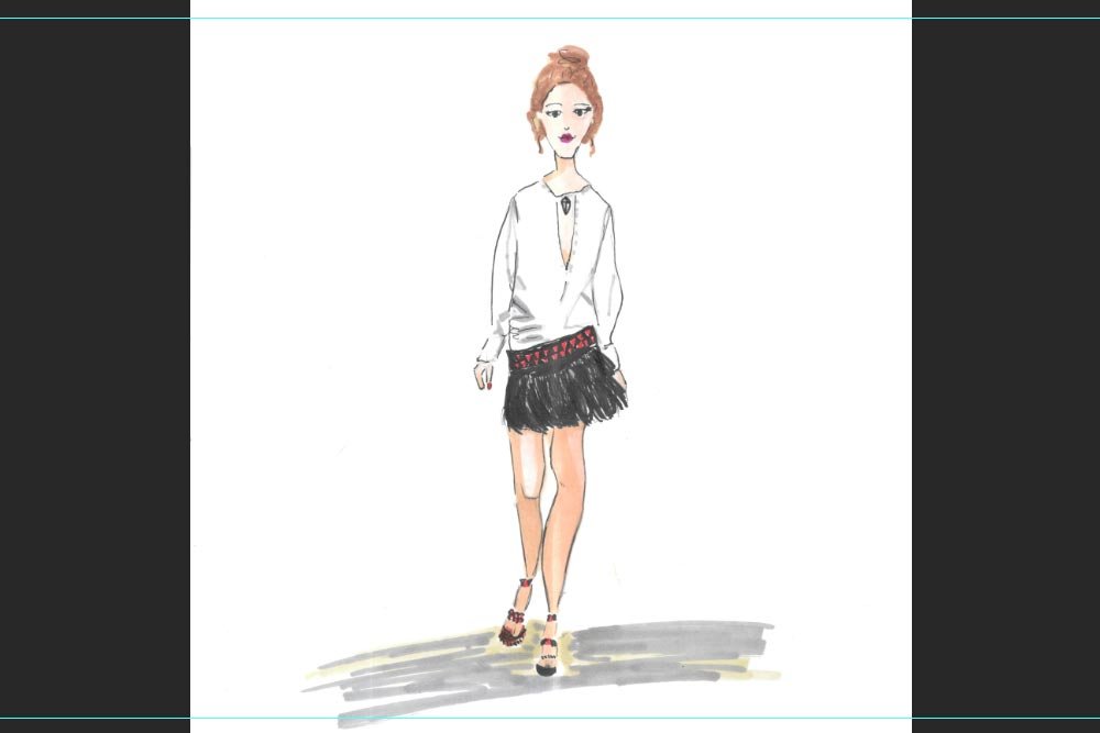
To crop each image, I’ll first set up some guides. To do this, I’ll click inside the top ruler and drag the guide down so it sits where I’d like to crop from. If you aren’t familiar with using guides, please scroll down to the Setting Guides section of this post. I explain everything there.
setting-guides.jpg

I’ll set guides like this for each illustration.

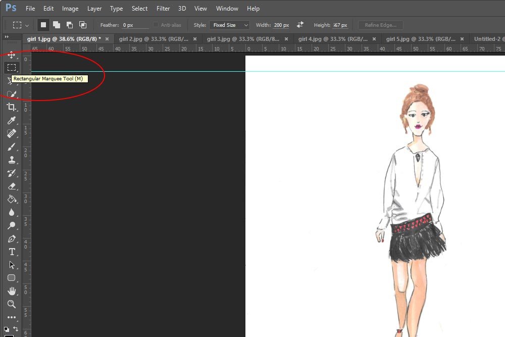
Next, I’ll select the Rectangular Marquee Tool from the left vertical toolbar.
rectangular-marquee-tool.jpg

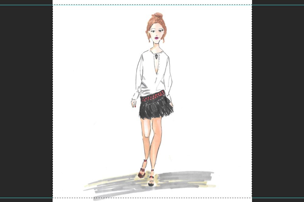
In the top options bar, I’ll be sure the Style drop-down box says Normal. Then, I’ll click and drag the marquee so it’s lined up with the guides and the edges of the image.
marching-ants.jpg

In the above screenshot, please notice the small dashed lines that surround the area of the image I’ll be cropping.

After that, I’ll head up to the Image > Crop menu item and click on it.
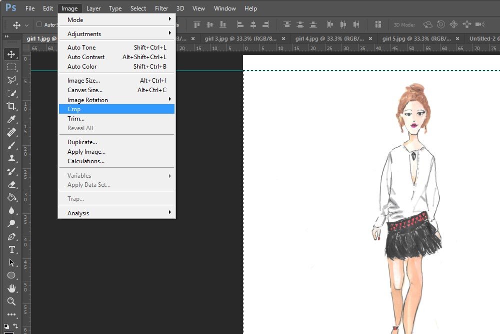
image-crop.jpg

Once I click Crop, everything outside those marching ants (dashed lines) will disappear. I’ll be left with this:
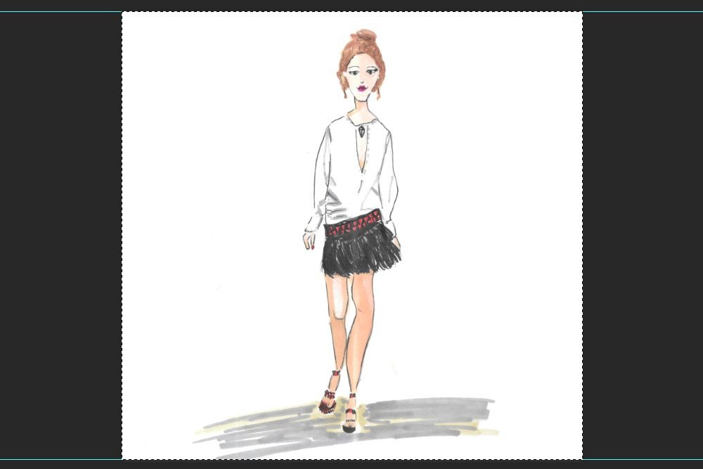
cropped-illustration.jpg

To remove the marching ants and deselect the image, I’ll go to the Select > Deselect menu item and click. Then, I’ll move on to the remaining four illustrations and do the same thing. I’ll crop them the same way I did above.

Resizing the Illustrations​

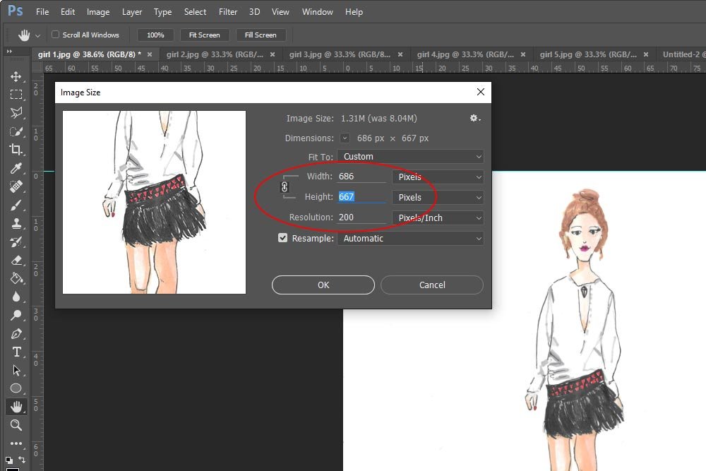
Since the output file will be 667 pixels high, I need to resize each illustration so it’s the same height. Resizing is simple. All that needs to be done is for me to click on the Image > Image Size menu item again and to set the Height dimension to 667. When finished, I’ll click OK. This will reduce the image size so it matches the output file’s dimensions. I’ll do this for all five illustrations.

NOTE: If you look inside the red circle in the screenshot below, you’ll notice that a small chain link is highlighted. Make sure yours is too. This locks the image ratio so things don’t end up all squeezed and weird looking.
reducing-image-size.jpg

After resizing, the images will look rather small on your screen. To enlarge them to their 100% size, simply click Ctrl + on your keyboard. Do this until you see 100% in each tab for each file.

Cropping Again​

Since I know that the final image will be 1000 pixels wide and that I have five illustrations to fit in the final file, I’ll do a bit of math. 1000 divided by 5 is 200. So, each of these illustrations now needs to be cropped to 200 pixels wide. This is really easy to do as well.

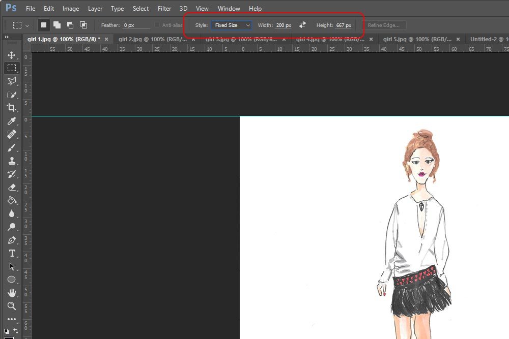
Again, I’ll go over to the left toolbar and click on the Rectangular Marquee Tool. This time though, I’ll make a change to the Style drop-down in the options bar up top. I’ll choose Fixed Size. Once I do that, a few more fields will appear. Inside the Width field, I’ll type 200 px and inside the Height field, I’ll type 667 px.
fixed-size.jpg

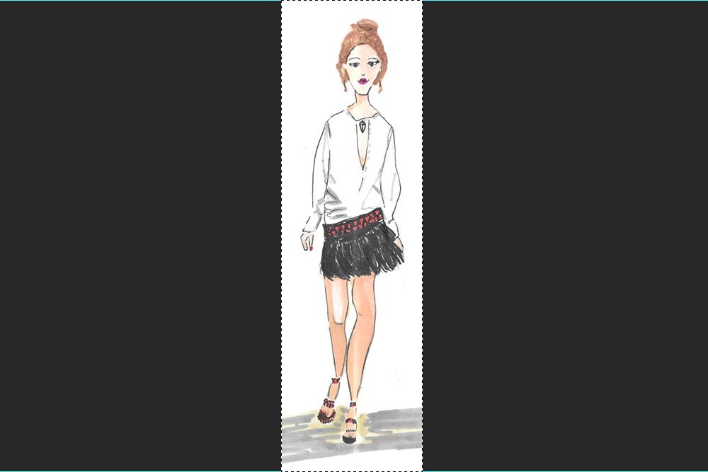
Now when I click inside one of the illustrations to crop, a fixed size square will appear. To nudge it up, down, right and left, I’ll use the arrow keys on my keyboard. When I get the square into position, I’ll go back to the Image > Crop menu item and click. This is what I’ve ended up with:
cropped-image.jpg

Again, I’ll deselect the Rectangular Marquee Tool. And again, I’ll crop all five illustrations this way.

Arranging the Layers Inside the Final Image File​

At this point in the project, I have five identically sized layers (images) that are located in five different tabs. What I need to do now is drag each layer over to the final file tab. To do this, I’ll need to go to the Layers panel in each illustration tab, click the layer and drag it up to the tab of the final image. Without letting go, I need to drag the layer down into the workspace of the final image and then let go. I need to do this for each of the five illustrations.

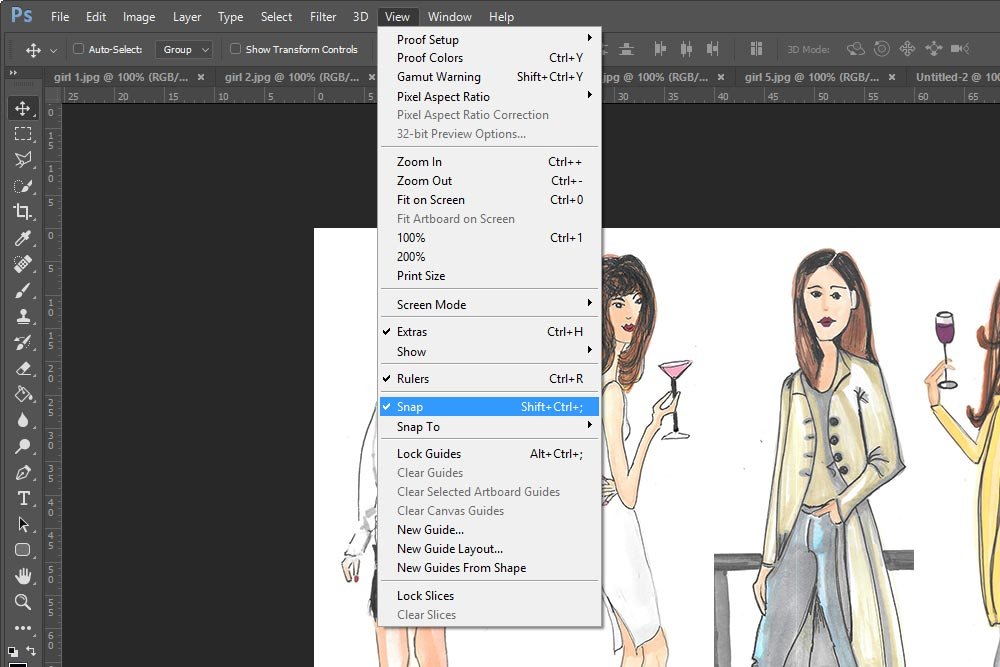
Once the layers are all in the same file, I can begin arranging them. If I go to the View > Snap menu item, each layer will snap into place much easier than if I didn’t use that feature.
view-snap.jpg

I’ll be sure to select the Move Tool (the top tool in the left vertical toolbar) to move the layers around. And if I take a look at the Layers panel, this is what it looks like with all the illustration layers in it:
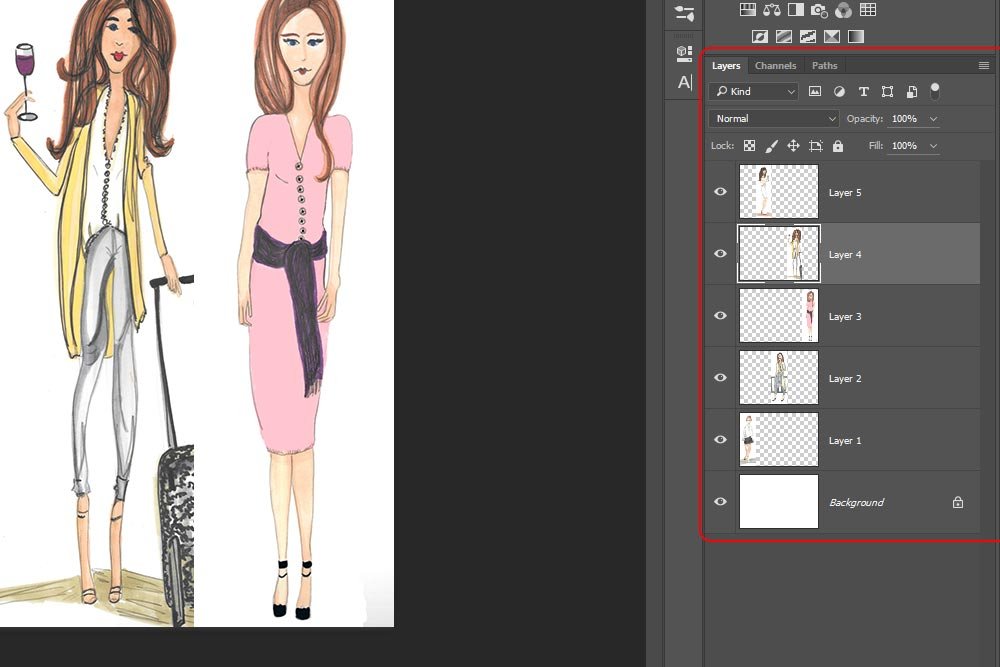
layers-panel.jpg

Once the layers are arranged the way I want them, I can save out the file.

Saving the File​

Now that the project is basically finished, I’d like to save the file so I can email it or use it online. To do this, I’ll go up to the File > Export > Save For Web menu item and click. When I do this, the Save For Web dialog box will appear.
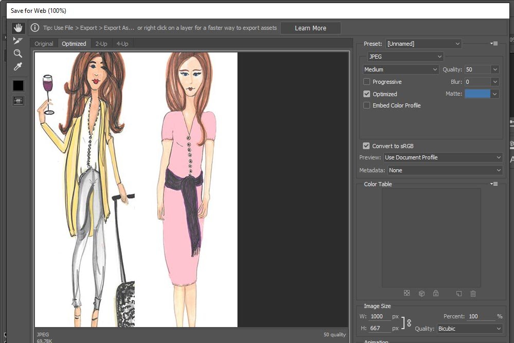
export-save-for-web.jpg

I’ll choose JPEG as the file type and 50% for the Quality. Then, I’ll click on Save and browse to the area on my computer I’d like to output the image.

And that’s it. I think this looks much more challenging than it is. I swear that if I timed myself to do something like this, it would take no longer than 2 minutes. If there are any areas you get hung up on, please ask in the comments section below. There are bound to be questions and by the time I get them, my fingers will be ready to type very clear and thorough answers. Thanks!
 
15Katey

15Katey

Member
Joined
May 10, 2021
Messages
130
Reaction Score
0
Points
23
  • #2

How to Overlap Graphics in Adobe Photoshop​

Do you remember a post I wrote a while back where I worked with a few different layers and merged them into one document in Adobe Photoshop? If not, please take a look at this post:

How to Arrange Layers in Adobe Photoshop

Basically, I showed how to take multiple files and drag them over into one project file as layers. I then trimmed them and arranged the layers side by side. It was a good post that covered some very common tasks in Photoshop. Well, today I’m going to expand on that post. The incredible illustrator who initially asked that I write the previous post has asked that I go one step further.

In today’s post, I’m going to use four separate illustration files and, again, merge them into one new file using Adobe Photoshop. Then, I’m going to make a selection with the Magic Wand Tool inside of each file. From there, I’m going to remove the white backgrounds so the models in the illustrations can be easily overlapped, giving them a more realistic and casual look.

If you’re into illustrating, this post may be of interest to you. If you’re into graphics in general, I’m sure you’ll appreciate this post too. What I cover in it are some very popular tasks that take place quite often in all types of design work.

Original Graphics​

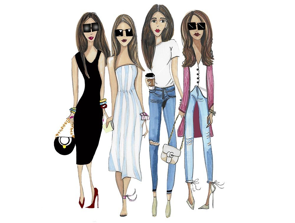
I made one graphic that shows all four models. Basically, I did this just to give you an idea of the illustrations I’m dealing with. Don’t take this image as any part of the project. I’ll begin directly below.

side-by-side.jpg

Remember, the goal of this project is to simply trim away the white background that exists around each of the models above. I won’t go into the specifics that have to do with selecting and edge refinement. I wrote in abundance about those topics already, so I’ll link to the posts where appropriate.

Creating a New File​

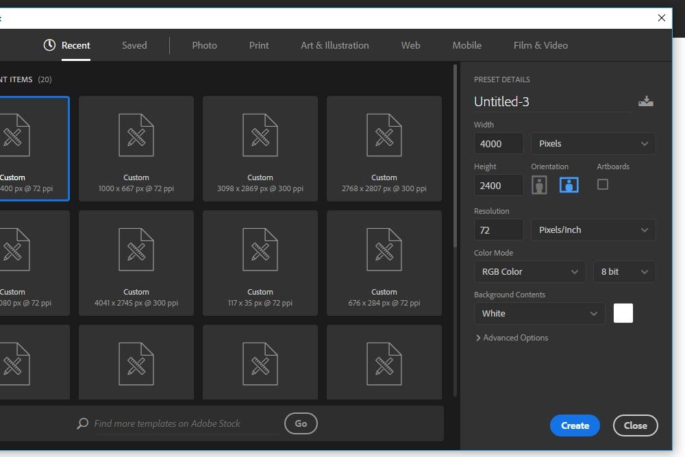
I took a look at each file in Adobe Bridge and discovered that, on average, these four files have dimensions of about 1000 pixels wide by 2200 pixels high. The tallest file is 2400 pixels high. Since I need to create a new file in Photoshop to contain the final graphic, I’ll make that file 4000 pixels wide by 2400 pixels tall. I can always trim away the extra space at the sides and reduce the final overall dimensions later on. That’s easy.

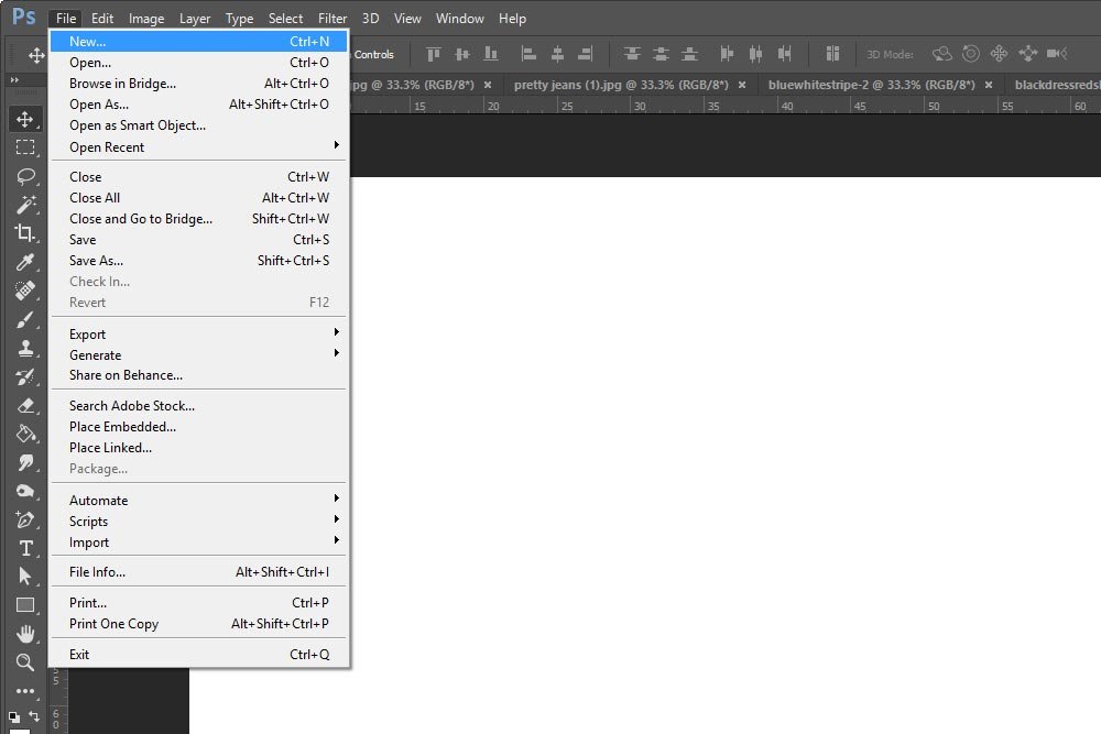
To create the new file, I went up to the top menu and clicked on File > New.

file-nex.jpg

After that, when the dimensions dialog box appeared, I typed in the values I already decided on. Since this project graphic will be used for web purposes, I kept the resolution at 72dpi. If I were going to use this for print, I’d go with 300dpi.

dimensions.jpg

Finally, I clicked on the Create button down below.

After I create the new, empty, file, I’ll use Adobe Bridge to launch each of the graphics into Photoshop. I generally use Bridge for things like this. You don’t have to. You can open these files directly in Photoshop. To see how to do this, please read this post:

The Various Methods of Opening Files in Adobe Photoshop

Once I do this, I’m all set for the next step. I have the empty work area that I created for the final graphic and the four working images in their respective tabs. Perfect.

Setting Up the Layers​

Since I’ll be going through the same process for all four graphics, I’ll use just one of them in this post.

As you can see, the backgrounds are white. Because I’ll be removing this background, I’ll need to see the results of my efforts. The easiest way to achieve this is to create a new layer that’s black. This way, as I remove material, I can quickly and clearly see what I’ve done.

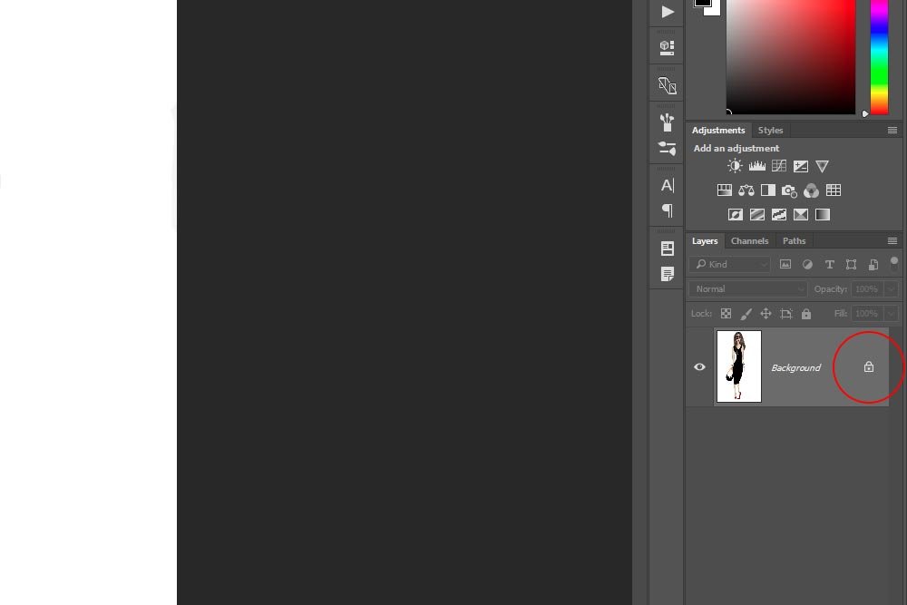
The first thing I’ll do is to unlock the background layer. I’ll head over to the Layers panel and click on the small lock icon to make it disappear and to unlock the layer.

locked-background.jpg

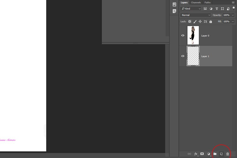
Next, I’ll create a new layer by clicking the New Layer icon at the bottom of the Layers panel.

new-layer-icon.jpg

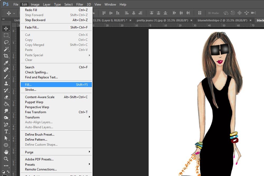
I’ll click and drag that new layer underneath the graphic layer. Finally, I’ll make sure the layer is selected and then I’ll head up to the Edit > Fill menu item and click.

edit-fill.jpg

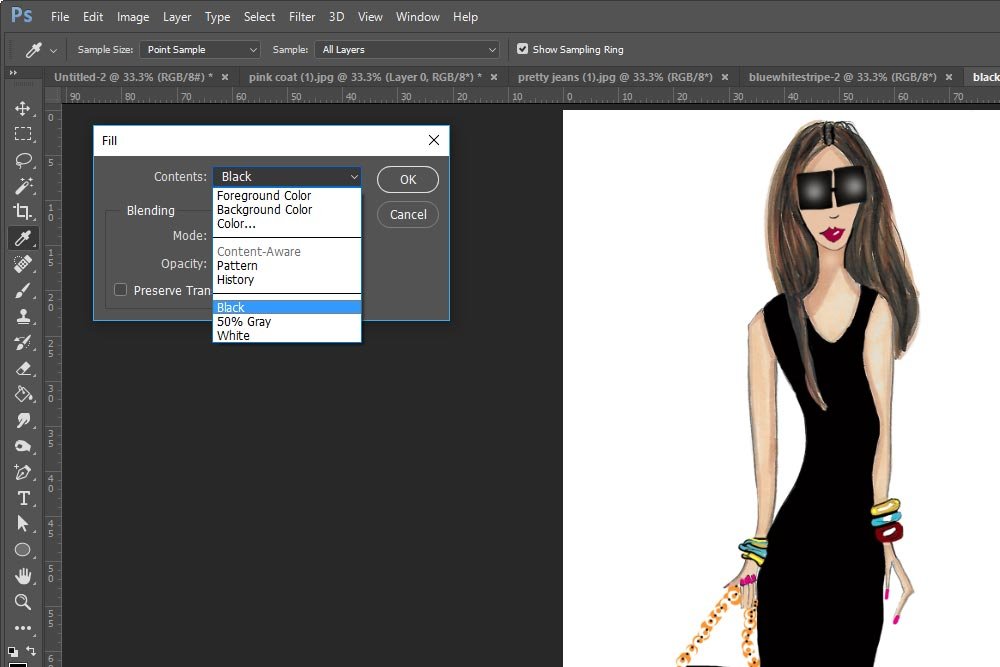
Once I do that, the Fill dialog box will appear. From the Contents drop-down menu, I’ll select Black, which will fill the empty layer I created with solid black.

fill-dialog.jpg

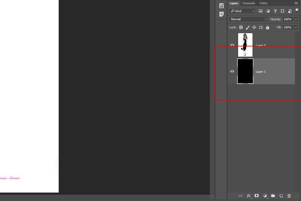
Since the graphic background is still there, it won’t see like anything has happened. If you look at the new layer though, you’ll see that the thumbnail is black. That’s a good thing.

black-layer.jpg

Trimming Away the Backgrounds​

What I’ve done so far is all preparatory. Now comes the fun part of actually trimming away the white areas around the illustrations. What’s especially easy for me is that I already wrote tons of posts on how to do this. Basically, I’m going to make a selection, if necessary, refine the selection and then delete the contents of it.

If you want to become a pro at everything that has to do with selections in Photoshop, simply search for Photoshop Selection in the search bar on this site. All the posts I’ve written on the topic will appear in the results.

For this post, I’m going to go quick and dirty. I understand that when someone wants to get something done, the last thing they want to do is learn a topic from the beginning. This isn’t a problem. There are only a few areas that need to be looked into.

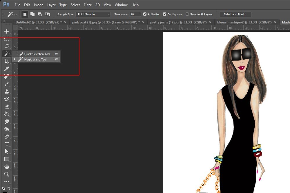
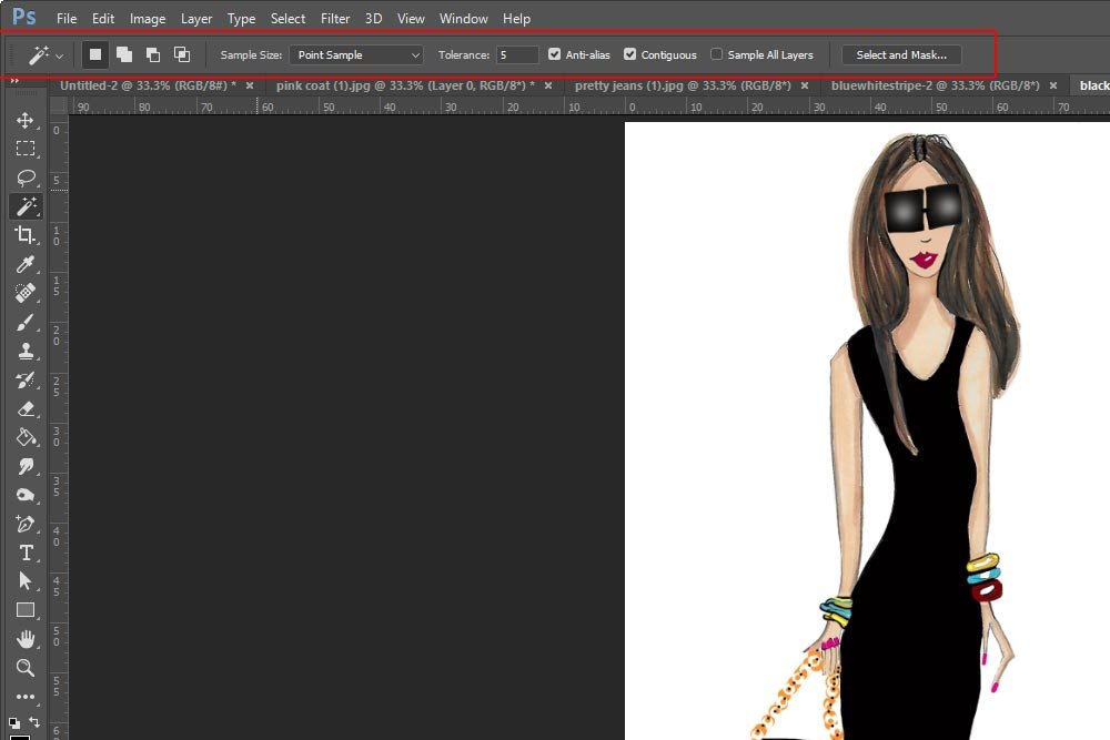
I’m back to the graphic. I’ll head over to the left toolbar and activate the Magic Wand Tool.

magic-wand-tool.jpg

When I do that, I’ll see the options bar change.

magic-wand-options-bar.jpg

Before I do anything else, I’d like to lead you to a resource on this particular tool. Since it’s ancient and incredibly useful, it wouldn’t be such a bad idea to learn as much as you can about it.

Make Quick Selections in Photoshop – Adobe

In particular, look at the Tolerance area.

Tolerance: Determines the color range of selected pixels. Enter a value in pixels, ranging from 0 to 255. A low value selects the few colors very similar to the pixel you click. A higher value selects a broader range of colors.

The reason I mention this one area of the options bar is that in one of the illustrations, while selecting the white background, the “almost white” shirt became selected as well, when I was working on it. Due to this, I lowered the Tolerance value and things began working properly. For all the illustrations, I used a Tolerance value of 5.

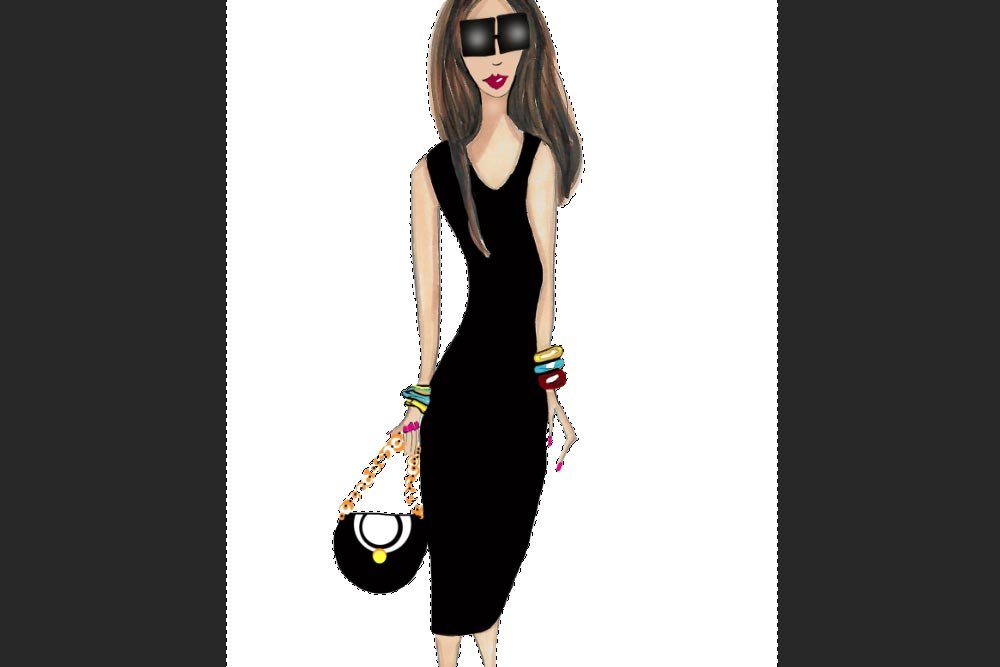
Since the tool is activated, I can now click in any area of the white background (making sure the illustration layer is selected in the Layers panel).

magic-wand-selection.jpg

After I made the selection, there was an area inside of the arm that needed to get selected as well. Also, there were two areas near the edge that needed to be selected. When using this tool, if you need to add to a selection, hold the Ctrl key on your keyboard. If you need to remove selected areas, hold the Alt key and continue clicking around.

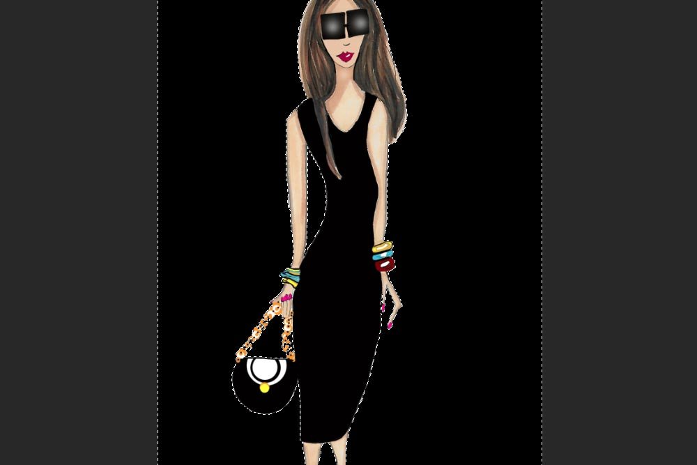
Once everything is selected, I’ll press Delete on my keyboard to remove all pixels in the selected areas. Since I have a nice black background, I can see the results clearly.

delete-background.jpg

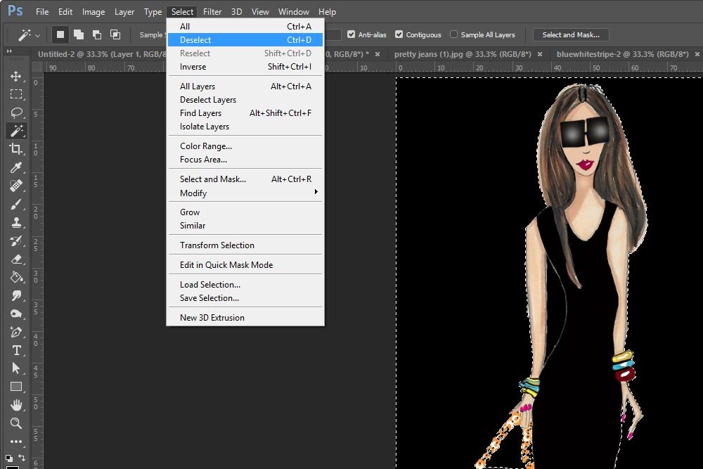
Finally, to get rid of the marching ants, head up to the Select > Deselect menu item and click. Once you do that, continue on with the remaining illustrations.

select-deselect.jpg

Combining Illustrations into One File​

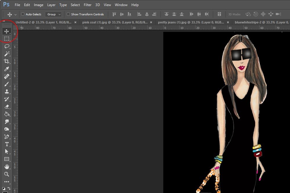
The last thing I need to do for this project is to get all the girls into the one file I created earlier. To do this, I’ll activate the Move Tool.

move-tool.jpg

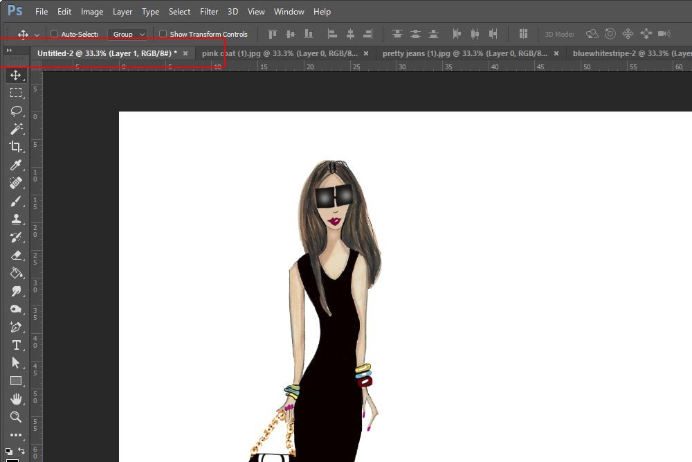
After making sure the proper (illustration) layer is selected in the Layers panel, I’ll click and drag it up to the tab of the file I’d like to move it to.

file-tab.jpg

Without letting go of my mouse button, I’ll wait until that tab file becomes visible. Then, I’ll continue dragging down into the workable area of the file. It’s there that I’ll drop the graphic.

I’ll continue on doing this with all the remaining models. After all the illustrations are in the file, I can arrange them by clicking on each layer and moving it so they look like a group of girlfriends walking down the street. If I wanted to get rid of the lines under the models, I could use the Eraser Tool to erase anything I don’t want to see. When I’m all finished, this is what I’ll end up with. Pretty awesome, if I don’t say so myself.

girls-group.jpg

After this, you can crop the image to size and then do what you wish with it.

How to Crop a Photo to an Exact Size & Resolution in Adobe Photoshop

——

There you have it – a nice file with multiple graphics overlapping one another in Adobe Photoshop. I hope I explained everything clearly. If you have any questions or concerns regarding this post, please leave them in the comment section below. Thanks for reading!
 
Top