Cameron
Member
- Joined
- May 10, 2021
- Messages
- 108
- Reaction Score
- 3
- Points
- 23
- #1
If you’ve been working in Adobe Photoshop for any amount of time, you surely know that it’s sometimes a necessity to alter the colors of objects captured in a photograph. Most of the time, when the need arises, folks select the object and change the color from there. Well, I’m here today to tell you that you may not need to go through the trouble of making any selections, depending on the image you’re working with. You may be able to take advantage of a shortcut that will let you quickly and easily change the color of something in your photo with just a few mere steps.
Of course, if you do want to make a selection, I’ve got some posts that will help you out with that. Just click the links below to explore them.
Making Selections in Adobe Photoshop
How to Combine & Trim Selections in Adobe Photoshop
Changing Colors with Color Range Selection in Adobe Photoshop
Using Selection Tools to Enhance Photos in Adobe Photoshop
In today’s post, I’ll be applying an adjustment layer to a demo photo in Adobe Photoshop. After that, I’ll go through what some of the sliders that belong to this particular adjustment layer mean and I’ll push them around in an effort to show you exactly how the movements can impact the colors of the photo. My goal is to have you say, “That’s it? I could do that.” when I’m finished. It’s super simple and super helpful, so read on below.
The Hue Slider
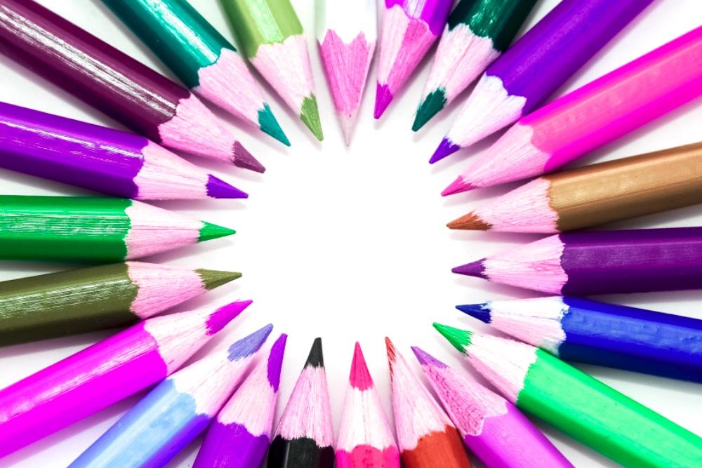
If I push the Hue slider in either direction, pretty much all the colors will change inside of the image. For instance, in this next screenshot, I pushed this slider to the left so it rested on the value of -84.
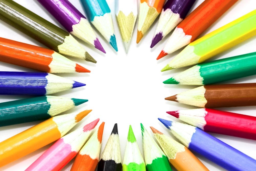
And in the next screenshot, I pushed it to the right for a value of +25.
Now, I know things can get a little weird by using this slider all by itself. That’s why many designers don’t do that. They use it in conjunction with other settings.
The Saturation Slider
This slider is fairly self-explanatory. But to give you an example of what can happen if this slider gets moved, I pushed it to the left for a value of -50.
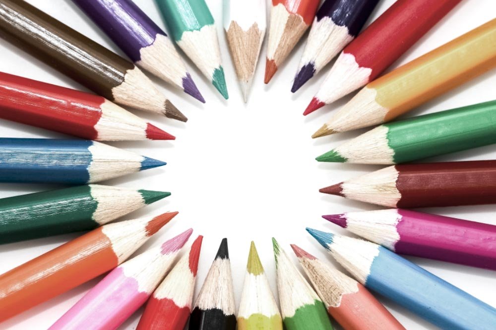
You can see how the saturation has been reduced a bit. Nothing crazy, but it’s different. If I wanted to increase the saturation, I’d simply move the slider to the right, past the value.
The Lightness Slider
The Lightness slider controls both the lightness and darkness of a photograph. If you push it to the left, the image will get darker overall. If you push it to the right, it’ll get lighter. Again, this is a blunt instrument. I’ll show you a screenshot with the slider pushed to the right for a value of +30 though.
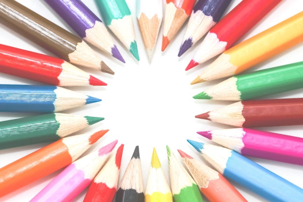
Above the sliders I just moved is a drop-down box with the value of Master currently selected. If I click that drop-down, I’ll see a few more options available to me.
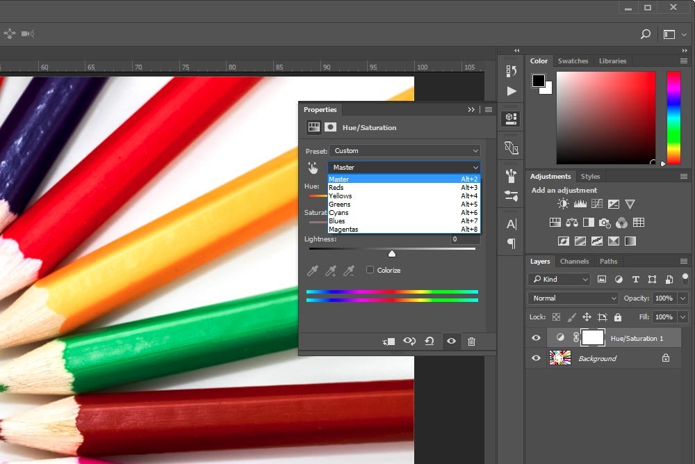
Inside this drop-down, I’ll click the color Red. Immediately after doing that, I see a small gauge appear down inside the double rainbows. I circled this gauge in red in the screenshot below.

If you look closely at the gauge (or whatever you call it), you’ll see two inside marks and two outside ones. The inside marks dictate which color is going to be targeted and the outside ones dictate how sharply or gradual any similar colors will be targeted. The default values are pretty good with this because if you were to shrink, or move the outside marks closer to the center ones, some of the color alterations might be jagged, if you’ve got a lot of gradients in your photo. If you move these outside marks further apart, you may not accurately and fully change the color you’re trying to change. I suggest you play with these settings on a sample photo to see exactly what’s going on.
For this next example, I’m going to do something drastic that will help you see exactly what’s going on. If you remember above, I chose the color red to target. What that means is that any slider I push of the three available to me, only the red pixels in the image will be affected. So, with this in mind, I’ll leave the Hue slider where it is and push both the Saturation and Lightness sliders all the way to the left. I want to change the color red to the color black. This should do that.
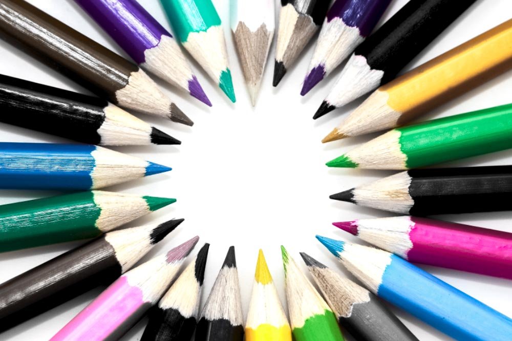
Wow, what a change. In the above screenshot, you may also notice that some other colors were slightly altered as well. The reason for this is because all of the red was removed from the photo. So, if there’s a pencil that’s normally orange, that pencil might not turn all the way dark black, but more of a dark gray. Basically, the red was pulled from the pencil.
If I wanted to alter a different color, I could simply choose one from the drop-down above.
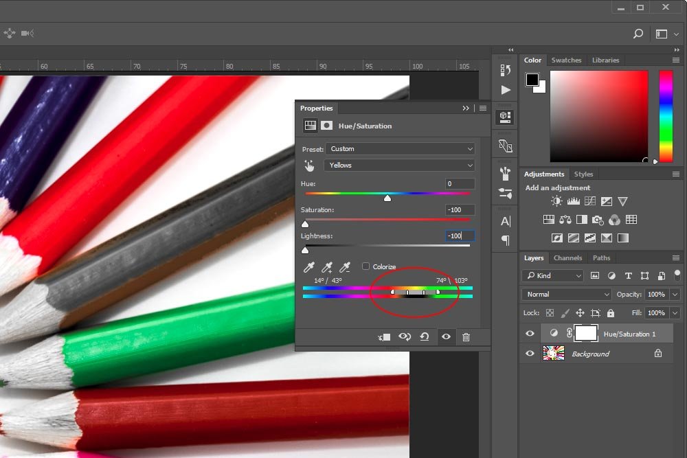
If you’ll notice in the above screenshot, the slider has been moved. Also, if you now look at the drop-down box, you’ll no longer see that Red has been chosen. After I moved that slider, the drop-down was automatically changed so the color Yellow is selected.
Now, if I look at the pencils, I can see the reds are back and the yellows are now much darker than they once were.
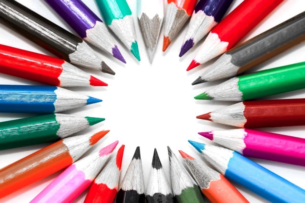
Okay, that’s pretty straightforward.
I have a fun idea. How about I click both of the left marks down on top of the rainbows and drag them to the left. I’d like to not only target the color yellow, but I’d like to target the color red as well.
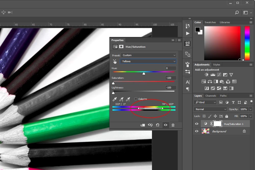
As you can see, that little gauge is now encapsulating both red and yellow and whatever is in between. Let’s see the output of this.
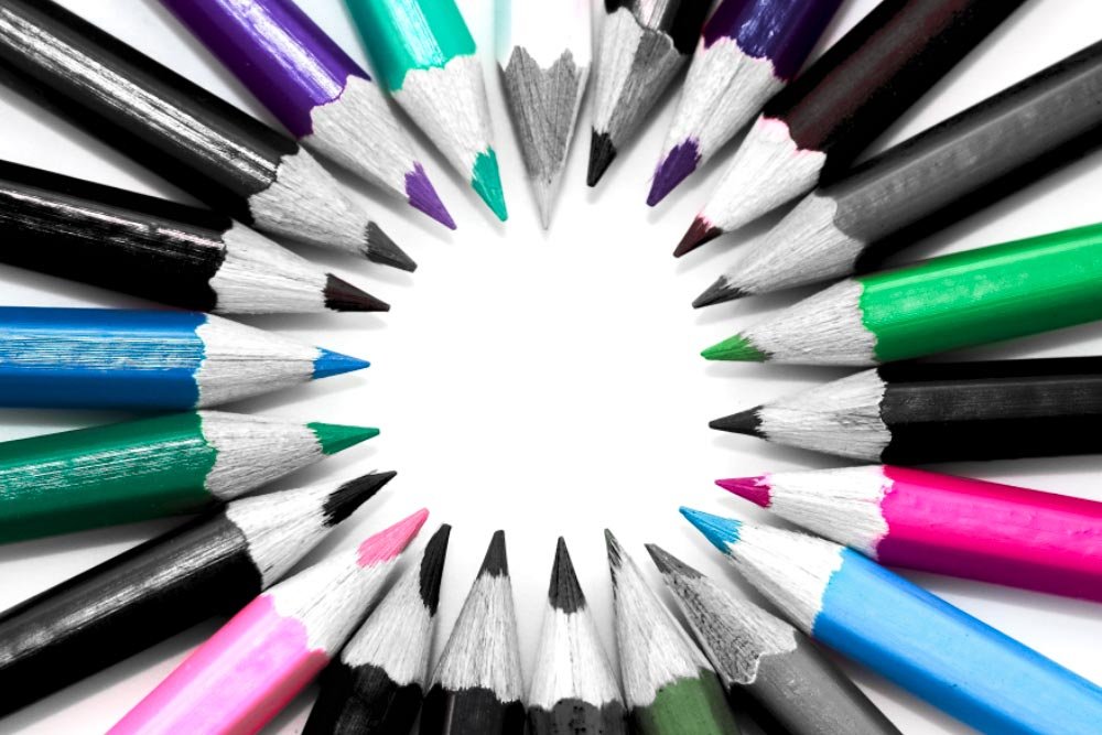
As you can see, both the reds and yellows have now been desaturated and darkened. Pretty cool.
From here, I’ll go back to the drop-down and select the color Red again. Then, I’ll push the Hue slider to the left so I have a value of -100.
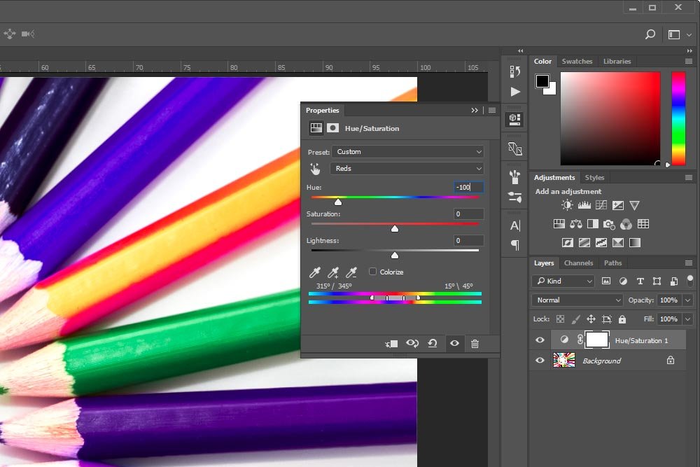
Now, I can see the output of this below.
As you can see, I’ve gone ahead and changed the color red to the color purple. Again, you’ll need to experiment with this type of change because it’s not all too intuitive regarding the output of each change. The good thing is that it’s easy to get the hang of.

If I were to roll over this tool, after a second or two, I’d see the following message appear near my mouse. It would say Click and Drag in Image to Modify Saturation. Ctrl+Click to Modify Hue. Interesting. So, if I wanted to change the saturation of a particular color in this image, all I would need to do is to select this tool and then click on that color and drag back and forth. Let’s try this with the color green. I’ll click on top of the green pencil and drag all the way to the left to desaturate it.
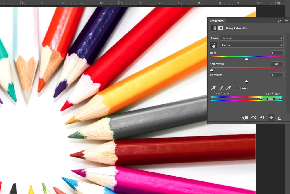
In the screenshot above, the most obvious aspect that changed was the color of the pencil. If we look inside the Properties panel though, we’ll see that the color drop-down value has been changed to Greens and the Saturation slider has been automatically moved all the way to the left. Also, down in the rainbows area at the bottom of this panel, the gauge is now sitting on top of the greenish colors.
For the final example of this post, I’ll reset the panel and then click Ctrl on my keyboard and then click and drag on the color Yellow. There’s a nice yellow pencil that’s resting right above the green one.
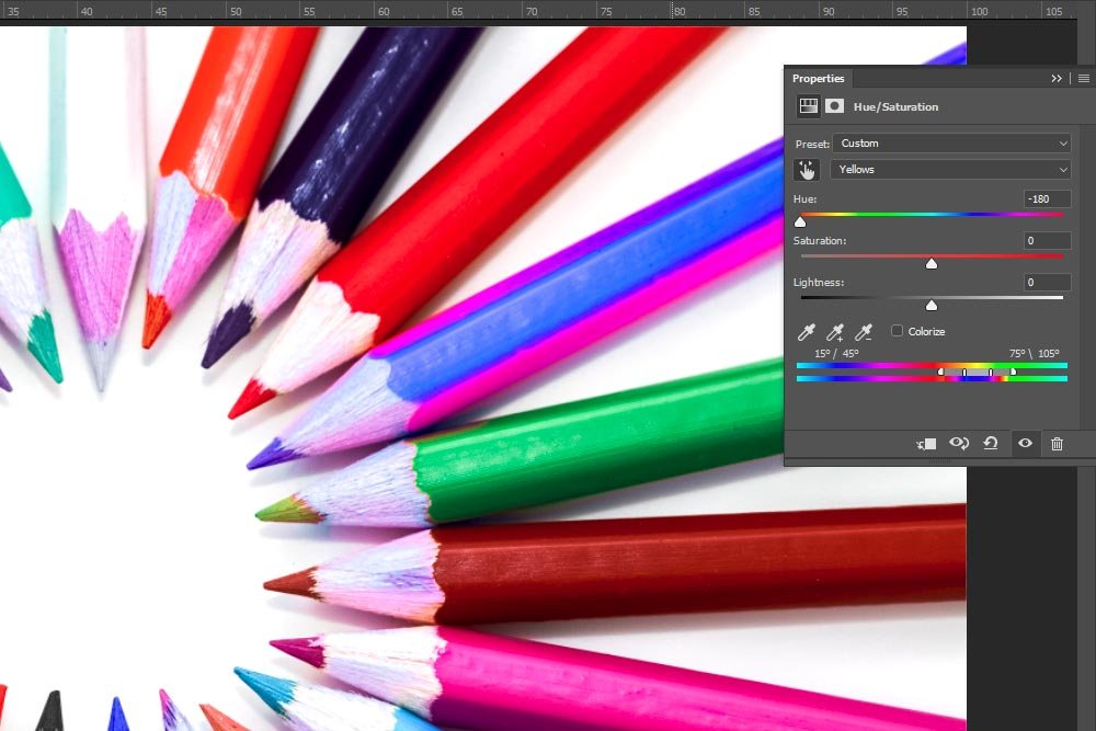
I clicked and dragged all the way to the left again and I can now see that the drop-down value has been changed to Yellows and the Hue slider has been moved all the way to the left. Also, down in the rainbow area, the gauge is now sitting on top of the yellowish colors and the pencil has been changed from yellow to blue/purple.
I’m not sure I mentioned this or not, but to reduce a value, click and drag to the left and to increase it, click and drag to the right.
——
I think that’s good for now. I hope I effectively showed you some of the ins and outs of the Properties panel that belongs to the Hue/Saturation adjustment layer. If you have any questions or concerns regarding this post, please leave them in the comments section below. Thanks for reading!
Of course, if you do want to make a selection, I’ve got some posts that will help you out with that. Just click the links below to explore them.
Making Selections in Adobe Photoshop
How to Combine & Trim Selections in Adobe Photoshop
Changing Colors with Color Range Selection in Adobe Photoshop
Using Selection Tools to Enhance Photos in Adobe Photoshop
In today’s post, I’ll be applying an adjustment layer to a demo photo in Adobe Photoshop. After that, I’ll go through what some of the sliders that belong to this particular adjustment layer mean and I’ll push them around in an effort to show you exactly how the movements can impact the colors of the photo. My goal is to have you say, “That’s it? I could do that.” when I’m finished. It’s super simple and super helpful, so read on below.
The Demo Photo
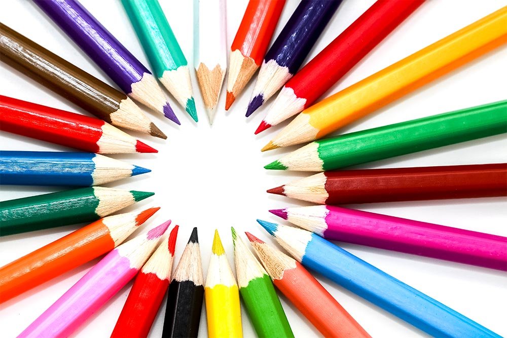
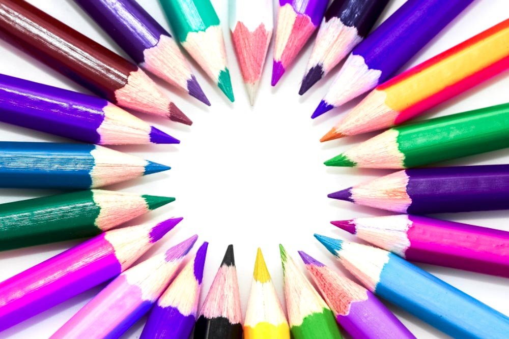
For this post, I needed to use a photo that has a nice range of colors. I found one that shows some colored pencils that exhibited just the range I was looking for. I think the changes I make below will show clearly with this image.
Applying the Hue/Saturation Adjustment Layer
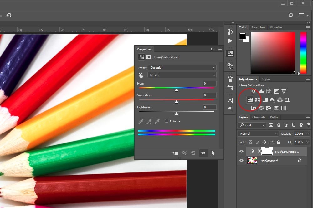
I’ve already got the image opened up in Photoshop. It’s currently the only layer available in the Layers panel. From here, I’ll head up to the Adjustments panel and click the Hue/Saturation icon. This will apply the appropriate adjustment layer.
Changing General Values
In the previous screenshot, you can clearly see the Properties panel for the adjustment layer I just applied. The three sliders staring you in the face are the most obvious to start off with, so that’s what I’ll do. Without me even doing anything, I’m sure you can guess what will happen if I were to push things around.The Hue Slider
If I push the Hue slider in either direction, pretty much all the colors will change inside of the image. For instance, in this next screenshot, I pushed this slider to the left so it rested on the value of -84.

And in the next screenshot, I pushed it to the right for a value of +25.

Now, I know things can get a little weird by using this slider all by itself. That’s why many designers don’t do that. They use it in conjunction with other settings.
The Saturation Slider
This slider is fairly self-explanatory. But to give you an example of what can happen if this slider gets moved, I pushed it to the left for a value of -50.

You can see how the saturation has been reduced a bit. Nothing crazy, but it’s different. If I wanted to increase the saturation, I’d simply move the slider to the right, past the value.
The Lightness Slider
The Lightness slider controls both the lightness and darkness of a photograph. If you push it to the left, the image will get darker overall. If you push it to the right, it’ll get lighter. Again, this is a blunt instrument. I’ll show you a screenshot with the slider pushed to the right for a value of +30 though.

Targeting a Specific Color
What I did above isn’t the way most people use this panel. What they do is target specific colors they may want to change. There are a few ways to do this. I’ll start off with the easiest.Above the sliders I just moved is a drop-down box with the value of Master currently selected. If I click that drop-down, I’ll see a few more options available to me.

Inside this drop-down, I’ll click the color Red. Immediately after doing that, I see a small gauge appear down inside the double rainbows. I circled this gauge in red in the screenshot below.

If you look closely at the gauge (or whatever you call it), you’ll see two inside marks and two outside ones. The inside marks dictate which color is going to be targeted and the outside ones dictate how sharply or gradual any similar colors will be targeted. The default values are pretty good with this because if you were to shrink, or move the outside marks closer to the center ones, some of the color alterations might be jagged, if you’ve got a lot of gradients in your photo. If you move these outside marks further apart, you may not accurately and fully change the color you’re trying to change. I suggest you play with these settings on a sample photo to see exactly what’s going on.
For this next example, I’m going to do something drastic that will help you see exactly what’s going on. If you remember above, I chose the color red to target. What that means is that any slider I push of the three available to me, only the red pixels in the image will be affected. So, with this in mind, I’ll leave the Hue slider where it is and push both the Saturation and Lightness sliders all the way to the left. I want to change the color red to the color black. This should do that.

Wow, what a change. In the above screenshot, you may also notice that some other colors were slightly altered as well. The reason for this is because all of the red was removed from the photo. So, if there’s a pencil that’s normally orange, that pencil might not turn all the way dark black, but more of a dark gray. Basically, the red was pulled from the pencil.
If I wanted to alter a different color, I could simply choose one from the drop-down above.
Sliding to a Different Color
In this next section, I’m going to show you what happens if I click and drag the small gauge that’s sitting on top of the rainbows. If I click right in the center of it, I can drag it so another color is being targeted. When I do this, a few things happen. First, I’ll slide the gauge over so it’s targeting the color Yellow.
If you’ll notice in the above screenshot, the slider has been moved. Also, if you now look at the drop-down box, you’ll no longer see that Red has been chosen. After I moved that slider, the drop-down was automatically changed so the color Yellow is selected.
Now, if I look at the pencils, I can see the reds are back and the yellows are now much darker than they once were.

Okay, that’s pretty straightforward.
I have a fun idea. How about I click both of the left marks down on top of the rainbows and drag them to the left. I’d like to not only target the color yellow, but I’d like to target the color red as well.

As you can see, that little gauge is now encapsulating both red and yellow and whatever is in between. Let’s see the output of this.

As you can see, both the reds and yellows have now been desaturated and darkened. Pretty cool.
Actually Changing the Color
I don’t want to forget the point of this post. So, in this section, I’ll reset all the slider so it’ll be like I’m working on a fresh photo. To do this, I simply clicked the Reset to Adjustment Defaults icon that’s at the bottom of the Properties panel. It’s the one that looks like a circle arrow that sits to the left of the eye icon.From here, I’ll go back to the drop-down and select the color Red again. Then, I’ll push the Hue slider to the left so I have a value of -100.

Now, I can see the output of this below.

As you can see, I’ve gone ahead and changed the color red to the color purple. Again, you’ll need to experiment with this type of change because it’s not all too intuitive regarding the output of each change. The good thing is that it’s easy to get the hang of.
A Shortcut For Modifying Saturation & Hue
While it’s all fine and dandy to make these types of changes by hand, it’s much quicker to use the Targeted Adjustment Tool. The way to access this tool is to click on the small hand icon in the Properties panel.
If I were to roll over this tool, after a second or two, I’d see the following message appear near my mouse. It would say Click and Drag in Image to Modify Saturation. Ctrl+Click to Modify Hue. Interesting. So, if I wanted to change the saturation of a particular color in this image, all I would need to do is to select this tool and then click on that color and drag back and forth. Let’s try this with the color green. I’ll click on top of the green pencil and drag all the way to the left to desaturate it.

In the screenshot above, the most obvious aspect that changed was the color of the pencil. If we look inside the Properties panel though, we’ll see that the color drop-down value has been changed to Greens and the Saturation slider has been automatically moved all the way to the left. Also, down in the rainbows area at the bottom of this panel, the gauge is now sitting on top of the greenish colors.
For the final example of this post, I’ll reset the panel and then click Ctrl on my keyboard and then click and drag on the color Yellow. There’s a nice yellow pencil that’s resting right above the green one.

I clicked and dragged all the way to the left again and I can now see that the drop-down value has been changed to Yellows and the Hue slider has been moved all the way to the left. Also, down in the rainbow area, the gauge is now sitting on top of the yellowish colors and the pencil has been changed from yellow to blue/purple.
I’m not sure I mentioned this or not, but to reduce a value, click and drag to the left and to increase it, click and drag to the right.
——
I think that’s good for now. I hope I effectively showed you some of the ins and outs of the Properties panel that belongs to the Hue/Saturation adjustment layer. If you have any questions or concerns regarding this post, please leave them in the comments section below. Thanks for reading!
