EmeraldHike
Member
- Joined
- May 10, 2021
- Messages
- 133
- Reaction Score
- 0
- Points
- 21
- #1
I use both the vibrance and saturation features inside of Photoshop so much that I don’t even think of them anymore. I know what they do and how they work, but really, I’m not sure I’ve ever truly looked into what exactly the difference between the two are. I mean, on the surface, both sliders add and remove color. One does it more then the other. So what’s the big deal? Well, perhaps there isn’t any, but I sure would like to dive a bit deeper into the topic to learn more about the intricacies of both color adjustments.
In today’s post, I’m going to use a photo as an example to show you the effect these sliders can have on color. For the uninitiated, I’ll do a bit of explaining of what both vibrance and saturation adjustments are and then, for the more initiated, I’ll talk about how things work behind the scenes. You may not ever need to know more beyond, “if I push this one way, I’ll get more color and if I push it the other way, I get less,” but still, these things are nice to know. Especially as you get better and better as using Adobe’s applications. Sometimes, these types of details matter.
By the way, what I write in this post applies to Photoshop, Lightroom and Camera Raw. Each of these applications uses both of these sliders and it all means the same thing.
Saturation: In general terms, saturation refers to how pure a color is. It has to do with the concentration and intensity of a color. In Photoshop (and others), if you were to add saturation to something, you’d be bringing the color closer to what’s considered “pure.” Conversely, if you were to desaturate something, you’d be removing color and making whatever it is you’re desaturating less pure. As you continued down this path, you’d end up with some shade of gray.
As you adjust the Saturation slider inside of Photoshop, you’re increasing or decreasing the intensity, or pureness, of all the colors in the image equally. Saturation doesn’t care. It’s a blunt instrument. Think of it as a mathematical equation. If you were to push the Saturation slider to the left 10%, you’re be removing 10% of the image’s color across the board. It’s that simple.
The issue with adjusting saturation is that it doesn’t matter where the beginning point of a certain color is. Let’s say that the color red in a photo is already fully pure, but every other color is quite dull. If you were to slightly push the Saturation slider to the right to increase the photo’s color concentration, you’d immediately oversaturate the red, while only mildly increasing the pureness of all the other colors. That red area would lose detail. Let’s just say it’s a temperamental adjustment that needs to be used with care. Just a little too much saturation can make a picture look very strange.
Vibrance: Vibrance is awesome and it’s the color adjustment tool I usually use most often, by far. The reason I’m so fond of it is because it’s sort of like saturation, but it’s got brains. While pushing the Saturation slider increases or decreases color concentration equally across the board, the Vibrance slider uses an algorithm that relatively adjusts saturation based on a color’s existing color intensity. I think it might be easier to read what Adobe has to say about it:
Vibrance adjusts the saturation so that clipping is minimized as colors approach full saturation. This adjustment increases the saturation of less-saturated colors more than the colors that are already saturated. Vibrance also prevents skintones from becoming over saturated.
Basically, if you take my previous example of the image where the color red was initially fully saturated but where the other colors weren’t, the Vibrance feature would be much more appropriate to use, if you wanted to adjust the color intensity of the image. While pushing the Vibrance slider, the color red would hardly be affected at all while the remaining colors would be much more affected. Of course, it’s not perfect, but it’s a much more subtle method for increasing or decreasing the intensity of color in a photograph.
I know you can’t see it, but when I turned on the clipping indicator in Camera Raw (where I was editing this image), I could see that the yellow pastels were oversaturated. Next, let’s look at some examples of different Vibrance settings.
In this next example, the top row is again at a Vibrance setting of 0. The second row from the top is 25%, the third row is 50%, the fourth row is 75% and the bottom row is 100%.
While it’s not terrible easy to see the color differences between the rows, I can tell you that after I turned on the clipping indicator at the full 100% setting, no areas in the photo were over saturated. Also, even at the higher vibrance settings, the image simply isn’t as saturated as it was in the first example photo. This is probably the reason many editors call the Vibrance feature the little brother of the Saturation one.
A good way to remember how Vibrance works is to think of it as favoring the weaker colors. Strong colors aren’t touched nearly as much as the weaker ones are.
——
I hope I effectively explained how both Vibrance and Saturation differ from one another in Adobe Camera Raw, Lightroom and Photoshop. While Vibrance is a non-linear adjustment, Saturation is as straight linear as they come. As you experiment with both of these adjustment tools, I think you’ll quickly become used to what they can accomplish. Both have a place in every editor’s arsenal.
If you have any questions or concerns regarding this post, please leave them in the comment section below. Thanks for reading!
In today’s post, I’m going to use a photo as an example to show you the effect these sliders can have on color. For the uninitiated, I’ll do a bit of explaining of what both vibrance and saturation adjustments are and then, for the more initiated, I’ll talk about how things work behind the scenes. You may not ever need to know more beyond, “if I push this one way, I’ll get more color and if I push it the other way, I get less,” but still, these things are nice to know. Especially as you get better and better as using Adobe’s applications. Sometimes, these types of details matter.
By the way, what I write in this post applies to Photoshop, Lightroom and Camera Raw. Each of these applications uses both of these sliders and it all means the same thing.
Demo Photo
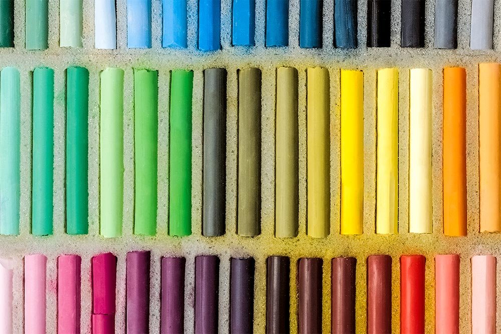
For this post, I’ll be using a photo of a box of pastels. I thought this type of photo would be appropriate because it covers a wide spectrum of color and none of them are already fully saturated. I can play with both of the features I’d like to discuss and really show off the differences in effects.
Definitions
I think I’ll set this post up in two parts. First, I’ll offer some definitions of what saturation and vibrance mean and then I’ll give some graphical examples to bring it all home. I’ll start with the definitions here.Saturation: In general terms, saturation refers to how pure a color is. It has to do with the concentration and intensity of a color. In Photoshop (and others), if you were to add saturation to something, you’d be bringing the color closer to what’s considered “pure.” Conversely, if you were to desaturate something, you’d be removing color and making whatever it is you’re desaturating less pure. As you continued down this path, you’d end up with some shade of gray.
As you adjust the Saturation slider inside of Photoshop, you’re increasing or decreasing the intensity, or pureness, of all the colors in the image equally. Saturation doesn’t care. It’s a blunt instrument. Think of it as a mathematical equation. If you were to push the Saturation slider to the left 10%, you’re be removing 10% of the image’s color across the board. It’s that simple.
The issue with adjusting saturation is that it doesn’t matter where the beginning point of a certain color is. Let’s say that the color red in a photo is already fully pure, but every other color is quite dull. If you were to slightly push the Saturation slider to the right to increase the photo’s color concentration, you’d immediately oversaturate the red, while only mildly increasing the pureness of all the other colors. That red area would lose detail. Let’s just say it’s a temperamental adjustment that needs to be used with care. Just a little too much saturation can make a picture look very strange.
Vibrance: Vibrance is awesome and it’s the color adjustment tool I usually use most often, by far. The reason I’m so fond of it is because it’s sort of like saturation, but it’s got brains. While pushing the Saturation slider increases or decreases color concentration equally across the board, the Vibrance slider uses an algorithm that relatively adjusts saturation based on a color’s existing color intensity. I think it might be easier to read what Adobe has to say about it:
Vibrance adjusts the saturation so that clipping is minimized as colors approach full saturation. This adjustment increases the saturation of less-saturated colors more than the colors that are already saturated. Vibrance also prevents skintones from becoming over saturated.
Basically, if you take my previous example of the image where the color red was initially fully saturated but where the other colors weren’t, the Vibrance feature would be much more appropriate to use, if you wanted to adjust the color intensity of the image. While pushing the Vibrance slider, the color red would hardly be affected at all while the remaining colors would be much more affected. Of course, it’s not perfect, but it’s a much more subtle method for increasing or decreasing the intensity of color in a photograph.
Examples of Saturation & Vibrance
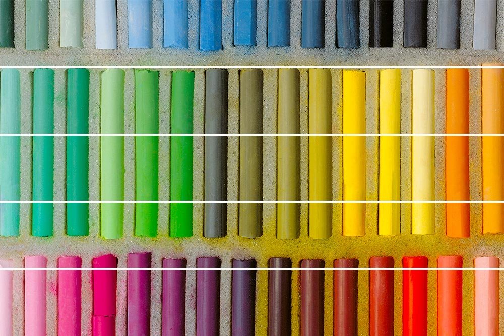
In this last section, I’m going to show you some examples of how both the Saturation and Vibrance features can affect color in a demo photo. For the first image, I’ll display five different saturation settings. At the top is a setting of 0, or no additional saturation at all. In the second row from the top, 25%, in the third, 50%, in the fourth, 75% and finally at the bottom, the Saturation slider is pushed all the way to 100%. Here, take a look.
I know you can’t see it, but when I turned on the clipping indicator in Camera Raw (where I was editing this image), I could see that the yellow pastels were oversaturated. Next, let’s look at some examples of different Vibrance settings.
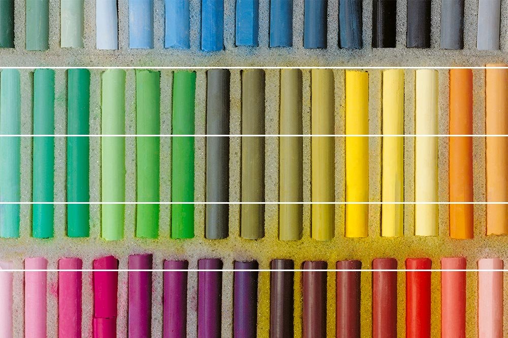
In this next example, the top row is again at a Vibrance setting of 0. The second row from the top is 25%, the third row is 50%, the fourth row is 75% and the bottom row is 100%.

While it’s not terrible easy to see the color differences between the rows, I can tell you that after I turned on the clipping indicator at the full 100% setting, no areas in the photo were over saturated. Also, even at the higher vibrance settings, the image simply isn’t as saturated as it was in the first example photo. This is probably the reason many editors call the Vibrance feature the little brother of the Saturation one.
A good way to remember how Vibrance works is to think of it as favoring the weaker colors. Strong colors aren’t touched nearly as much as the weaker ones are.
——
I hope I effectively explained how both Vibrance and Saturation differ from one another in Adobe Camera Raw, Lightroom and Photoshop. While Vibrance is a non-linear adjustment, Saturation is as straight linear as they come. As you experiment with both of these adjustment tools, I think you’ll quickly become used to what they can accomplish. Both have a place in every editor’s arsenal.
If you have any questions or concerns regarding this post, please leave them in the comment section below. Thanks for reading!
