EmeraldHike
Member
- Joined
- May 10, 2021
- Messages
- 133
- Reaction Score
- 0
- Points
- 21
- #1
Have you even noticed the information that’s included in a newscast, down towards the bottom of the screen? I know you’ve seen it. We all have. Usually, the information states the person’s name who is currently speaking or where they’re located. Sometimes the information is scrolling. Whatever type of text is there, it’s usually contained in some sort of banner or overlay of some sort. Different channels and mediums have become very creative through the years with their displays of information. Some in a good way and some in not such a good way.
In today’s post, I’d like to work through a project in Adobe Photoshop that adds information to the lower portion of a video clip. I’ll first open the clip and then I’ll create a partial screen background of sorts. Finally, I’ll add some text and make a few minor adjustments. While the idea of what I’m about to show you is simple enough, it does take some knowledge and work to achieve. It’s more labor intensive than some of my previous posts. What I’m trying to say here is that this post may take a little longer to read and work along with.
Now that I know the dimensions of the video, I can close out the Image Size dialog box by clicking on the Cancel button. I don’t need that anymore.
To create the new file, I’ll head back up to the File menu, but this time, I’ll select New. When the New Document dialog box opens up, I’ll select the Film & Video option that’s all the way to the right in the top bar. Inside is this area are different sizes and options for various video files. I’ll choose the 1920×1080 option because that’s the size of the video I’ll be working with.
When I’m ready, I’ll click the Create button and a new file will appear in Photoshop. It will contain preset guides that look like this.
The guides are there for a reason. Because of the size and display of a lot of video out there on different devices, it’s best to keep any text or information inside a set parameter. For this project, I’ll cover the entire lower portion of the video with the background, but I’ll keep the text inside the inner blue guides. By the way, the area inside the inner set of guides is known as “title safe.”
Next, I’ll begin creating the graphic itself. To do this, I’ll head down to the bottom of the Layers panel and I’ll click on the Create New Fill or Adjustment Layer option. When the menu appears, I’ll choose the Gradient option. I could have chosen anything, but I thought a gradient would look professional.
When the Gradient Fill dialog box appears, I’ll make a few adjustments. I’ll turn the Angle so it’s set to degrees and then I’ll adjust the colors by clicking on the sample gradient itself. In this case, I went with a muted natural beige color. I thought that matched with the video well. I also adjusted the opacity for the colors in the gradient. If you’d like to learn how to create and work with gradients in Photoshop, please feel free to click through the link in the sentence or search the word “Gradient” in the search box on this website. I’ve written about this topic extensively.
As it stands, the gradient is an overlay on top of the entire video sample. I don’t want that. I would like to see the gradient cover only the bottom portion of the video. To remedy this situation, I’ll again activate the Rectangular Marquee Tool from the left toolbar and then I’ll draw a rectangle over just the portion of the video where I’d like to see the graphic. After that, I’ll head up to the Select > Inverse menu item and click. This will alter the selection so it’s the opposite of what I initially drew. Finally, making sure that I click on the mask in the gradient layer in the Layers panel, I’ll right-click inside of the selection, choose Fill from the menu that appears and then I’ll choose Black from the Contents drop-down in the Fill dialog box. Essentially, I’m masking out the gradient from places I don’t want to see it.
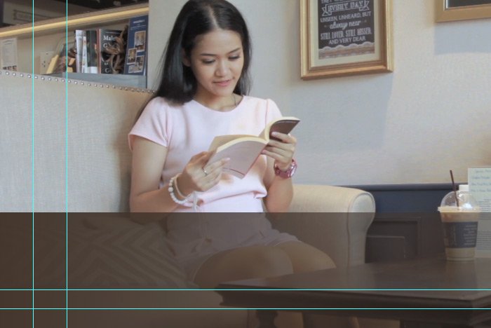
Here’s part of the final gradient background for this graphic.
At this point in the post, all I have to do is add the text that describes the video. This is what will appear as the video progresses. I think I’ll add something random, like, “Jane Doe of Miami, Florida – Avid Reader & Coffee Drinker.” It will look like this.

That looks perfect. I like it a lot. Now all I have to do is move this graphic over to the video file.
After that, I’ll click on the group in the Layers panel and I’ll drag that group up to the video file’s tab and hover there for a moment. Then, once I see the workspace for the video file become highlighted, I’ll continue dragging down into the workspace. That’s where I’ll drop the group.
Next, since the sample screenshot is still inside of the group, I can align it with the video itself. I’ll drag it around until I see the edges in their proper positions. Then, I’ll delete that sample screenshot layer from the group. I won’t need that anymore.
Finally, since I most likely won’t see any of the graphic because it’s not situated on the timeline correctly, I’ll head down to the Timeline panel and I’ll open the group by clicking on the little white arrow over to the left of it. Then, I’ll click and drag both the group itself and the inside elements until they are aligned the way I want them to be. Take a look at what I’m talking about.
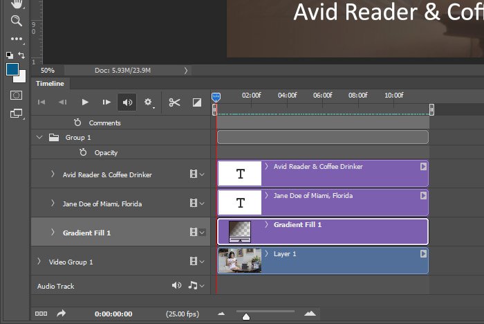
Do you see how the graphic layers inside of the group extend for the same distance as the video does? This means that that graphic will be seen the entire time. Of course, I can add fades and adjust the duration of things, but that’s beyond the scope of this post. I merely wanted to show you how to set up a graphic like this and I do believe I’ve achieved my goal.
That’s it! I guess it wasn’t as long and drawn out as I made it out to be up top. And the process is actually very simple once you get the hang of the necessary elements.
I hope I clearly explained how to create an informational “Lower Thirds” graphic to apply to your next video file. If you have any questions, please let me know in the comment section below or you can leave them in the Adobe Photoshop Discussion Board any time. Thanks for reading!
In today’s post, I’d like to work through a project in Adobe Photoshop that adds information to the lower portion of a video clip. I’ll first open the clip and then I’ll create a partial screen background of sorts. Finally, I’ll add some text and make a few minor adjustments. While the idea of what I’m about to show you is simple enough, it does take some knowledge and work to achieve. It’s more labor intensive than some of my previous posts. What I’m trying to say here is that this post may take a little longer to read and work along with.
Opening the Video in Photoshop
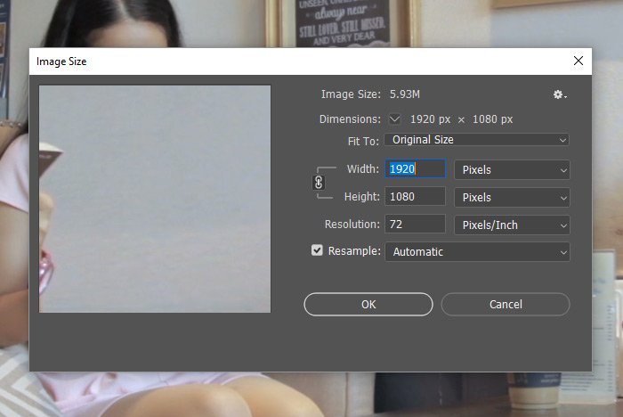
Because the graphic I’ll be making needs to follow some guidelines, I’ll first need to open up the video in Photoshop to check something out. To do this, I’ll head up to the File > Open menu item, click, find the video I’ll be using and then open it up. Once it’s opened up in the workspace, I’ll visit the Image > Image Size menu item and click. What I’m looking for here is the pixel dimensions of the video. In my case, the dimensions are 1920×1080. That’s perfect.
Now that I know the dimensions of the video, I can close out the Image Size dialog box by clicking on the Cancel button. I don’t need that anymore.
Setting Up the Informational Graphic File
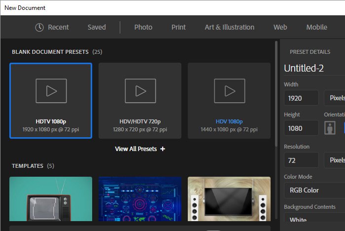
Creating the informational graphic in its own file is a good idea for a few different reasons. First, it’s easier to work away from the video because it’s less confusing and second, by creating a separate file, I’ll be able to keep it as a template for the next time I’d like to make one of these graphics. There’s no reason to do all this work again. If I need to change some text and a few colors in the future, that’s easy enough to do.To create the new file, I’ll head back up to the File menu, but this time, I’ll select New. When the New Document dialog box opens up, I’ll select the Film & Video option that’s all the way to the right in the top bar. Inside is this area are different sizes and options for various video files. I’ll choose the 1920×1080 option because that’s the size of the video I’ll be working with.

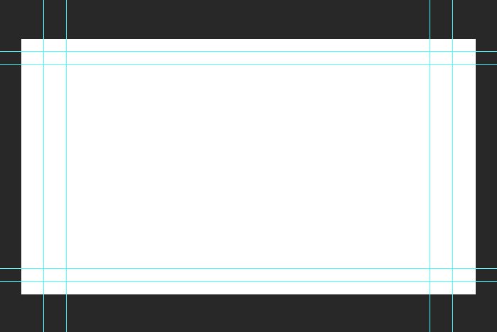
When I’m ready, I’ll click the Create button and a new file will appear in Photoshop. It will contain preset guides that look like this.

The guides are there for a reason. Because of the size and display of a lot of video out there on different devices, it’s best to keep any text or information inside a set parameter. For this project, I’ll cover the entire lower portion of the video with the background, but I’ll keep the text inside the inner blue guides. By the way, the area inside the inner set of guides is known as “title safe.”
Creating the Informational Graphic
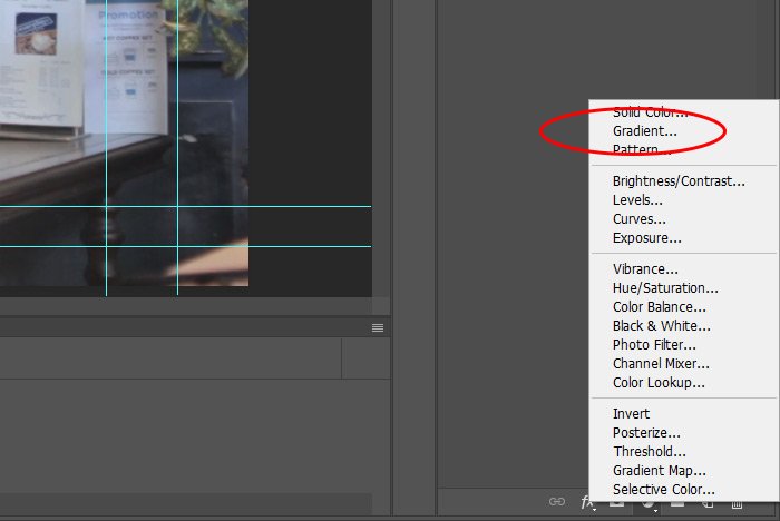
Okay, now we’re getting somewhere. I have the video open and I also have the new graphic file set up where I’ll be creating the graphic. Since it’s much easier to lay out the graphic if I can see what’s going on in the video, I’ll head back into the video tab in Photoshop. Once there, I’ll select the Rectangular Marquee Tool from the left toolbar and use the keyboard shortcut of Ctrl+A to select the entire video dimension. Then, I’ll head back into the empty file and use the keyboard shortcut of Ctrl+V to paste the screen shot of whatever it was inside of the selected area. This was a sample slice of the video.Next, I’ll begin creating the graphic itself. To do this, I’ll head down to the bottom of the Layers panel and I’ll click on the Create New Fill or Adjustment Layer option. When the menu appears, I’ll choose the Gradient option. I could have chosen anything, but I thought a gradient would look professional.

When the Gradient Fill dialog box appears, I’ll make a few adjustments. I’ll turn the Angle so it’s set to degrees and then I’ll adjust the colors by clicking on the sample gradient itself. In this case, I went with a muted natural beige color. I thought that matched with the video well. I also adjusted the opacity for the colors in the gradient. If you’d like to learn how to create and work with gradients in Photoshop, please feel free to click through the link in the sentence or search the word “Gradient” in the search box on this website. I’ve written about this topic extensively.
As it stands, the gradient is an overlay on top of the entire video sample. I don’t want that. I would like to see the gradient cover only the bottom portion of the video. To remedy this situation, I’ll again activate the Rectangular Marquee Tool from the left toolbar and then I’ll draw a rectangle over just the portion of the video where I’d like to see the graphic. After that, I’ll head up to the Select > Inverse menu item and click. This will alter the selection so it’s the opposite of what I initially drew. Finally, making sure that I click on the mask in the gradient layer in the Layers panel, I’ll right-click inside of the selection, choose Fill from the menu that appears and then I’ll choose Black from the Contents drop-down in the Fill dialog box. Essentially, I’m masking out the gradient from places I don’t want to see it.
Here’s part of the final gradient background for this graphic.

At this point in the post, all I have to do is add the text that describes the video. This is what will appear as the video progresses. I think I’ll add something random, like, “Jane Doe of Miami, Florida – Avid Reader & Coffee Drinker.” It will look like this.

That looks perfect. I like it a lot. Now all I have to do is move this graphic over to the video file.
Applying the Informational Graphic to the Video File
It’s much easier to work with layer groups than individual layers in cases like these, so I think I’ll group these informational graphic layers together before I move them over to the other file. To group the layers, I’ll select all of them in the Layers panel and then I’ll head down and click on the Create a New Group button at the bottom of said panel.After that, I’ll click on the group in the Layers panel and I’ll drag that group up to the video file’s tab and hover there for a moment. Then, once I see the workspace for the video file become highlighted, I’ll continue dragging down into the workspace. That’s where I’ll drop the group.
Next, since the sample screenshot is still inside of the group, I can align it with the video itself. I’ll drag it around until I see the edges in their proper positions. Then, I’ll delete that sample screenshot layer from the group. I won’t need that anymore.
Finally, since I most likely won’t see any of the graphic because it’s not situated on the timeline correctly, I’ll head down to the Timeline panel and I’ll open the group by clicking on the little white arrow over to the left of it. Then, I’ll click and drag both the group itself and the inside elements until they are aligned the way I want them to be. Take a look at what I’m talking about.

Do you see how the graphic layers inside of the group extend for the same distance as the video does? This means that that graphic will be seen the entire time. Of course, I can add fades and adjust the duration of things, but that’s beyond the scope of this post. I merely wanted to show you how to set up a graphic like this and I do believe I’ve achieved my goal.
That’s it! I guess it wasn’t as long and drawn out as I made it out to be up top. And the process is actually very simple once you get the hang of the necessary elements.
I hope I clearly explained how to create an informational “Lower Thirds” graphic to apply to your next video file. If you have any questions, please let me know in the comment section below or you can leave them in the Adobe Photoshop Discussion Board any time. Thanks for reading!
