CampFireJack
Member
- Joined
- May 9, 2021
- Messages
- 118
- Reaction Score
- 1
- Points
- 16
- #1
In the past, I’ve written about how using the “Auto” features in Adobe Photoshop can be a great starting point for adjusting photos. There are many of these auto features out there. For instance, If you were to open a photograph in Photoshop and then navigate to the Image > Adjustments menu and click on the Brightness/Contrast menu item, you’d see the related dialog box open. Inside of the box is an Auto button. If you clicked that button, you’d see the sliders move automatically, to positions where Photoshop thought they were best suited, based on its own intelligence. There are more examples of this feature, but I’ll get to some of them later. What I’d like to say right now is that by allowing Photoshop to initially attempt to adjust an image for you and then modifying that adjustment yourself later on, you can save yourself a lot of time.
In today’s post, I’d like to show you a somewhat hidden area of two of the adjustment layer Properties panels. Both of these panels have Auto buttons in them, but behind that button are three additional auto adjustments that can be made. Personally, I have no idea how anyone would ever find this hidden panel without first being told about it, but these things aren’t up to me. At least I discovered it so I can share it with you. Below, I’ll talk about what these additional auto adjustment algorithms can do.

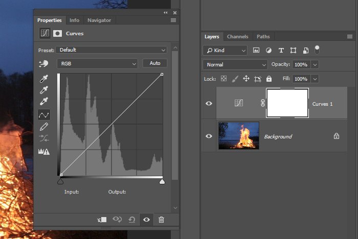
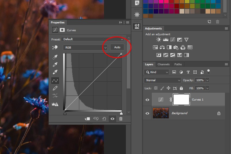
So basically, to create this new adjustment layer and to open the Properties panel, all I did was click on the Curves icon in the Adjustment panel.
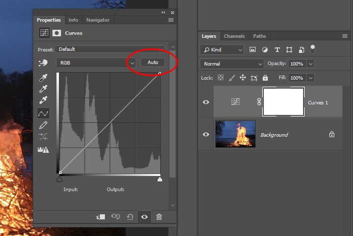
Here’s the Auto button.
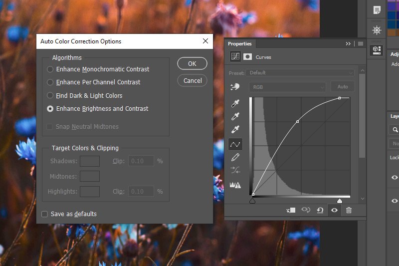
Here’s the Auto Color Correction Options panel that appears after holding down the Alt key and clicking the Auto button.
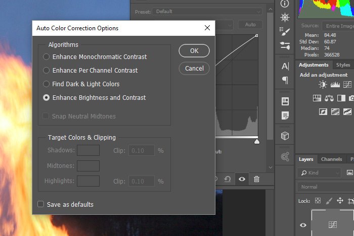
If you’ll notice, when you simply click the Auto button the regular way, some changes are made to the image, appearance-wise. Those changes are the same as if you were to select the bottom option in the panel that just opened. The Enhance Brightness & Contrast one. I’ll talk about the options in a moment.
Enhance Monochromatic Contrast: This option works directly on highlights and shadows, regardless of the consideration for each channel. This means that each channel is altered identically so the relationship between those colors won’t be altered at all. Bright areas of the image will appear brighter and dark areas of the image will appear darker after using this option. This is the algorithm that the Image > Auto Contrast menu item uses.
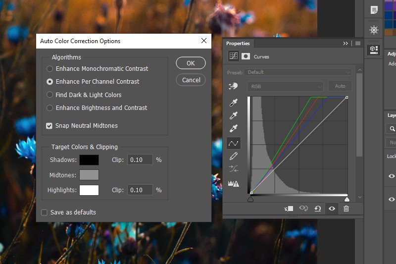
Enhance Per Channel Contrast: Unlike the previous option, this one does focus on each channel independently. Taking advantage of this option can result in a more robust correction because each channel is altered. But, because each channel is touched, colors can be shifted. Simply put, your image may look either better or worse after using this option. Unexpected color shift may occur. This is the algorithm that Image > Auto Tone menu item uses.
Find Dark & Light Colors: This option takes an average of all the lightest and the darkest pixels of an image and makes a calculation to increase contrast based on that result. This is the algorithm the Image > Auto Color menu item uses.
You’ll really need to open up this dialog box and experiment to get a feel for what each option can do for you. At least you now know these things exist and that that can make a difference in your images.
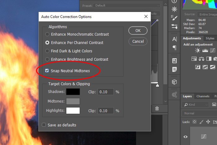
If you select one of the options above this check box, you’ll see what was previously unavailable, become available (meaning, this option becomes checkable, if that’s even a word). What this option does is it finds a nearly neutral color in the image you’re working on and it sets the midtone of the image to make that color neutral. Again, you’ll need to check this box a few times to see the effect it has on an image.
At the bottom of this dialog box are a few other options that have to do with clipping of the highlights and the shadows. I’m going to keep this area for a post that’s dedicated to just this topic. I don’t want to go too far in this one. What I basically wanted to show you in this post was that if you hold down the Alt key on your keyboard while clicking on the Auto button in the Properties panel for either the Levels of Curves adjustment, you’ll have a few more options to play with. That is, if you’re a fan of using the Auto feature at all. Some of us like to do things by hand, but like I said, it’s not a bad idea to start off with letting Photoshop make a few decisions for us.
I hope I clearly explained how to use the additional auto algorithms for adjusting the tone of images in Adobe Photoshop. If you have any questions regarding this post, please let me know in the comment section down below. Also, you can always ask questions in the Photoshop discussion forums as well. Thanks for reading!
In today’s post, I’d like to show you a somewhat hidden area of two of the adjustment layer Properties panels. Both of these panels have Auto buttons in them, but behind that button are three additional auto adjustments that can be made. Personally, I have no idea how anyone would ever find this hidden panel without first being told about it, but these things aren’t up to me. At least I discovered it so I can share it with you. Below, I’ll talk about what these additional auto adjustment algorithms can do.
Demo Image
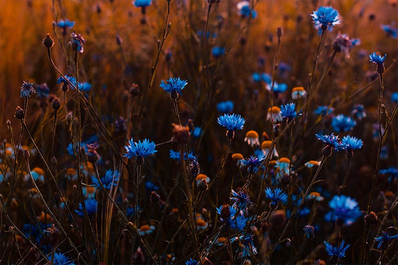
For this post, I thought I’d go with a photo that has the potential for a lot of additional contrast. Not that I’ll be pushing anything to the limit, but I did want a photo that had the potential to show the differences that some of these auto algorithms can apply. Fire at night is going to be perfect for this.
Applying Either a Levels or Curves Adjustment Layer
The additional auto adjustment algorithms can be found inside of either the Levels or Curves adjustment Properties panels. For this demonstration, I’ll head up to the Adjustments panel and click on the Curves icon. That will open up the associated Properties panel and will also add that adjustment to the Layers panel.
So basically, to create this new adjustment layer and to open the Properties panel, all I did was click on the Curves icon in the Adjustment panel.
Opening the Auto Color Correction Options Panel
As I’ve described in the past, applying an “auto” correction is simple. All you need to do is click the Auto button in the Properties panel. You can see this button below. I’ll circle it in red for you. Here’s the thing, to access the additional correction algorithms, you’ll need to hold down the Alt key on your keyboard and then click the button. I know, weird.Here’s the Auto button.

Here’s the Auto Color Correction Options panel that appears after holding down the Alt key and clicking the Auto button.

If you’ll notice, when you simply click the Auto button the regular way, some changes are made to the image, appearance-wise. Those changes are the same as if you were to select the bottom option in the panel that just opened. The Enhance Brightness & Contrast one. I’ll talk about the options in a moment.
The Algorithms – Explained
In this section, I’ll do my best at explaining what each option in the Auto Color Correction Options dialog can do for you. To be honest though, much of what I write below won’t matter one bit. It’s ultimately the look that matters most, so even if you think one option is “the one” for you after reading its description, it may not be at all. But for the sake of being thorough and technical, I’ll describe the options below.Enhance Monochromatic Contrast: This option works directly on highlights and shadows, regardless of the consideration for each channel. This means that each channel is altered identically so the relationship between those colors won’t be altered at all. Bright areas of the image will appear brighter and dark areas of the image will appear darker after using this option. This is the algorithm that the Image > Auto Contrast menu item uses.
Enhance Per Channel Contrast: Unlike the previous option, this one does focus on each channel independently. Taking advantage of this option can result in a more robust correction because each channel is altered. But, because each channel is touched, colors can be shifted. Simply put, your image may look either better or worse after using this option. Unexpected color shift may occur. This is the algorithm that Image > Auto Tone menu item uses.
Find Dark & Light Colors: This option takes an average of all the lightest and the darkest pixels of an image and makes a calculation to increase contrast based on that result. This is the algorithm the Image > Auto Color menu item uses.
You’ll really need to open up this dialog box and experiment to get a feel for what each option can do for you. At least you now know these things exist and that that can make a difference in your images.
Snapping Neutral Midtones
In the dialog box I showed you, you’ll notice a small check box that’s labeled at Snap Neutral Midtones. I’ve circled that option in the screenshot below. Take a look.
If you select one of the options above this check box, you’ll see what was previously unavailable, become available (meaning, this option becomes checkable, if that’s even a word). What this option does is it finds a nearly neutral color in the image you’re working on and it sets the midtone of the image to make that color neutral. Again, you’ll need to check this box a few times to see the effect it has on an image.
At the bottom of this dialog box are a few other options that have to do with clipping of the highlights and the shadows. I’m going to keep this area for a post that’s dedicated to just this topic. I don’t want to go too far in this one. What I basically wanted to show you in this post was that if you hold down the Alt key on your keyboard while clicking on the Auto button in the Properties panel for either the Levels of Curves adjustment, you’ll have a few more options to play with. That is, if you’re a fan of using the Auto feature at all. Some of us like to do things by hand, but like I said, it’s not a bad idea to start off with letting Photoshop make a few decisions for us.
I hope I clearly explained how to use the additional auto algorithms for adjusting the tone of images in Adobe Photoshop. If you have any questions regarding this post, please let me know in the comment section down below. Also, you can always ask questions in the Photoshop discussion forums as well. Thanks for reading!

