15Katey
Member
- Joined
- May 10, 2021
- Messages
- 130
- Reaction Score
- 0
- Points
- 23
- #1
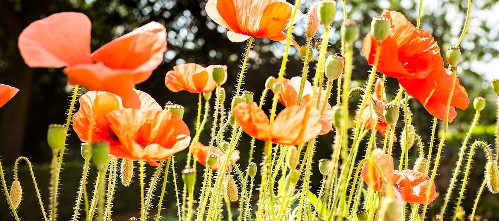
In today’s post, I’m going to be adjusting some of the sliders in the HSL/Grayscale panel to see what kind of effect they will have on a few example photos. If you aren’t aware, “HSL” stands for Hue, Saturation and Luminance. Let me give you some definitions of exactly what these are below.
Hue – A color or shade.
Saturation – The intensity of a color.
Luminance – The brightness or darkness of a color.
I’m sure there are some more involved definitions out there, but I’m really trying to keep things simple here. And as we go through this post, you’ll see exactly how each of the sliders in the tabs inside of the HSL panel can affect a photograph. First though, let’s take a look at the HSL panel itself.
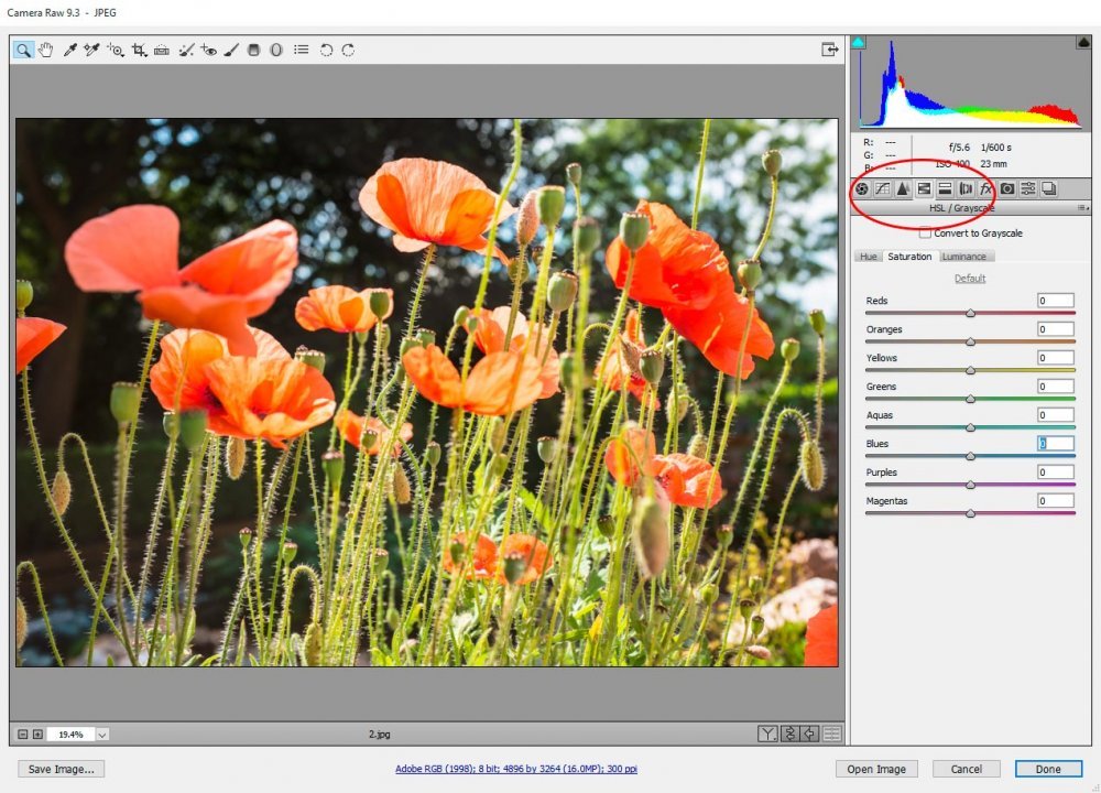
Saturation Tab
I’d like to kick things off inside the Saturation tab, so if you’re following along, please click into that. If you’ll notice, inside this tab, we’ve got eight sliders. They range from red to green to magenta. The idea behind each slider is to adjust the amount of saturation, or intensity, for that specific color. For example, in our demonstration photo, we’ve got some flower petals that are primarily colored red and orange. I’ll go ahead and lessen (slide to the left) both of those colors.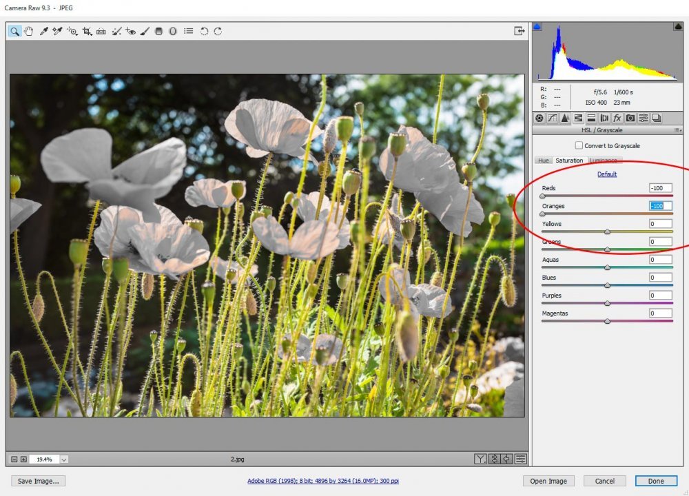
As you can see, I’ve desaturated the flower petals.
If I reset those two sliders and increase the yellow and green colors by moving their sliders all the way to the right, we can see that the flower stems will become much more saturated.
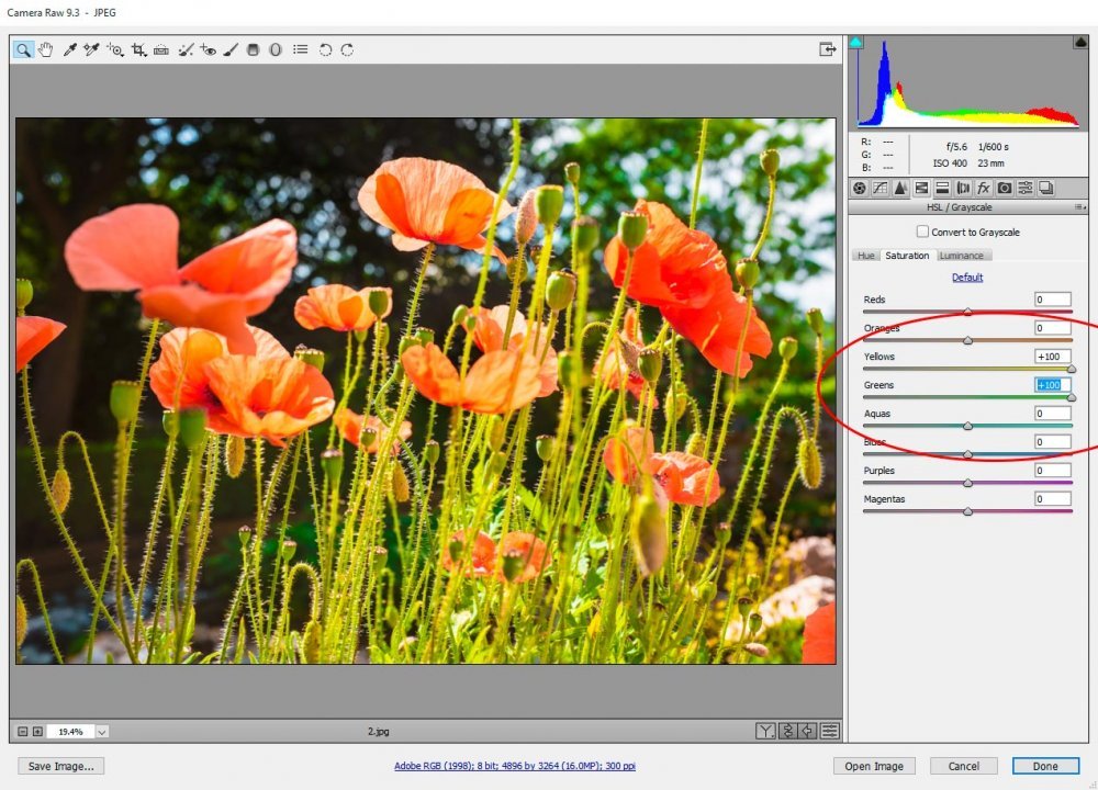
Inside the Saturation tab, there’s a fairly wide spectrum of colors to adjust, so you can potentially have a far reaching impact if you make the proper adjustments.
Luminance Tab
Let’s mix things up a bit and change flowers. Let’s also head into the Luminance tab to see if we can brighten and darken some colors. Take a look at the screenshot below to view our original flower.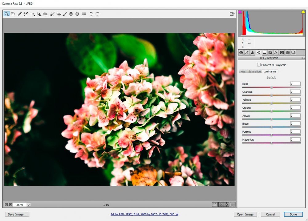
As you can see, we’ve got the same variety of colors to adjust back and forth. If you click between the Saturation and Luminance tabs, you’ll notice a small change. Where the Saturation slider alter the intensity of color, the Luminance sliders alter the brightness of color. To view this clearly, look at each end of the color sliders. Let’s see if we can adjust something.
Besides white, I’d say this flower photo is primarily made up of reds, greens and yellows. Let’s move those particular sliders all the way to the left to darken the colors.
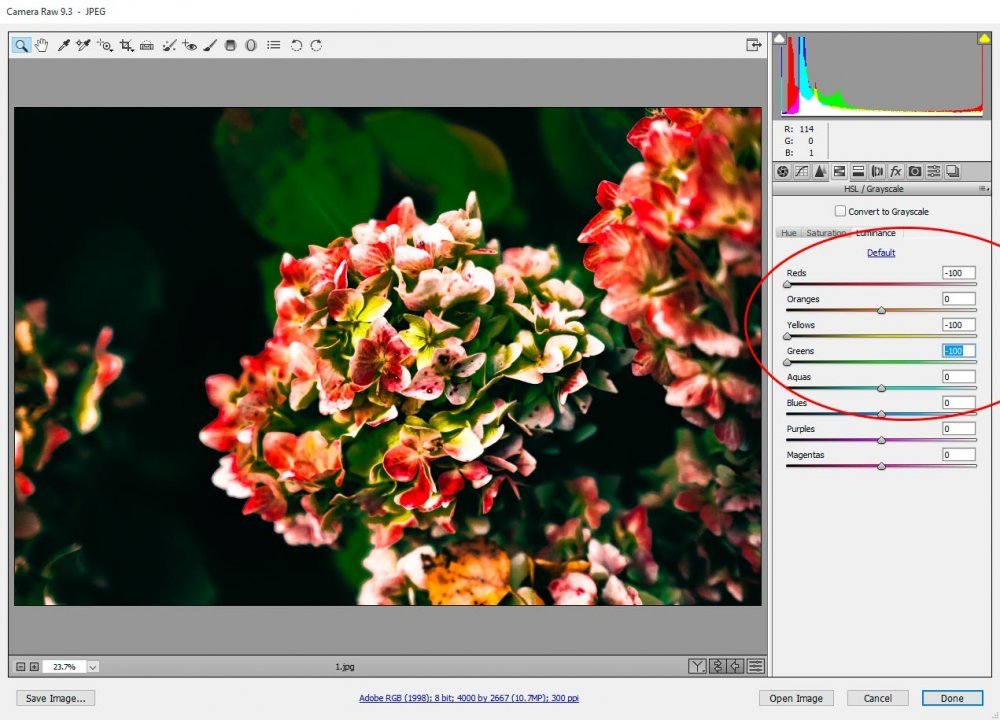
I’d say that actually looks pretty neat. We significantly transformed the visual effect of this photo.
Let’s do the opposite and brighten these three colors by moving the sliders all the way to the right.
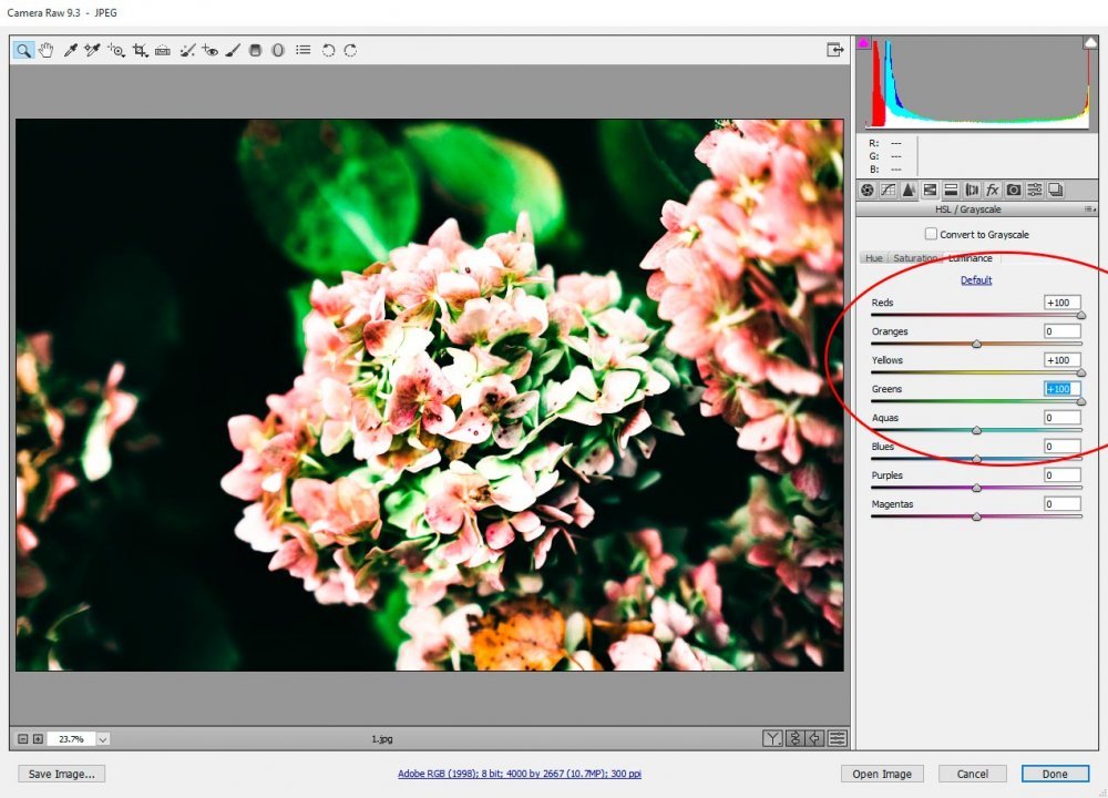
Now, instead of darkening those three colors, we’ve essentially “whitened” them. Again, this gives the photo an entirely different look.
Hue Tab
The Hue tab is a strange one in that it gives us the ability to actually change a color. If we have pure red roses, we can change the red color to orange, magenta or somewhere in between. The same is true if we have a flower with yellow petals. Within the Hue tab, we can change the yellow so it’s more orange or green. I’ve used this tab quite a bit and let me tell you that you can come up with some interesting combinations by moving the sliders contained inside.I found the perfect photo to exemplify what I’m referring to. It’s sort of a purple flower. Take a look.
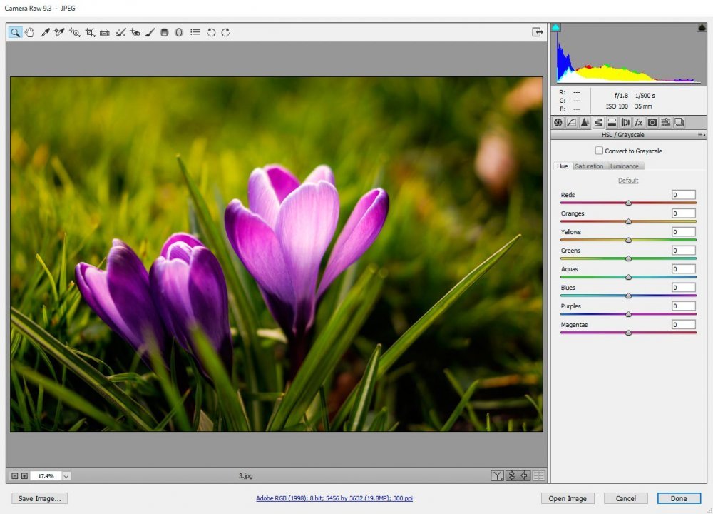
For this example, I’m only going to adjust one slider – the purple one. This slider gives me the opportunity to change any purple inside the image to either blue or magenta. Let’s turn the purple to blue first by moving the slider all the way to the left.
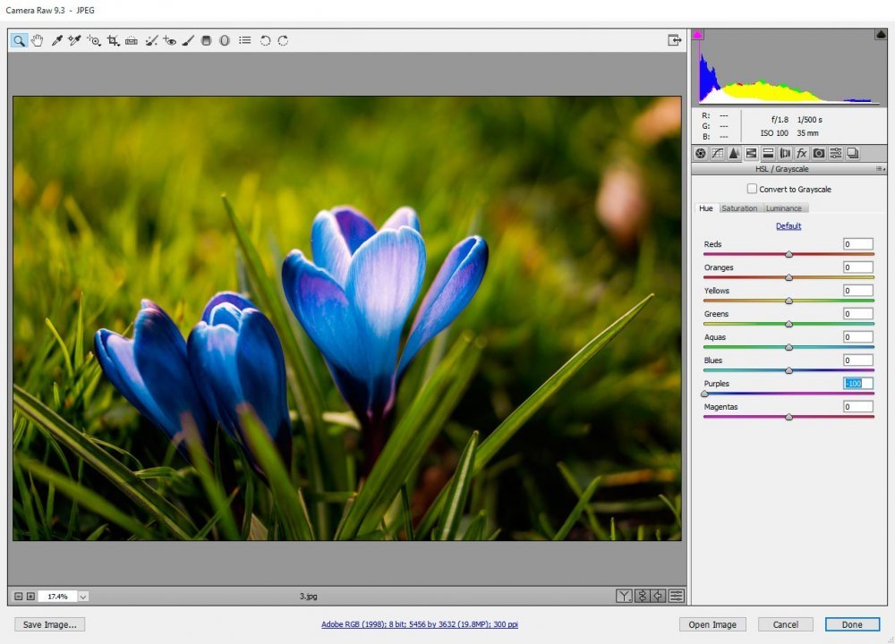
Wow, I’d say that’s a change. Now, let’s move the slider to the right so our purple flower turns magenta.
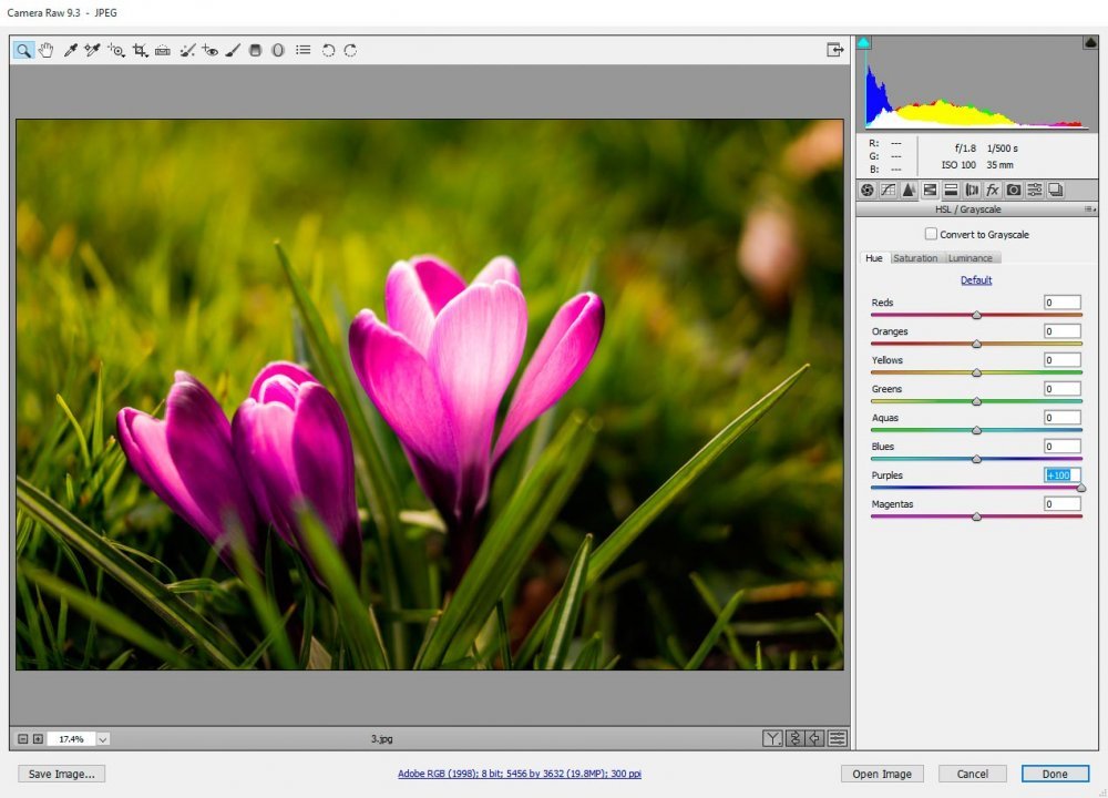
I’m not sure which one looks better. I like them both. I think you get the idea here that this is a very powerful tab inside the HSA panel. I also hope I’ve given you some sufficient background into the workings and possibilities of it as well.

