15Katey
Member
- Joined
- May 10, 2021
- Messages
- 130
- Reaction Score
- 0
- Points
- 23
- #1
Tell me if you’ve ever experienced something like this – You install a new program on your computer (such as Adobe Photoshop), open it up and start wildly clicking icons and tools in an effort to see how everything works. You don’t really know how to do anything yet, but you still click away. Crop, paint and apply filters. I’d say filters is the most fun.
The reason I bring this up is because this is exactly what I did with pretty much every single application I’ve ever installed on any of my many computers. I can remember back so clearly – trying to make a photo look as good as the ones I’ve seen online – within the first 10 seconds of using whatever it was I was using. I can also remember the frustration of not getting anywhere. While the buttons, icons and tools looked relatively simple, without any true knowledge and understanding, I left myself in a heap of a mess. Eventually, I would just close things down, order some instruction book from Amazon, never read it and fail. I hated that part – the failing that is.
I want to fill you in on something. Learning any type of post-processing application takes time. It needs to be progressed through as more of a habit as opposed to as a task. It needs to become a way of life and worked on every day. It’s the little things that matter the most. Sure, I can apply the Lens Flare filter rather quickly and enjoy a major change to whatever photo it is I’m working on, but would I be able to apply that lens flare correctly? When should I do that? Why? There’s more to design and editing than simply getting things done.
Part of the reason I enjoy writing posts that touch on small topics is because, for one, I get to learn and review. I enjoy that and every time I write, something new emerges. Another reason is, because it’s the many small topics that combine to create a large one. Take today’s topic for example; I’ll be working in the Properties panel of the Hue/Saturation adjustment layer. That’s it. There are only a few areas I’d like to talk about, but when you’re finished reading (and I’m finished writing), things will be more clear than they ever were – just for that one panel. I was never very good at breezing through panels while avoiding their details. It’s much better to stop and really analyze things.
With that said, in today’s post, I’d like to cover a few areas of what I just stated above; the Properties panel of the Hue/Saturation adjustment layer in Adobe Photoshop. I’ll be using a beautiful photo of some flowers to help clarify the topics I’ll be discussing. It’s the sliders I’m most interested in, so if you’d like to pick up some knowledge and impress your friends, read on below. I’ll be adjusting the colors, saturation and lightness of the objects in the demo photograph.
Original Photo
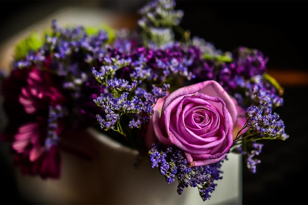
At the top of this post, you can see the original photo with all of its original colors. My goal is to simply add the Hue/Saturation adjustment layer to change a few of the colors. This is a popular activity for almost any type of photography. Folks need to update and enhance colors all the time.While doing this, I’ll be exploring the aspects of the Properties panel control.
Creating an Adjustment Layer
The first task I’m going to complete is to create the Hue/Saturation adjustment layer. To do this, I’ll head up to the Adjustments panel and click the appropriate icon.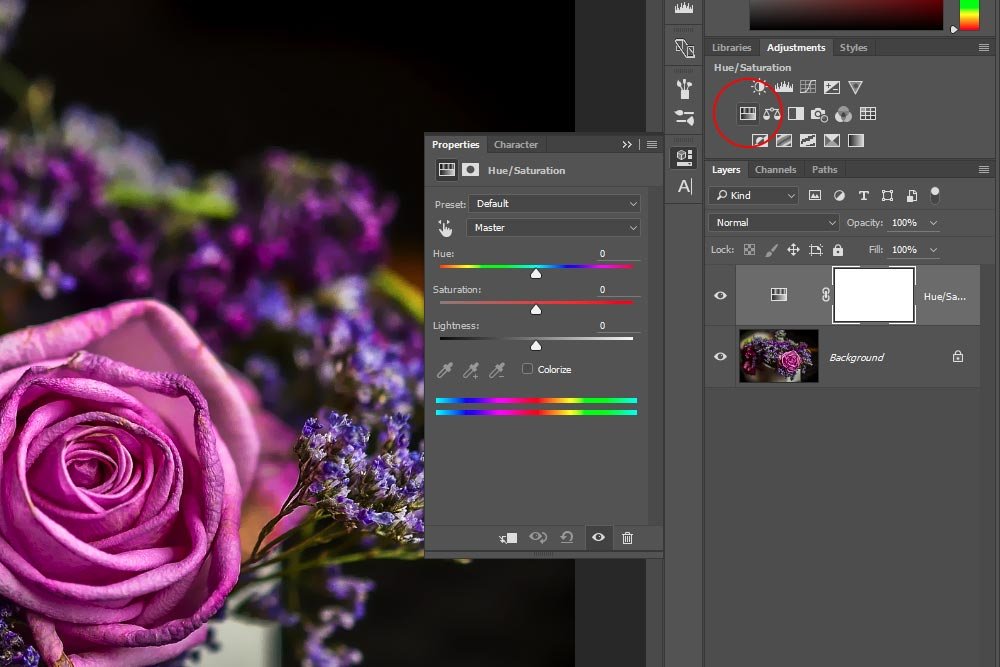
Once I do that, I’ll see the related Properties panel appear. I’ll also notice that the new layer was created in the Layers panel.
Now, I want you to remember that any change I make to this photo related to this adjustment layer will be non-destructive. This means that the original photo will be untouched and I can revert back to it at any time.
Presets
The first area I’d like to cover in the Properties panel is called Presets. This is a drop-down box that holds some fairly magnificent methods for very quickly adjusting the look and feel of a photo.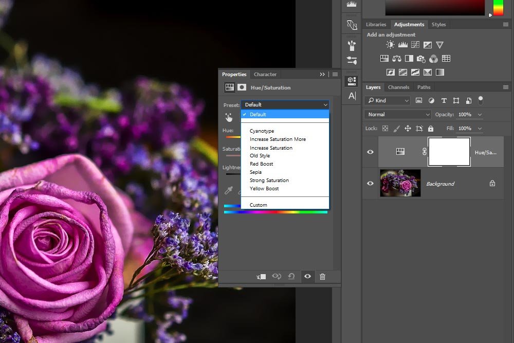
To edit a photo using nothing more than a preset adjustment is extraordinarily simple. Actually, the whole process takes about three clicks. And as you can see, there are a few available choices. They are:
– Cyanotype
– Increase Saturation More
– Increase Saturation
– Old Style
– Red Boost
– Sepia
– Strong Saturation
– Yellow Boost
– Custom
As an example, I’ll first select the Cyanotype preset to show you what that looks like.
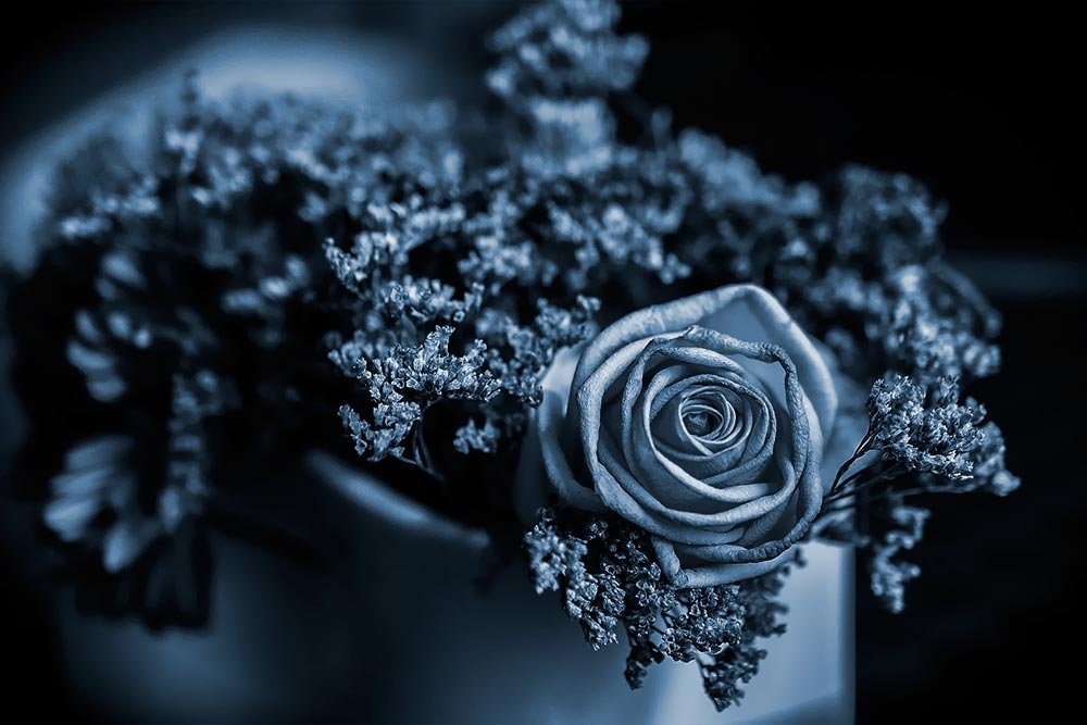
Next, I’ll select Old Style.
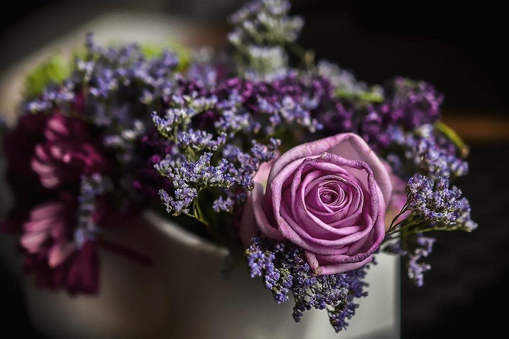
And finally, I’ll choose Sepia.
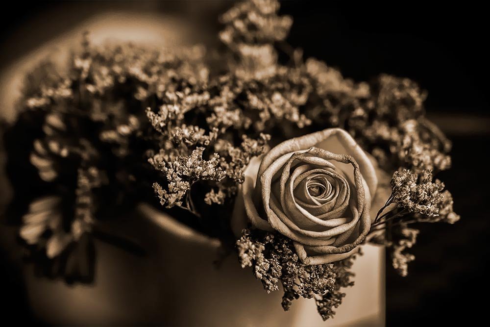
As you can see, there are some interesting results. All that work boiled down to a few easy steps. And what’s even cooler is that as you choose a preset, you can look at the sliders and controls in the same panel below to see what changed. Everything is completely visible. So if you enjoy the look of the Sepia selection, but would rather accentuate a color other than what’s given, you can easily figure out what happened and how to make the necessary change. Photoshop is all about keeping your eyes open and exploring around the menus and panels.
Selective Color
This next drop-down actually doesn’t have a name. On Adobe’s support page, it’s called “the menu to the right of the On-image adjustment tool.” That doesn’t matter. It’s basically the drop-down that’s directly below the Preset one.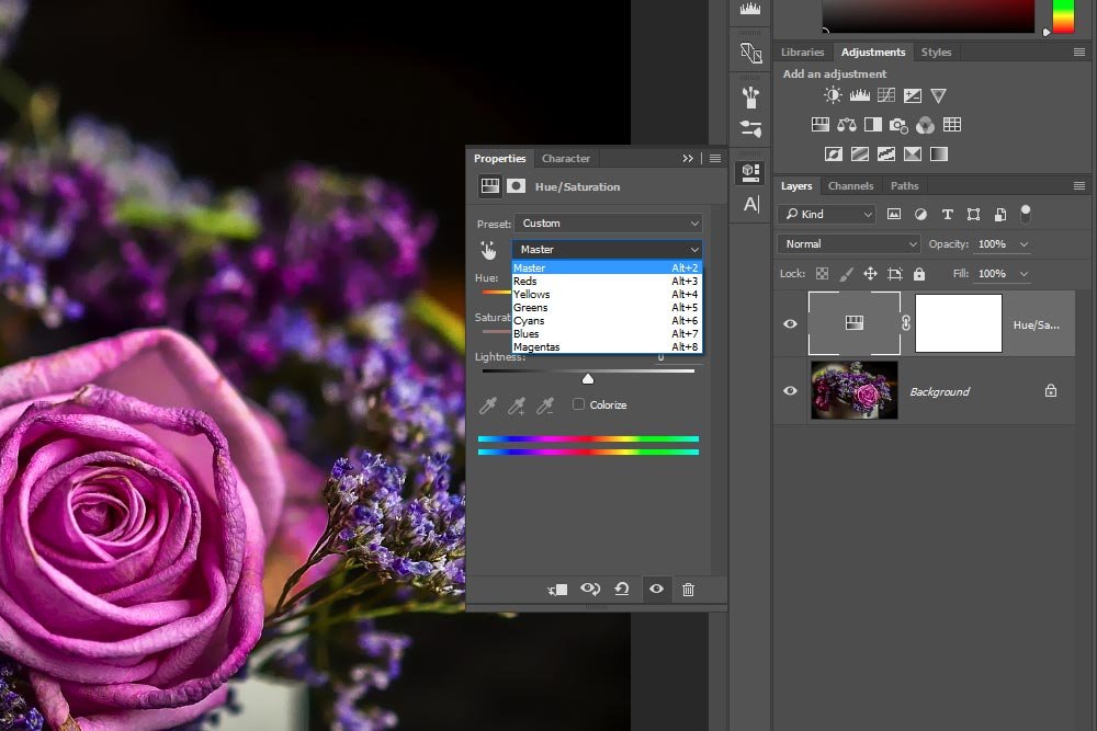
Inside this drop-down menu are a few choices. They are:
– Master (all colors)
– Reds
– Yellows
– Greens
– Cyans
– Blues
– Magentas
Now, this is where things get interesting. This drop-down menu and its selections work in tandem with the On-Image Adjustment Tool (the little hand icon to the left of the drop-down) and the hue sliders at the bottom of this panel. I’ll explain what I mean below.
I like to think of this trio as controlling the target color you’d like to change. Each one does it in a different way.
The Drop-Down
If I were to choose Master from the drop-down menu in question, all colors in the photo would be selected. I could alter them with the Hue slider, add or remove color with the Saturation slider and/or lighten or darken them with the Lightness slider.If I were to select one of the other, more color focused, choices though, my options would change. I’ll use an example to illustrate this. Since there are some magentas in this photo, I’d like to see how it would look if I changed them. So, I’ll go ahead and choose Magenta from the drop-down menu.
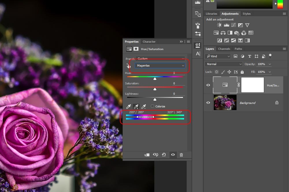
If you look at the screenshot above, you’ll see that Magenta is selected from the drop-down menu. If you look a bit lower than that, you’ll also see that something new happened to the hue sliders at the bottom of the panel. Inside the bracket that appeared inside of the sliders, you’ll see the range of color that will be affected if I move any of the above sliders, such as the Hue, Saturation or Lightness. That’s right, all other colors in the photo will be left alone and only the magenta color that’s locked in that range will be altered. Let see this in action. I’ll push the three primary sliders around a bit.
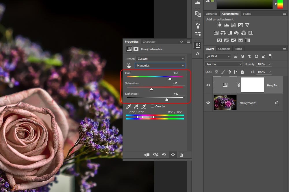
This is the output of the photo. Notice how only the magenta colors in the photo changed. All others stayed the same.
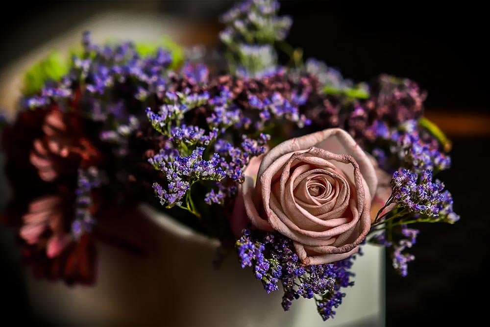
Furthermore, I can edit one color, just as I did above, then select another color from the drop-down and edit that. I can repeat this step with all the available colors and build upon my initial changes.
The On-Image Adjustment Tool
Very similar to the drop-down is the On-Image Adjustment Tool. This tool can be found to the left of the color choice drop-down menu. It’s an icon that has the image of a little hand in it. If I click this tool to activate it, my mouse pointer will turn into a dropper. I can select any color from the photo by clicking on it and that color will be automatically chosen from the drop-down menu. This is a great tool to use if you can’t quite identify a color in the photo, but you know you want it changed.As with the previous method, you can continuously select colors with this tool. All you need to do is to click the tool, select a color with the dropper, make your slider changes and then click on the tool icon again. This will deactivate it. If you want to select another color, simply click on the tool once more to start again (with an additional color). You can do this as many times as there are colors in the drop down menu.
Color Range
Let’s say you already selected a few colors to alter using one of the methods from above. You made your changes, but noticed that you would like to expand the selected colors. You initially selected a color that had a gradient into another color or two different colors are right next to each other. Whatever the reason, you want to expand the range of color for adjustment. We can do this.
If you take a look at the screenshot directly above, you’ll see that I outlined an area in the Properties panel. This area includes three icons that allow you to expand, contract or keep the same color selection.
Since I already made a choice to change up the magentas in the photo, I clicked on the small dropper icon with the + symbol next to it in the outlined area to add to that. When I used my mouse (dropper) to click on another color, the brackets in the double color bars grew apart to accommodate that. Now, when I move the three primary sliders to make adjustments to the colors, anything contained inside the bracket area will be affected.
Another method for accomplishing the same thing is to physically click on the bracket edges themselves. You can click right on them and drag them to the left and the right to capture the color range and feathering you’d like.
To assist in explaining how this works, I’ll take a blurb from Adobe’s support page:
Four color wheel values (in degrees) appear in the Properties panel (the double hue sliders at the bottom). They correspond to the adjustment sliders that appear between the color bars. The two inner vertical sliders define the color range. The two outer triangle sliders show where the adjustments on a color range “fall off” (fall‑off is a feathering or tapering of the adjustments instead of a sharply defined on/off application of the adjustments). Source.
As you can see, you have a lot of control when it comes to changing colors in a photo.
Resetting the Adjustments
Oftentimes, I like to mess around with making changes before I settle on anything permanent. I do a lot of pushing sliders and making selections from the drop-down boxes. Because of this habit, it becomes cumbersome to reset everything to its original state before I begin making changes in earnest. Luckily, many panels in Photoshop have a feature that will take on this chore for you.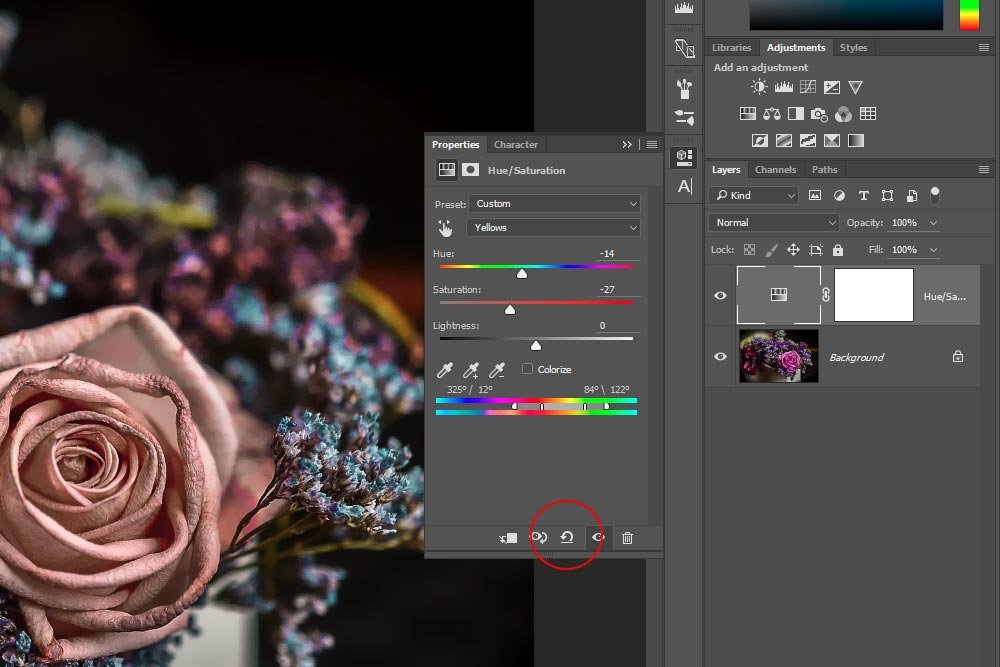
If you look at the screenshot above, you’ll see that I circled an icon at the bottom of the panel. It looks like a semi-circular arrow. If you click this icon, all the adjustments you made will be reset to their default settings.
Finally, here is the image after I made some changes to it. I actually like this version more than all the rest – even the original.
