LukeLewis
Member
- Joined
- May 7, 2021
- Messages
- 134
- Reaction Score
- 0
- Points
- 21
- #1
I’ve already written quite a few posts that have discussed how to change the color of an object using Adobe Photoshop, but as of yet, I haven’t discussed the particulars of the tool that enables this type of action. In the most basic sense, all it takes to change the color of something in Photoshop is to apply a Hue/Saturation adjustment layer to the layer in question and then use the targeted adjustment tool to select the color. Then, push the Hue slider until you see the new color you desire. That’s it.
There is, however, one small issue with this method and I’ll explain what that’s all about below. Which brings me to the point of this post. In today’s post, I’ll be working through a project in which I’ll alter the color of a scooter in a photo that includes colors that are similar elsewhere in the image. When I go to change the appearance of the scooter, the other colors will change as well, which isn’t what I want. I’ll explain why this unwanted action is occurring as well as how to work around it.
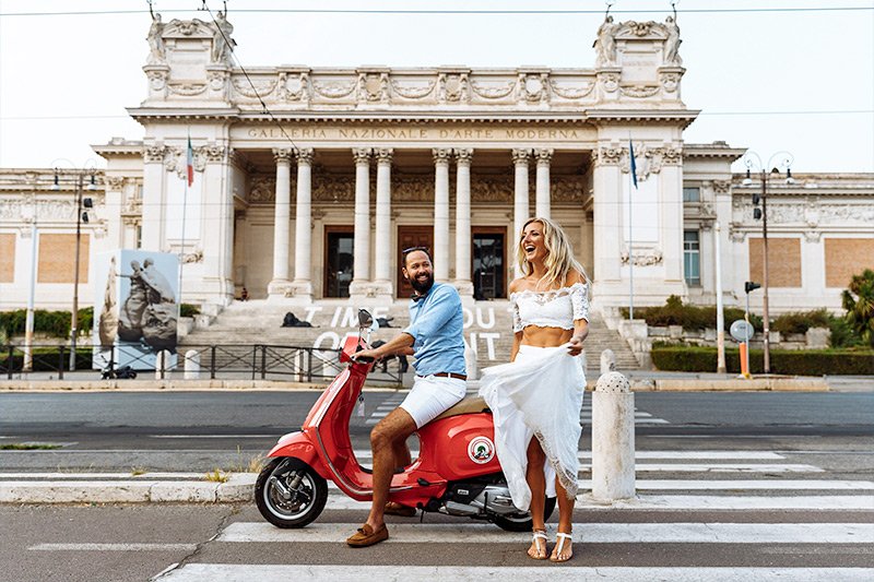
Photo by: https://imagestudio.com
Yeah, I’d say we have a small problem here. While the scooter is a very neat shade of blue, which is what I wanted, the people have turned green. There are also hints of green elsewhere in the image as well. Why did this happen and how did this happen? More importantly, how do we avoid something like this in the future?
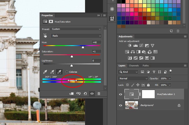
If you look at the top spectrum, you’ll notice that the color red is captured by two handles along with two additional handles outside them. The reason red is captured here is because that’s the color I clicked on when I used the Targeted Adjustment Tool earlier on. The red in the scooter. Now, the corresponding bottom spectrum represent what the top spectrum colors have turned into after I moved the Hue slider. You can see that the red is showing in the top spectrum and the current blue is showing in the bottom. Really, that’s it. I know these two color spectrums look intimidating because there seems to be a lot going on down there at the bottom of this panel, but they really shouldn’t be intimidating at all. I just summed them up in a few sentences.
Now that we have that out of the way, let’s move onto something much more exciting. Take a look at the tabs in the screenshot above. The handles, if you will. These are the small tick marks in the upper color spectrum. As you can see, the two inner handles encapsulate the color red. That’s the color of the scooter that I clicked on. This red color is being fully represented by these two tabs. If you’ll notice, there are two additional handles as well. These are located outside the two I just described. The two handles represent additional colors, but not at the same strength as the inner two. So, if I were to keep the two inner handles set where they are, but clicked and dragged both of the two outer handles outward, many more colors would be represented (to a diminishing degree) and those colors would shift in the imagine I’m currently working on. If I wanted to capture and change a whole lot of color, I’d spread the handles outward, but if I wanted to change only very specific colors, such as what I’d like in this particular project, it only makes sense that I’d click and drag those handles inward. By dragging them inward, I’d be narrowing the potential colors that would be impacted by my moving the Hue slider up above.
Just to recap, if I want to affect lots of colors in an image completely (100%), I’d click and drag the two inner handles outward. If I wanted to affect fewer colors or just one color individually, I’d click and drag those two handles inward. If I wanted to affect lots of colors, but to a lesser degree, I’d click and drag the two outer handles and drag them outward and if I wanted to affect fewer colors in the same respect, I’d drag those outer handles inward.
Wow, that’s a lot of dragging, but it’s really a simply concept. The best way to get a grasp of this is to click on a color in your own photo and then drag the handles around to see the effects. You’ll get the idea of what’s going on rather quickly.
By doing this, I excluded all colors other than the very specific red that the scooter is colored. Oh yeah, I also pushed the Hue slider to the left a bit because that blue I originally chose was looking pretty lousy, but that’s neither here nor there.
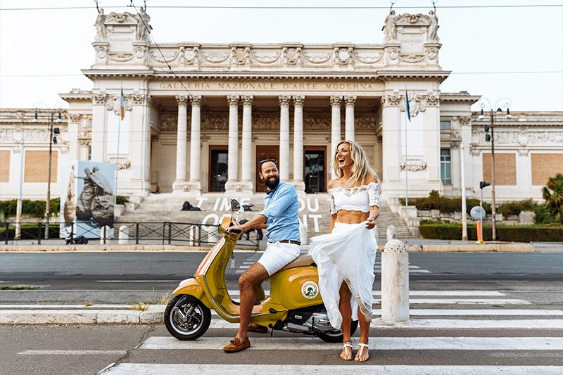
As you can see, the people’s skin is back to normal and the building in the background is back to normal as well. It’s as easy as that. And the scooter’s color is changed. That was the original goal after all.
I hope I showed you how to change the color of something using Adobe Photoshop as well as how that color change worked. It’s the behind the scenes that matters as much as the actual task sometimes. If you have any questions or comments, please add them in the comment section down below. If you’re reading this via email, simply click on the link up above, right under the logo and then scroll down to the bottom of the post page. The comment section is down there. Thanks for reading!
There is, however, one small issue with this method and I’ll explain what that’s all about below. Which brings me to the point of this post. In today’s post, I’ll be working through a project in which I’ll alter the color of a scooter in a photo that includes colors that are similar elsewhere in the image. When I go to change the appearance of the scooter, the other colors will change as well, which isn’t what I want. I’ll explain why this unwanted action is occurring as well as how to work around it.
Original Image
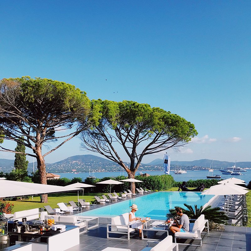
Take a look at the photo below. Notice how the scooter is a shade of red. Also notice how there are other shades of red included in the photo, such as on the building behind the couple as well as the couple’s skin tones. I’ll show you down below how all of these reds will inadvertently change color.
Photo by: https://imagestudio.com
Changing Color
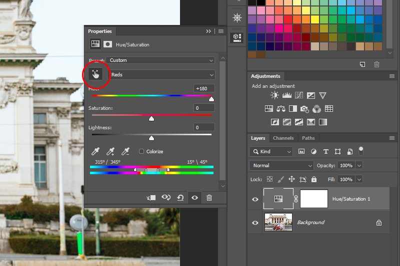
Okay, I’ll go ahead and follow some simple instructions that will help me change the color of the scooter. I’ll go ahead and click on the Hue/Saturation button that’s located in the Adjustments panel and then, once the adjustment layer is present in the Layers panel, I’ll click on the Targeted Adjustment Tool (circled in red in the screenshot below) and then click my mouse pointer on the red in the scooter to select the color. Then, I’ll drag the Hue slider to the left or to the right to find a new color. Here’s the result of those actions.

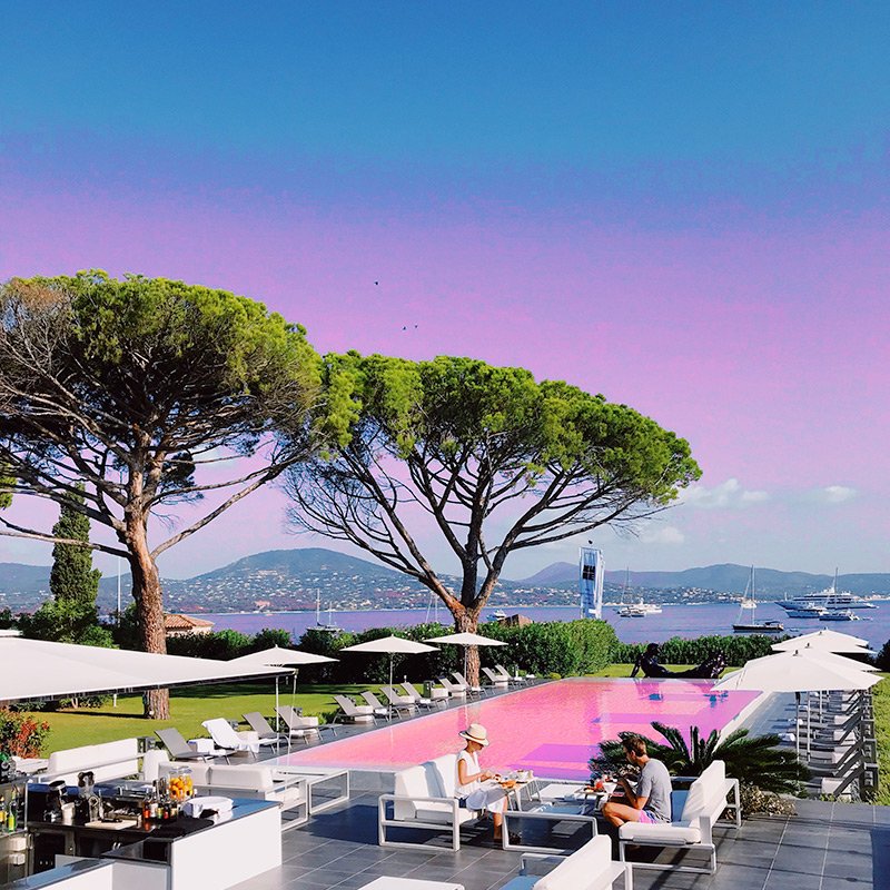
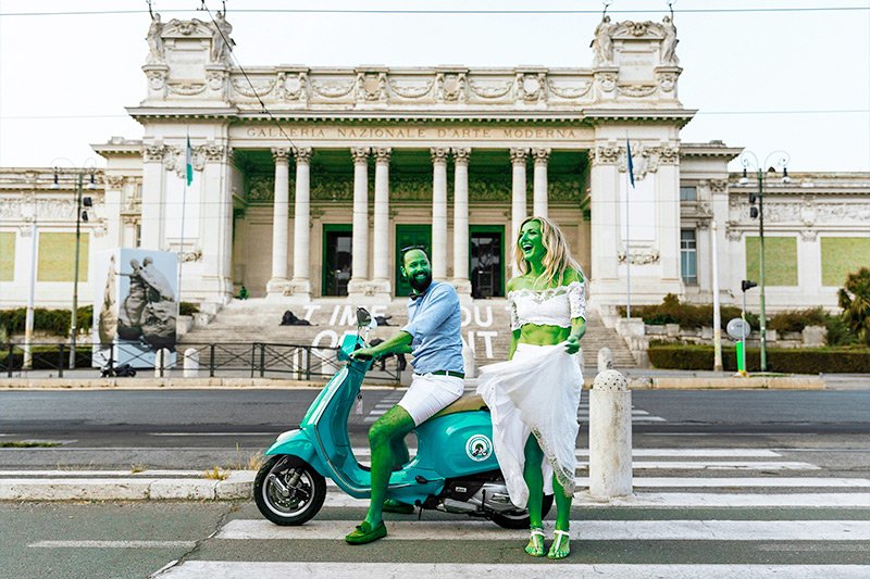
Yeah, I’d say we have a small problem here. While the scooter is a very neat shade of blue, which is what I wanted, the people have turned green. There are also hints of green elsewhere in the image as well. Why did this happen and how did this happen? More importantly, how do we avoid something like this in the future?
Analyzing the Panel
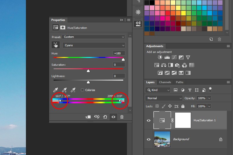
The answers to my questions lie in the Properties panel. I showed this in the above screenshot. What I’d like to specifically look at here are the two color spectrums down at the bottom of this panel. Here, take a closer look.
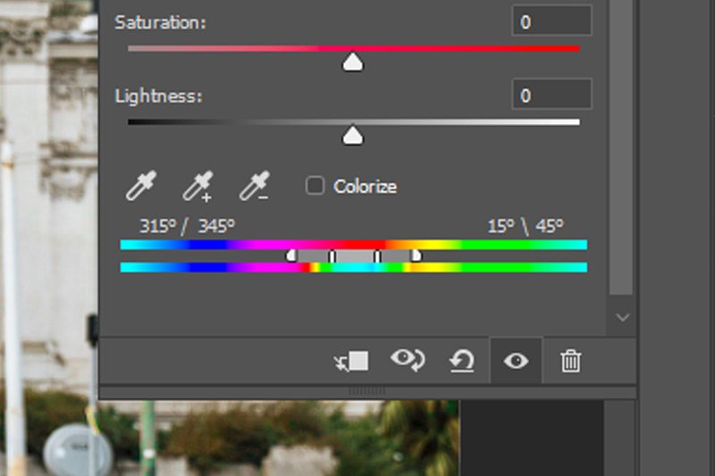
If you look at the top spectrum, you’ll notice that the color red is captured by two handles along with two additional handles outside them. The reason red is captured here is because that’s the color I clicked on when I used the Targeted Adjustment Tool earlier on. The red in the scooter. Now, the corresponding bottom spectrum represent what the top spectrum colors have turned into after I moved the Hue slider. You can see that the red is showing in the top spectrum and the current blue is showing in the bottom. Really, that’s it. I know these two color spectrums look intimidating because there seems to be a lot going on down there at the bottom of this panel, but they really shouldn’t be intimidating at all. I just summed them up in a few sentences.
Now that we have that out of the way, let’s move onto something much more exciting. Take a look at the tabs in the screenshot above. The handles, if you will. These are the small tick marks in the upper color spectrum. As you can see, the two inner handles encapsulate the color red. That’s the color of the scooter that I clicked on. This red color is being fully represented by these two tabs. If you’ll notice, there are two additional handles as well. These are located outside the two I just described. The two handles represent additional colors, but not at the same strength as the inner two. So, if I were to keep the two inner handles set where they are, but clicked and dragged both of the two outer handles outward, many more colors would be represented (to a diminishing degree) and those colors would shift in the imagine I’m currently working on. If I wanted to capture and change a whole lot of color, I’d spread the handles outward, but if I wanted to change only very specific colors, such as what I’d like in this particular project, it only makes sense that I’d click and drag those handles inward. By dragging them inward, I’d be narrowing the potential colors that would be impacted by my moving the Hue slider up above.
Just to recap, if I want to affect lots of colors in an image completely (100%), I’d click and drag the two inner handles outward. If I wanted to affect fewer colors or just one color individually, I’d click and drag those two handles inward. If I wanted to affect lots of colors, but to a lesser degree, I’d click and drag the two outer handles and drag them outward and if I wanted to affect fewer colors in the same respect, I’d drag those outer handles inward.
Wow, that’s a lot of dragging, but it’s really a simply concept. The best way to get a grasp of this is to click on a color in your own photo and then drag the handles around to see the effects. You’ll get the idea of what’s going on rather quickly.
Correcting the Color Change
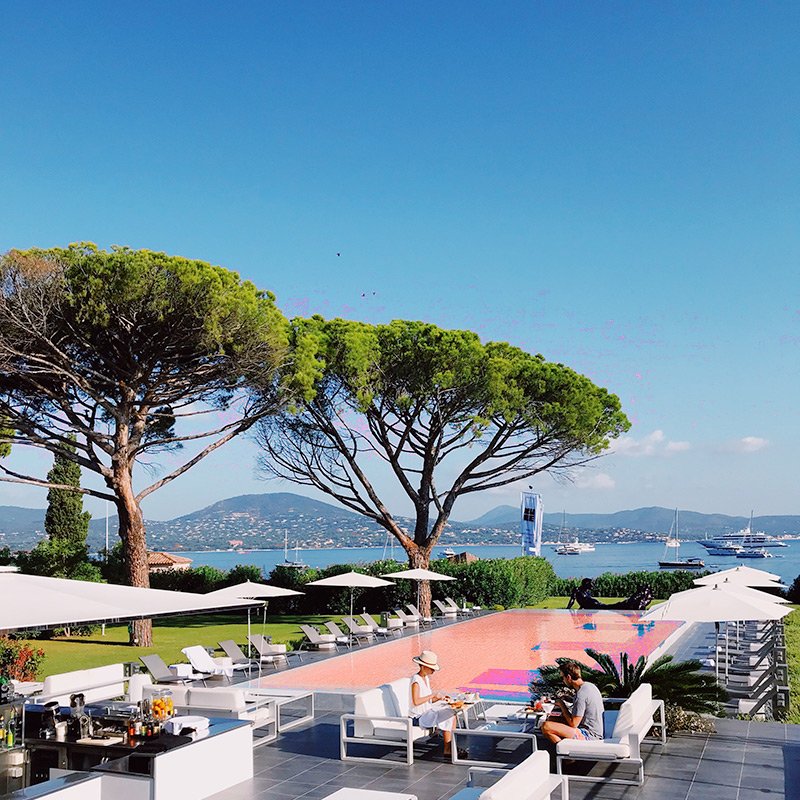
Okay, back to the project at hand. The question now is, what do I do to correct the color changes so they meet my needs? Well, I could always click on the eyedropper tool with the minus symbol next to it down at the bottom of the Properties panel and then click on the colors that changed in the image that are everywhere other than the scooter. I tried this and it didn’t work very well. The most effective action I took was to narrow down the color range. I clicked on the outer handles in the top color spectrum and I moved them inward so they sat right next to the inner handles. That solved all of my problems.
By doing this, I excluded all colors other than the very specific red that the scooter is colored. Oh yeah, I also pushed the Hue slider to the left a bit because that blue I originally chose was looking pretty lousy, but that’s neither here nor there.

As you can see, the people’s skin is back to normal and the building in the background is back to normal as well. It’s as easy as that. And the scooter’s color is changed. That was the original goal after all.
I hope I showed you how to change the color of something using Adobe Photoshop as well as how that color change worked. It’s the behind the scenes that matters as much as the actual task sometimes. If you have any questions or comments, please add them in the comment section down below. If you’re reading this via email, simply click on the link up above, right under the logo and then scroll down to the bottom of the post page. The comment section is down there. Thanks for reading!

