Search

Text Effects in Photoshop

  • Thread starter JodyBuchanan
  • Start date
JodyBuchanan

JodyBuchanan

Member
Joined
May 10, 2021
Messages
138
Reaction Score
0
Points
21
  • #1
Have you ever wondered how you can easily invert part of your text when it overlaps other text? I’ve wondered that for a long time and today, I’d like to share the trick for how to accomplish that with you.

Text Effects with the Difference Blend Mode in Photoshop​

When it comes to text effects, the Difference blending mode can be a lot of fun. This is one mode that doesn’t get a lot of play, but I think when I show you its power, you’ll add it to your arsenal of “go to” tools, especially when you’re working with text. There’s a lot you can do with this one.

Before I go any further though, let’s refresh ourselves on what the Difference blend mode can do for us. Or rather, what the Difference blend mode does, in general.

The Difference blend mode “Looks at the color information in each channel and subtracts either the blend color from the base color or the base color from the blend color, depending on which has the greater brightness value. Blending with white inverts the base color values; blending with black produces no change.”

In essence, most of what you need to remember is that white inverts the color of the background layer and black makes no change. So, if you have a white background layer and a white layer on top of that and apply the Difference blend mode to that white top layer, everything will invert to black.

I know this isn’t the easiest thing to understand, so I’ll do my best to help you out below.

In today’s post, I’m going to offer you two examples of how you can take advantage of this particular blend mode, in order to get some pretty neat looking effects while working in Adobe Photoshop. Really, the extent of the effects are going to be up to you and what your brain came come up with, but I’ll give you the beginnings of what you’ll need right here.
Example #1​

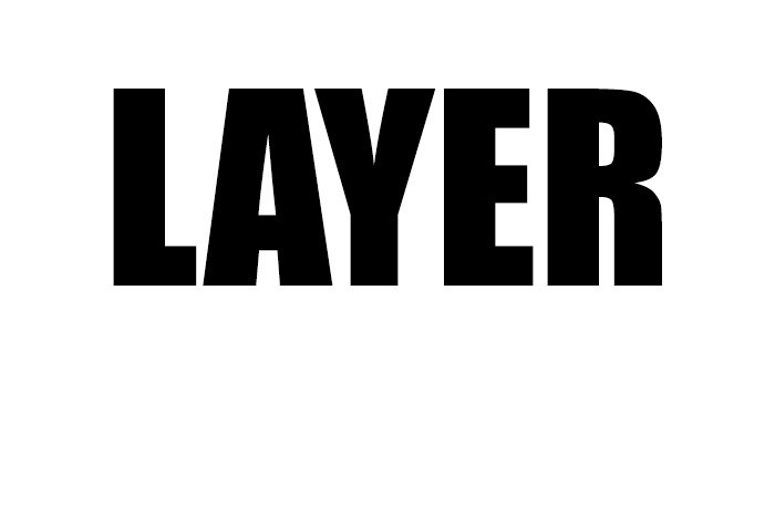
For this first example, I’m going to create a simple document that has a white background. I’ll then add one text layer with the text colored black. This is what I have so far.

layer.jpg

It’s rather simple, I know. As you can see, the text says, “LAYER.”

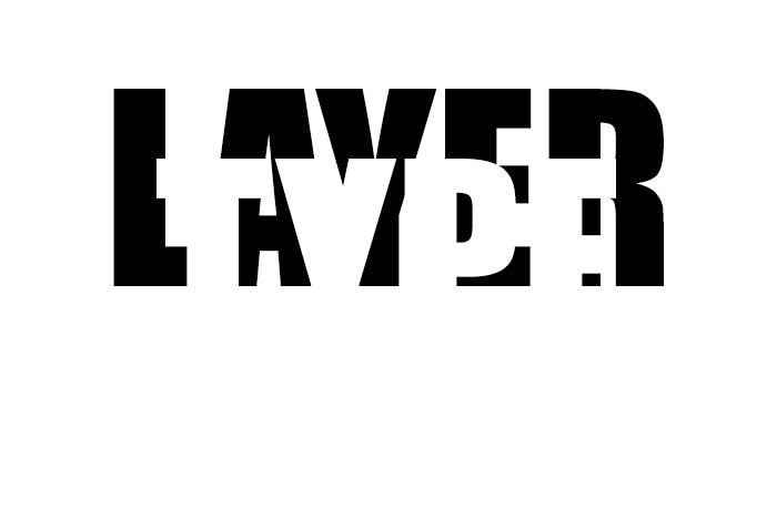
Next, I’ll type out some new text on a new layer. This time though, I’ll make the new text white and have it spell out “TYPE.” So you can see the new text, I’ll make it so it overlaps the bottom portion of the first text. Here’s what we have.
white-overlap.jpg

Do you see the white text creeping up on the black text from below? That’s good.

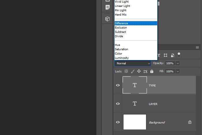
At this point, I’d like to apply the Difference blending mode to the “TYPE” text layer. Knowing what this blending mode does, I’ll assume that the parts of the text that are on top of the white background will turn black and the parts that are covering the black “LAYER” text will stay white. Let’s see the result. First, I’ll change the blend mode in the Layers panel.
difference-blend-mode.jpg

Now, let’s check out the result.

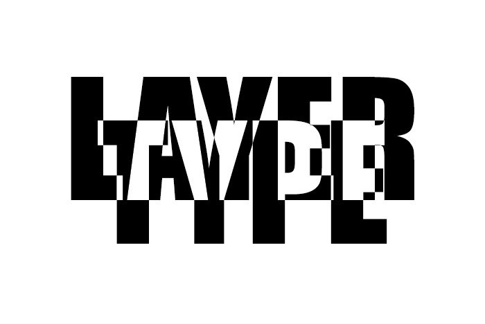
full-overlap.jpg

Yup, just as I suspected. the bottom layer has been partially inverted. Now, if I push that bottom layer down just a bit so it’s more readable and then apply an Invert adjustment layer, I can invert everything in the entire image for an even more creative look.

First I’ll apply the Invert adjustment layer by going over to the Adjustments panel and clicking on the Invert icon.
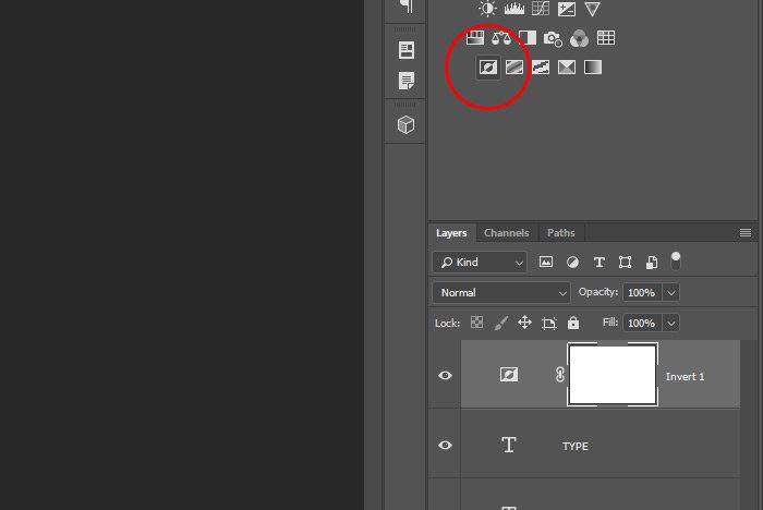
invert-adjustment-layer.jpg

And then I’ll take a look at the result.
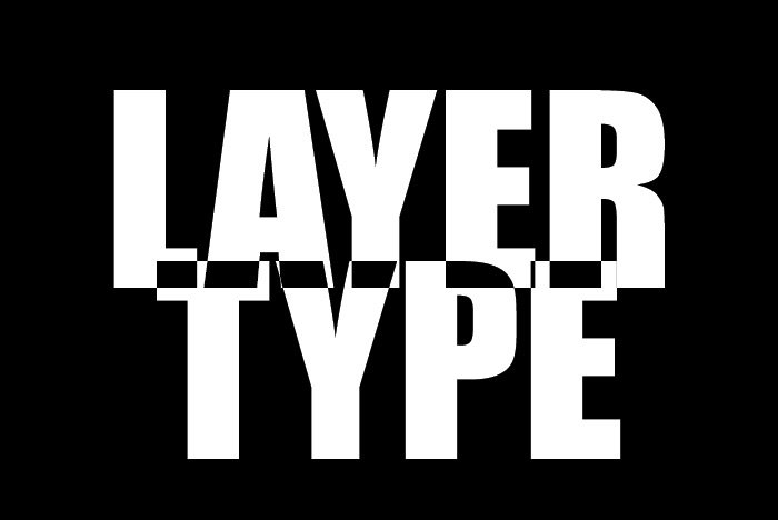
inverted-text-background.jpg

I’m sure you can see the possibilities here. Just with this small amount of information, you should be able to add a lot of flair to all different types of projects. I’m picturing this type of effect having a big role in media types, such as magazines and other types of print.

Example #2​

Now that we know what this blend mode can do, let’s apply it to a real-world project. This isn’t going to be any more challenging that what I just did, but it will be better looking.

I’ve got a photo of a girl in a yoga pose here and I’m pretending that I’d like to use this image in a magazine. Right now, the image looks fine, but I want to add a message to it. Let’s see the photo.
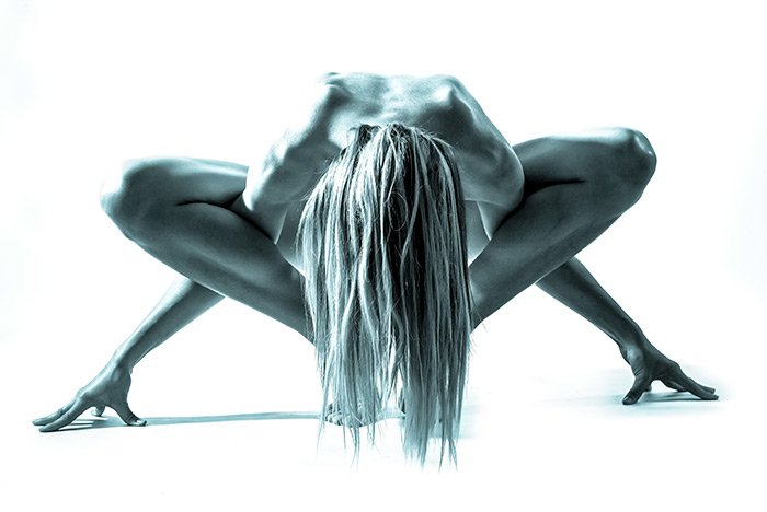
yoga-girl.jpg

What if I write “YOGA” across the entire picture. Would that look good?
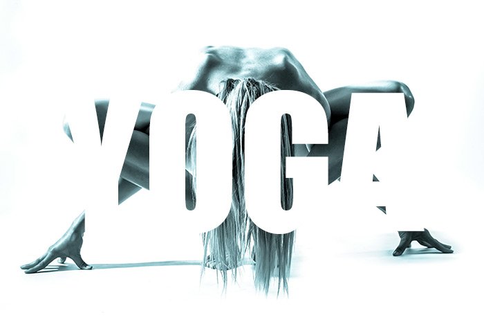
girl-white-text.jpg

I guess that looks okay, but what if I apply the Difference blending mode to the white text? I wonder how that would improve the image. Let’s take a look.
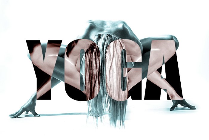
difference-mode-yoga-girl.jpg

Ah, that looks better. Now we can at least see the text while having the girl fully visible. I wonder if this version is edgy enough though. I think I want to invert everything, just as I did in the first example. That should change things up. I’ll add an Invert adjustment layer, just for fun. Let’s see what that does.
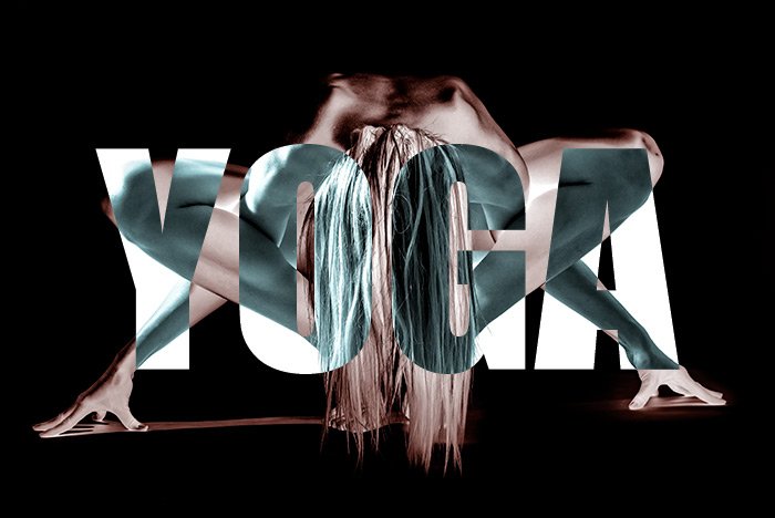
inverted-yoga.jpg

Oh now we’re getting somewhere. I could even change the look further if I change the text from being white to being gray. I could do any number of things, but that’s beyond the scope of this post. What I shared above is what I wanted to show you, so I think I’ll stop there. I’m hoping you can find an application for this.

I hope I clearly explained how to use the Difference blending mode to establish a text effect in Adobe Photoshop. I also hope I gave you some good examples of how the Invert adjustment can affect these changes as well. If you have any questions regarding this post, please let me know in the comment section below. Thanks for reading!
 
JodyBuchanan

JodyBuchanan

Member
Joined
May 10, 2021
Messages
138
Reaction Score
0
Points
21
  • #2

Exploring Layer Style Contours in Adobe Photoshop​

Contours are those little things that most of us breeze right by when working with layer styles in Adobe Photoshop. I completely understand why this happens. When I open up the Layer Style palette to apply a Drop Shadow, Inner Glow, Stroke or any other style, I primarily focus on the top portion of each of these areas. I sort of forget about what’s down below. That’s a shame though because all I’m doing there is making settings to the Structure of the effect. There’s a lot more to add to a style in both the Elements and Quality sections down towards the center and bottom areas of the palette. If you have no idea of what I’m talking about, don’t even worry about it. It’ll all become crystal clear down below.

In today’s post, I’m going to play around a bit in the Layer Style palette in Adobe Photoshop. I’ll apply an effect and make a few tweaks to that effect in each of the sections that control it. The effects will be applied to some text, which will help bring any changes I make out and very visible. Ultimately, I’d like to show you how these effects can make a piece of text appear as well as demonstrate how the Contour portion of this palette can bring out some really neat looks.

Writing Out Some Demo Text​

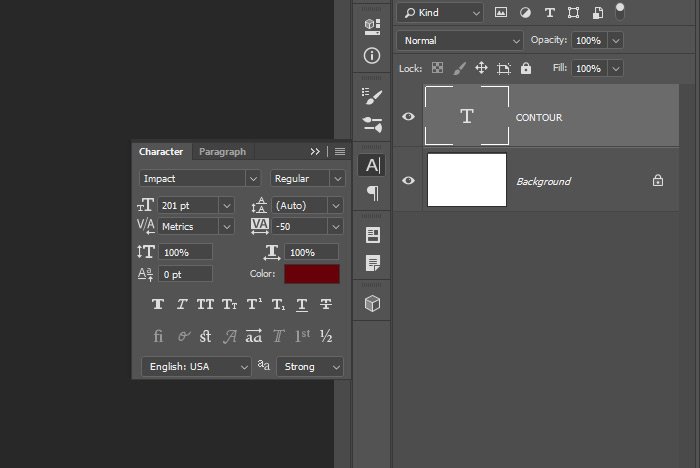
I’m going to go out on a limb today and use the word “CONTOUR” as some demo text. I thought that was very fitting. To do this, I’ll use the Horizontal Type Tool and the Character panel to type and adjust the word to how I’d like it to look. Here are the settings from the Character panel.

character-panel.jpg

I’m working with a file that has the dimensions of 700×468 pixels because that’s what fits well on this blog. My goal is to get the text as large as possible to see everything that I do clearly. Down below, I think I’ll enlarge the text so things are even more clear.

Here’s the word of the day.

contour.jpg

Applying an Inner Glow​

Just so you’re aware, the Contour attribute is included in the Drop Shadow, Inner Shadow, Inner Glow, Outer Glow, Bevel and Emboss and Satin effects. I’ll discuss this more below, but the Contour attribute controls the shape of the effect, so it’s not so two-dimensional looking.

When working with contours, it’s helpful to experiment with the Inner Glow effect because it’s uniform around the inner edges of the text. I think it’ll show well.

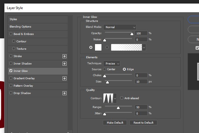
Okay, to apply this effect, I’ll double-click on an empty area of the text layer in the Layers panel and then when the Layer Style palette opens, I’ll click on the Inner Glow option in the left column. The Inner Glow effect area will appear and the settings I applied last will be waiting for me. To reset these to the Photoshop default, I can click the Reset to Default button down at the bottom of the panel, but I won’t do that here. I’d like to use some of these settings the way they are and then explain what’s going on down below.

inner-glow-settings.jpg

First though, let’s check out the result of the effect.

inner-glow-contour.jpg

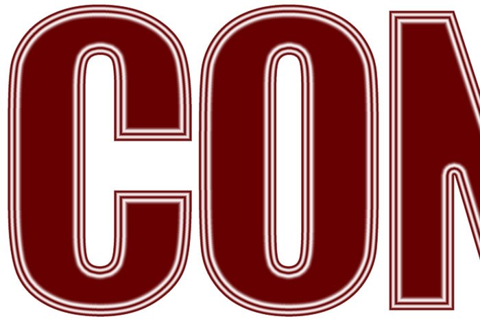
And here’s an enlarged view.

enlarged-text.jpg

The Contour Setting​

If you’re following along, feel free to copy my settings from the previous screenshot. I played with them for a while in an effort to make the contour I applied obvious. Remember though, font size affects how the contour will look, so you may need to make a few adjustments here and there to see things clearly.

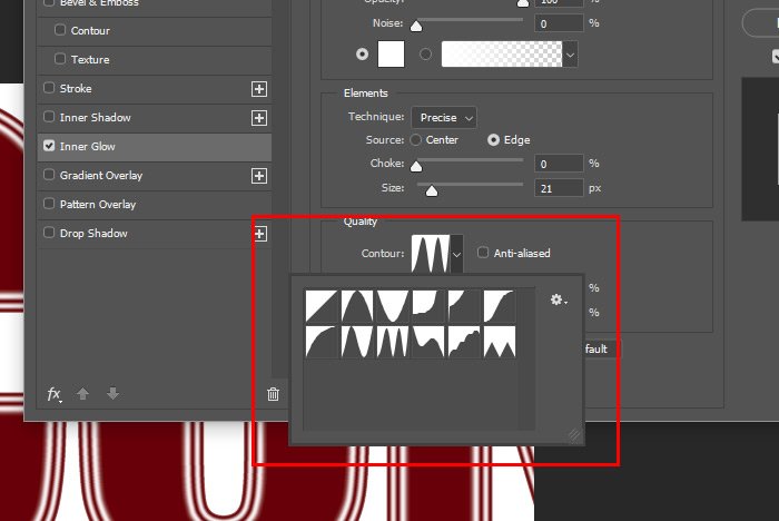
Okay, so what in the heck is a contour? Well, first let me who you where this setting resides. It’s in the Quality portion of the Inner Glow effect area. You can either use the presets that come with Photoshop or you can customize your own. Here’s what the presets look like. To access these, all I did was click on the drop-down arrow next to the contour thumbnail.

contour-presets.jpg

Now, if I click on the thumbnail itself, the Contour Editor will open up, which offers me endless possibilities when it comes to making this effect unique.

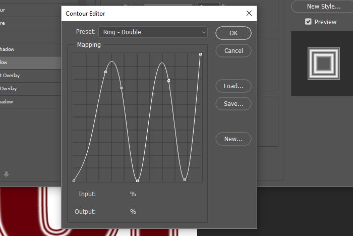
contour-editor.jpg

Let’s talk about what the contour settings can do for an effect. The reason I chose the above preset is because it makes it easy to understand what’s happening. Let’s say I chose an inner glow effect and it was a plain white gradient. It was the very first, default contour that Photoshop offers, the one with the diagonal half and half white and gray triangles. Well, those white and gray triangles represent the contour itself. Basically, the inner glow will slope down in the fashion the gray triangle does. Straight and to the point.

Now let’s say that I chose a contour that had ripples in it, like the one in the screenshot above. With this one, instead of the inner glow simply showing at full intensity and then fading into nothingness in a straight line, the inner glow will ripple down and then back up and then down and back up again. What it’s doing is controlling the contour of the effect. Or more simply put, how the effect travels from it’s start point to its end point. We can control whether or not the inner glow travels in a straight line or if it bounces all over the place and whether or not those empty areas in between the full ones are big or small. Think of the contours as wrinkles. We can wrinkle the effect, such as the inner glow.

This may seem confusing in the beginning, but Photoshop tries to help by giving us a thumbnail preview of how the effect will look once it’s applied to the element we’re affecting. If you look at the screenshot above, you’ll see the preview off to the right.

Some Examples​

I think the best way to help you get an idea of what’s going on is to offer some examples. I’ll give three here for three different contours. I won’t do anything custom because the presets are pretty good. Just know that if you did want to create a custom contour, you can start off with one of the presets and then open up the Contour Editor and click and drag the lines inside of that.

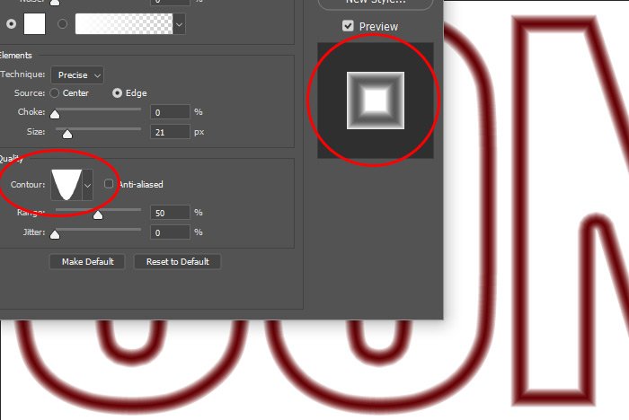
Let’s start off with a regular Linear contour. In the following screenshots, I’ll circle the contour thumbnail I chose, the preview and the letters it’s affecting in the workspace in the background. I think I can capture all three in the same screenshot. Here’s the Linear one.

linear-contour.jpg

This one is the Cone-Inverted contour. Again, notice and compare the thumbnail, the preview and the final product.

cone-inverted-contour.jpg

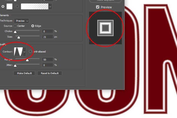
And finally, we have the Ring contour.

ring-contour.jpg

The more you practice using these things and the more you compare the preview with the actual effect on the object, the more it becomes clear what contours can accomplish.

Saving a Custom Contour​

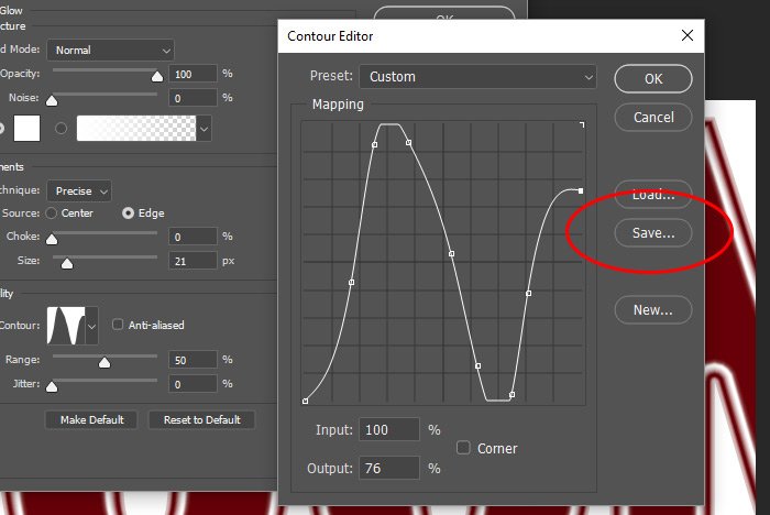
In this final section, I’m going to click on the contour thumbnail so the Contour Editor opens up. Then, I’ll click and drag a few anchor points around for a custom look. When I’m finished, I’ll click the Save button, which will allow me to name the contour I just created and save it out as a custom contour. Then, I’ll click on the OK button to exit the editor.

save.jpg

It’s really as easy as that. I can create as many custom contours as I want and then save them so they’re available to me later on. When I’m finished in the Layer Style palette, I’ll click that OK button to return to my file to enjoy the fruits of my labor.

——

I hope I clearly explained what the Contour feature inside of the Layer Style palette is and how it works. If you have any questions or comments regarding this post, please let me know in the comment section below. Thanks for reading!
 
JodyBuchanan

JodyBuchanan

Member
Joined
May 10, 2021
Messages
138
Reaction Score
0
Points
21
  • #3

How to Create an Editable Halftone Text Effect in Adobe Photoshop​

Have you ever seen those really cool text effects where it appears that the text was created from little dots? This look is called a “Halftone Effect” and it’s possible to create something like this right inside of Adobe Photoshop. Since this type of thing takes a little practice to get just right, it’s important to follow a few steps to make whatever it is your working on editable, so you can go back and make changes if necessary. So many times, while working in Photoshop, we jump right into making things look good that we forget to follow the correct steps that will offer flexibility later on. Can you imagine working on something for an hour and then having to start from scratch, just for one small change? That’s not the way to get things done properly while creating graphics, so I’ll show you what you need to know below.

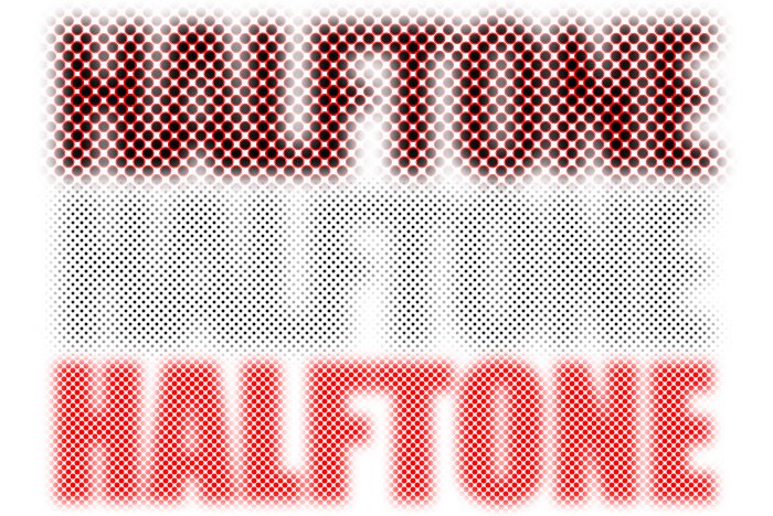
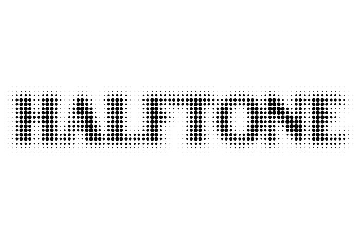
In today’s post, I’d like to apply a halftone text effect to the word “HALFTONE.” For this project, I’ll be taking advantage of Smart Objects, two filters and a layer effect or two. You’re going to love this one, so be sure to bookmark this page. I’ll show you how to blur the text, how to apply the halftone filter to it and how you can edit the actual word if you’d like to as well how to change the text color after the effect has been applied. Of course, there’s an endless number of results you can get when you’re experimenting with something like this, so I’ll stick with the basics with what I share down below. I’ll leave the creativity to you when working on your own project. This image below is of what I created just a few minutes ago while I was playing around. Once you get the hang of the necessary steps, you can create and apply this effect in about 30 seconds.

half-tone.jpg

Writing Out the Text​

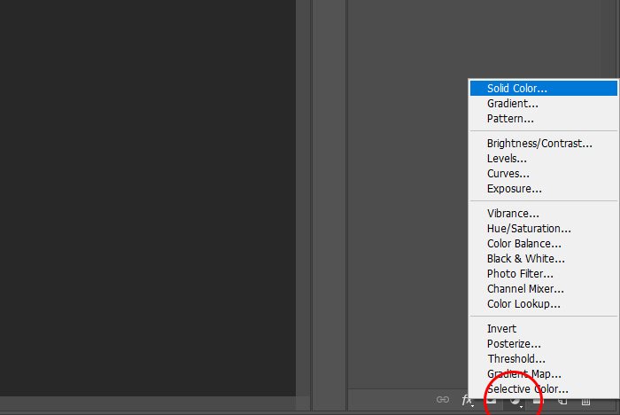
The first thing I’ll have to do for this project will be to set up some layers. The bottom layer will be a solid fill layer and the layer above that will be the text layer. To create the fill layer, I’ll head down to the bottom of the Layers panel and click the Create New Fill or Adjustment Layer button and when the menu appears, I’ll select the Solid Color option.

solid-color-fill-layer.jpg

I’ll make this solid color white.

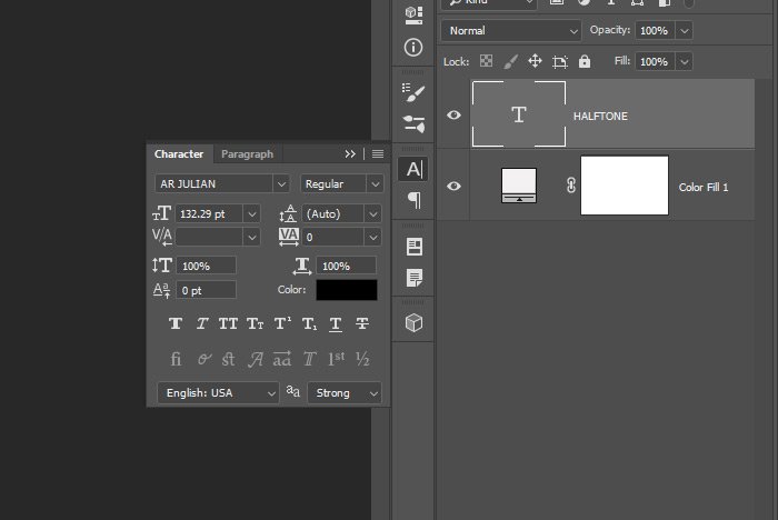
Next, I’ll write out my text with the Horizontal Type Tool, which will create a new layer automatically. I’ll then delete the background layer that was in the Layers panel by default. This is what the Layers panel will look like.

text-fill-layers.jpg

And finally, here’s the word I’ll be applying the effect to today. I decided to mix up the fonts and use AR Julian, which I thought looked nice.

text.jpg

Creating a Smart Object​

Because of the editable nature of this text, we’ll need to include both the fill layer and the text layer into one Smart Object. The process of accomplishing this is simple. I’ll click one layer in the Layers panel, hold down the Shift key and then click the other one. This is just to get both layers selected. Then, I’ll right-click on one of the layers and select Convert to Smart Object from the menu that appears. Doing this will change the two layers into one layer; the Smart Object. If I ever want to see the two original layers again, all I’ll need to do is double-click on the Smart Object layer thumbnail and those original layers will appear in a new tab, and they’ll be editable there.

Blurring the Text​

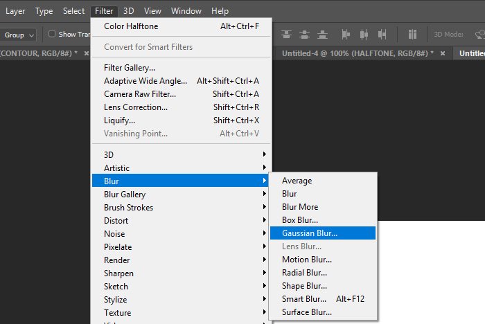
The next step that needs to be completed will be the blurring of the text. For this, I’ll head up to the Filter > Blur > Gaussian Blur menu item and click.

filter-blur-gaussian.jpg

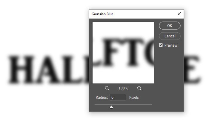
Once the Gaussian Blur dialog box appears, I’ll push the Radius slider to the left and to the right until I find a nice medium blur that offers what I’m look for, while still keeping the text legible. When I’m done with that, I’ll click on the OK button to apply the effect.

gaussian-blur-dialog.jpg

Applying the Color Halftone Filter​

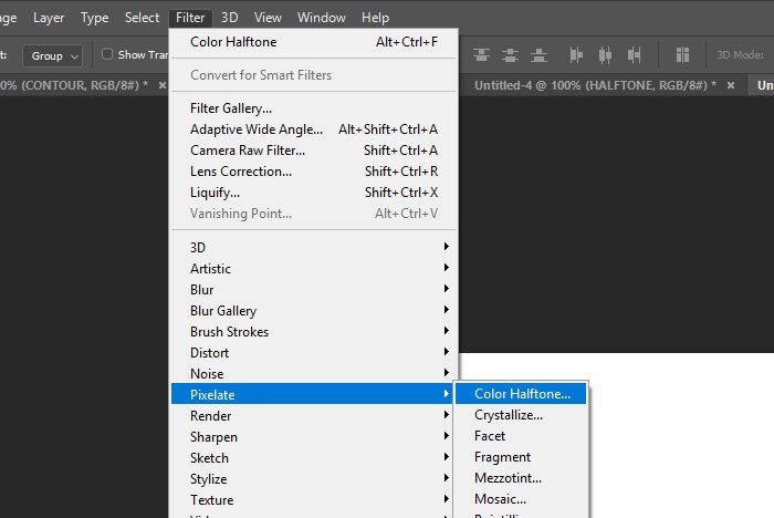
Okay, I’m now at the point of applying the actual Color Halftone filter to the Smart Object. To do this, I’ll visit the Filter > Pixelate > Color Halftone menu item and click.

filter-pixelate-color-halftone.jpg

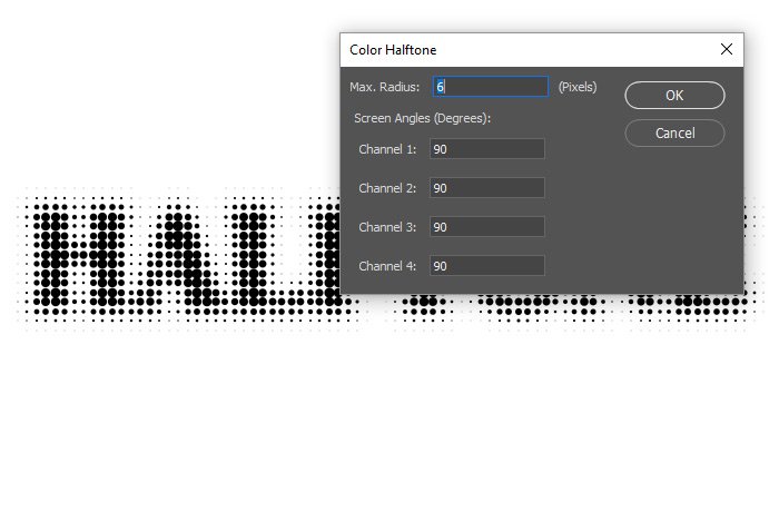
When I do that, the Color Halftone filter dialog box will appear.

color-halftone-dialog.jpg

This may take some trial and error. There are a few default values in this box when first using it and you may need to plug some numbers in and then hit the OK button, just to see how things look. There’s no preview with this filter, but I’m sure there will be someday. I chose to make the Max Radius 6 pixels and all four Screen Angles 90 degrees. This is my result with these values.

black-halftone.jpg

Changing the Look​

What’s great about this approach is that I can go in and change things any time I want. To change anything in the original text layer or the color layer, I’ll need to double-click on the Smart Object layer in this file. When I do that, another tab will open and I’ll have the ability to edit those original layers there (this is how Smart Objects work). I’ll need to make sure I visit the File > Save menu item once I’m done to apply the changes, but it’s really that easy.

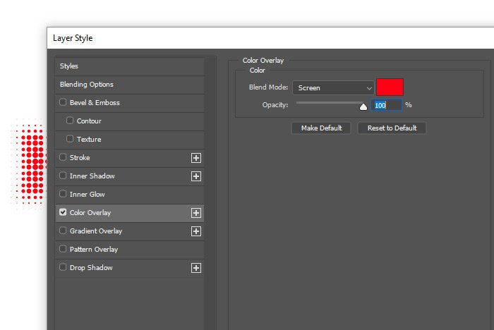
To change the color of the text and to play with the look of things a bit, I can double-click on the Smart Object layer itself so the Layer Style palette opens up.

layer-style-dialog-1.jpg

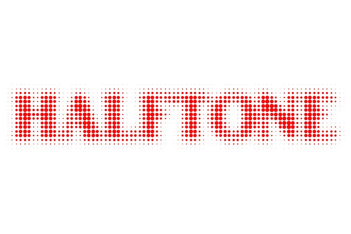
Once in the palette, I’ll click on the Color Overlay option in the left column and then choose the color I’d like to see the text. Because I have a white background, I’ll need to also select the Screen blend mode. To see some alternative changes, I could also run through the other blend modes, just to see if I bump into something I like. Once I’m finished here, I’ll click the OK button.

Here the text is in red.

red-halftome.jpg

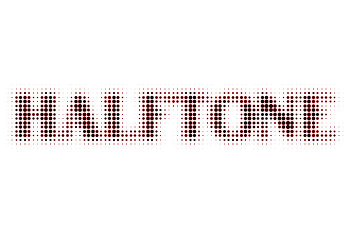
This is what the text looks like after I chose the Color Dodge blend mode.

color-dodge.jpg

Because the text, background and layer style are completely editable, the sky’s the limit when it comes to what can be done with this.

I hope I clearly explained how to apply both the Gaussian Blur and Color Halftone filters to a Smart Object in Adobe Photoshop. If you have any questions, please let me know in the comment section down below. Thanks for reading!
 
JodyBuchanan

JodyBuchanan

Member
Joined
May 10, 2021
Messages
138
Reaction Score
0
Points
21
  • #4

A Creative Text Effect Using Blending Modes in Adobe Photoshop​

The thing I love most about this text effect is that it’s so easy to pull off. There’s no special knowledge you need to accomplish what I’ll show you below, so if you can type out a few words and change a blending mode or two, you’re all set. I can see this type of effect being used all over the place. It’s sort of artistic, so you’ll need to choose where you’ll like to utilize it, but I think it looks good. Also, while this effect is simple to create, it’s not something that someone would just come up with, so this is more of a “Hey, that’s a really cool idea!” post than anything else.

In today’s post, I’m going to type out a few words inside of Adobe Photoshop. Then, I’ll color the words with something appealing so the base color matches what I have going on in my mind. After that, I’ll duplicate the text layer and flip it around so the text is backwards. I’ll color that duplicated layer with something complementary and finally, I’ll apply a blending mode to that new layer to see if I can get an effect out of it. I’ll show you a few samples of different blending modes down at the bottom of this post.

My Random Words​

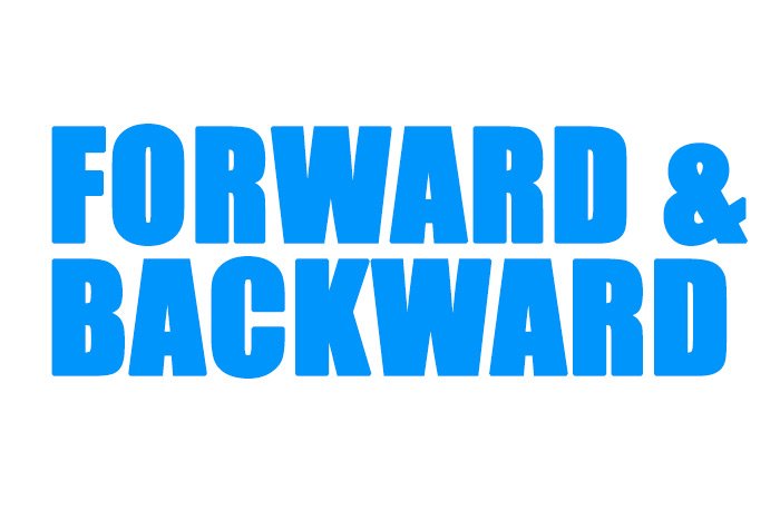
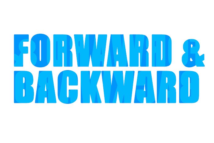
Okay, I already created a new file in Adobe Photoshop and now I’m ready to type out some random words. Since I have to type something, I’ll use the Horizontal Type Tool to write out FORWARD & BACKWARD. Here, have a look.

forward-backward-text.jpg

There, that should do it. As you can see, I also colored the text with a nice blue. More specifically, the color is #0099ff. Also, the font I chose is Impact at 129pt.

Duplicating the Layer​

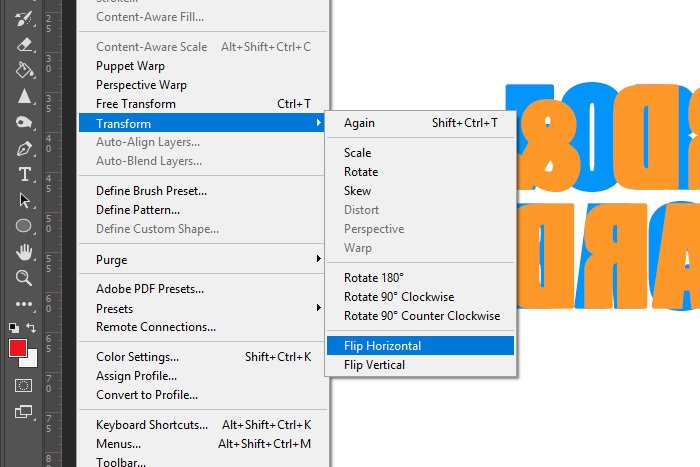
Next up, I’m going to duplicate this layer. To do so, I’ll click on the layer in the Layers panel and then use the keyboard shortcut of Ctrl+J. Then, I’ll color the text with a nice orange (#ff9900). Once that’s done, I’ll head up to the Edit > Transform > Flip Horizontal menu item and click. That will flip the text so it reads backwards.

edit-transform-flip-horizontal.jpg

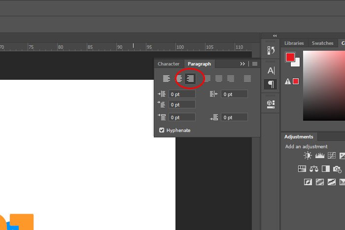
Finally, I’ll align the text to the right as opposed to the left in the Paragraph panel. I’ll make sure I move the text so the left edges match up as well.

paragraph-panel.jpg

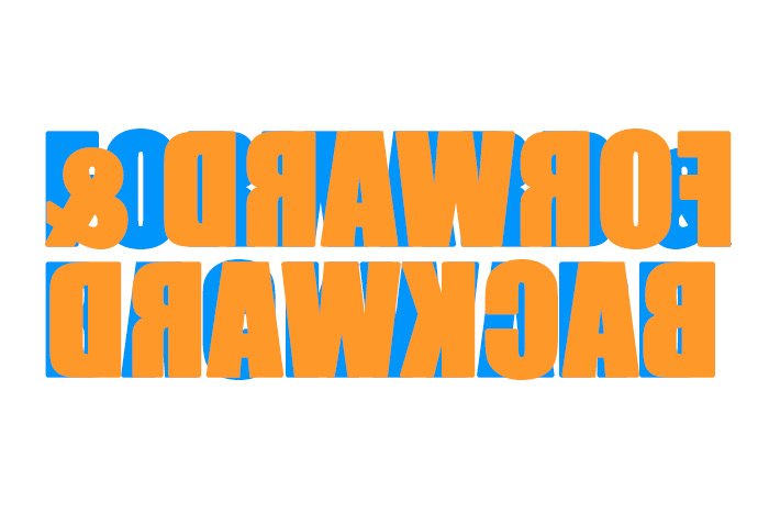
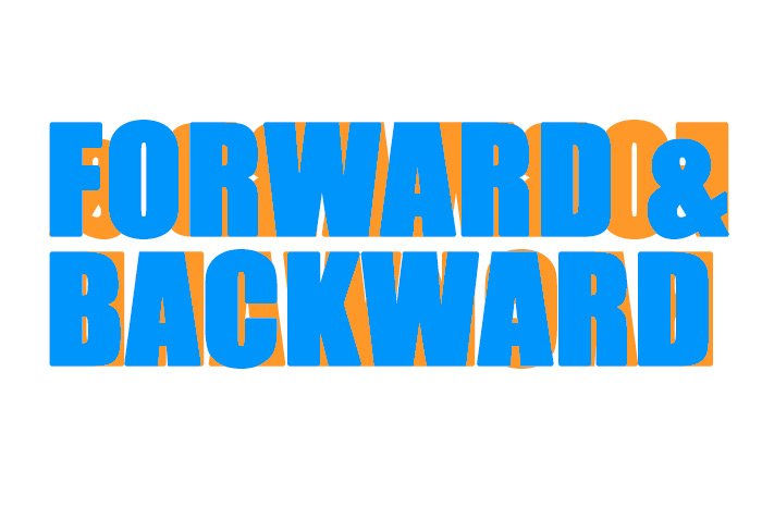
Here’s the result of all this.

opposite-layers.jpg

Applying Some Blending Modes​

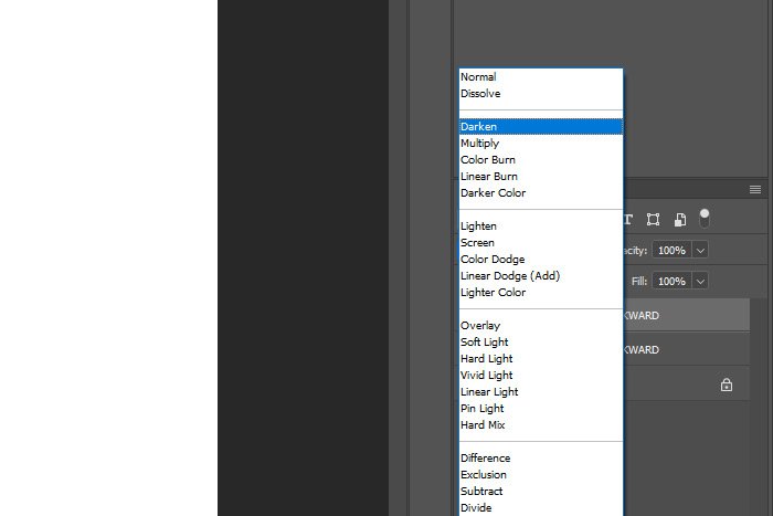
Really, all I have left to do is choose which blending mode I’d like to use. So, with this in mind, I’ll visit the top of the Layers panel, and with the orange text layer selected, I’ll run through some of the different options. By the way, it’s important that the orange layer be on top of the blue one in the Layers panel.

blending-modes.jpg

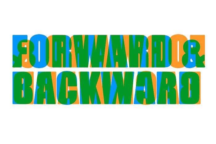
Let’s start off with Darken.

darken-blend-mode.jpg

Now let’s try Darker Color.

darker-color.jpg

How about Color Dodge?

color-dodge.jpg

I think I’ll settle on Overlay. It’s the most muted.

overlay.jpg

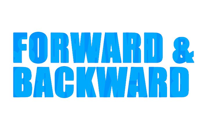
Since the overlay layer is so muted, I think I’ll change the color of that layer to white and then reduce the opacity of it to 30%. Here’s what I end up with as my final product.

white-color.jpg

I think that’s pretty good. As you can imagine, you can run the gamut with all the available options. You can change colors, opacities and blend modes to get the look you’re after. Experiment, have fun and create something wonderful.

I hope I clearly explained how you can create a neat text effect with duplicate layers, colors and blend modes in Adobe Photoshop. If you have any ideas for effects like this, please share them in the comment section down below or in the Photoshop discussion forum. Thanks for reading!
 
JodyBuchanan

JodyBuchanan

Member
Joined
May 10, 2021
Messages
138
Reaction Score
0
Points
21
  • #5

Cool Liquid Text Effect in Adobe Photoshop​

I’ve got a nice little text effect that I’d like to share with you today. This one is a “self-contained” effect, meaning it can be completed entirely inside of the Layer Style palette. It’s so simple, but it’s got a really cool look to it. I guess you could call it a liquid effect because the end result appears as though someone has melted the text inside of an oven. You’re going to love this one. And the best part is that after the effect has been applied, it’s completely editable. You can use the Horizontal Text Tool to change the wording if you wish.

In today’s post, I’m going to demonstrate how to go about applying the text effect I just mention above using Adobe Photoshop. I’ll first write the text out in an empty document and then I’ll apply a few different layer styles to it. From there, I’ll manipulate those styles in a way that’s somewhat unexpected. I hope you like it.

The Demo Text​

I’ll start off with writing a random word on an empty document inside of Photoshop. Today, I decided upon the word “MELTED” because it seemed appropriate. I also gave it a random color because the actual text color doesn’t even matter at this point. Here’s the text.

example-text.jpg

I have a document with two layers at this point. The bottom layer is a white background and the top layer is the text.

Adding a Drop Shadow & Adjusting the Settings​

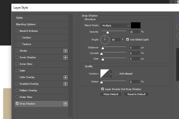
I’d like to now add a drop-shadow to the text. To do this, I’ll double-click on the text layer in the Layers panel and then, when the Layer Style palette opens up, I’ll click on the Drop Shadow option in the left column. If you’ve ever seen this area of the Layer Style palette, you’re familiar with what it looks like. If you’re not, this is pretty much the default look and these are the default settings.

drop-shadow-layer-style.jpg

It’s in this one area that almost all the work will be done. Watch how easy this is.

I’ll work right down this list of options. I’ll first change the Blend Mode to Normal and the Opacity to 75%. Then, I’ll keep the Angle at 90°.

This is what I have so far.

shadow-effect.jpg

Next, I’ll change the Distance, Spread and Size to 20px, 25% and 35px respectively.

Making these changes will give me this.

larger-shadow-effect.jpg

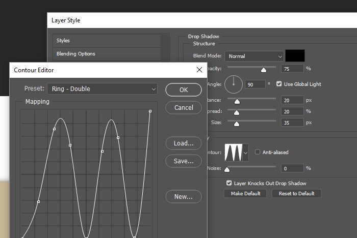
The next step I’ll take is to click on the Contour box and then, when the Contour Editor dialog opens up, I’ll click the Preset drop-down and inside of that drop-down, I’ll select the Ring – Double option.

contour-editor-ring-double.jpg

Now let’s take a look at what I have.

double-ring-contour.jpg

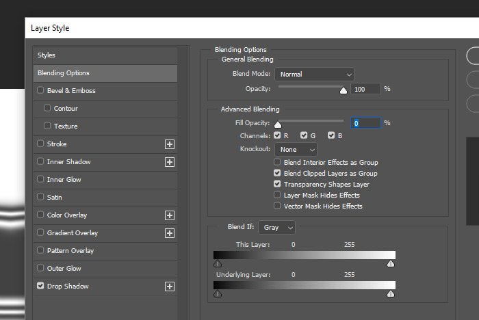
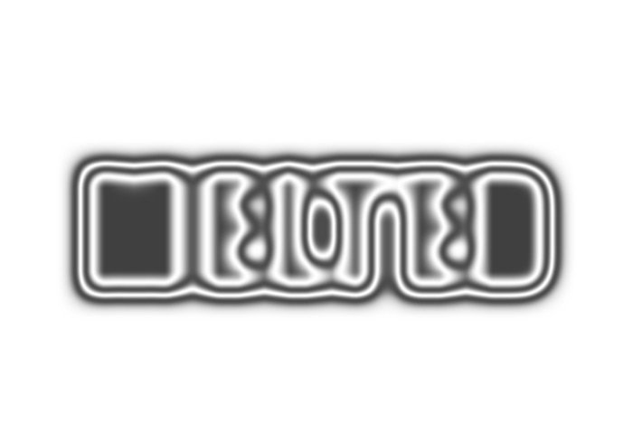
As you can tell, I’ve got a bit of a problem. We can clearly see that I’m going for a shadow effect, but the original text is blocking it. I’d like to get rid of that text, or at least hide it so it’s invisible. To do this, I’ll head up to the Blending Options option in the left column and click. Once I’m in that area, I’ll push the Fill Opacity slider all the way to the left until it has a value of 0%. This will completely hide the text, but will leave the shadow.

blending-options-fill-opacity.jpg

At this point, I think it’s safe to return to the Drop Shadow area, so that’s what I’ll do. But first, let’s take a look at what I’ve got as a result.

knock-out-text.jpg

Wait a second. That doesn’t look very good. The text is gone, but it appears that it’s still cutting out part of the shadow. Okay, the way to fix this is to uncheck the Layer Knocks Out Drop Shadow option in the Drop Shadow area. This will allow for the shadow effect to shine through, without being blocked at all by the original text.

You know, there’s a reason why I’m doing things in this order. I wanted to confront these issues as I was explaining things to you. I learn better like this and my hope is that you do too.

Okay, let’s see what I have now.

melted-text-effect.jpg

Making Final Adjustments​

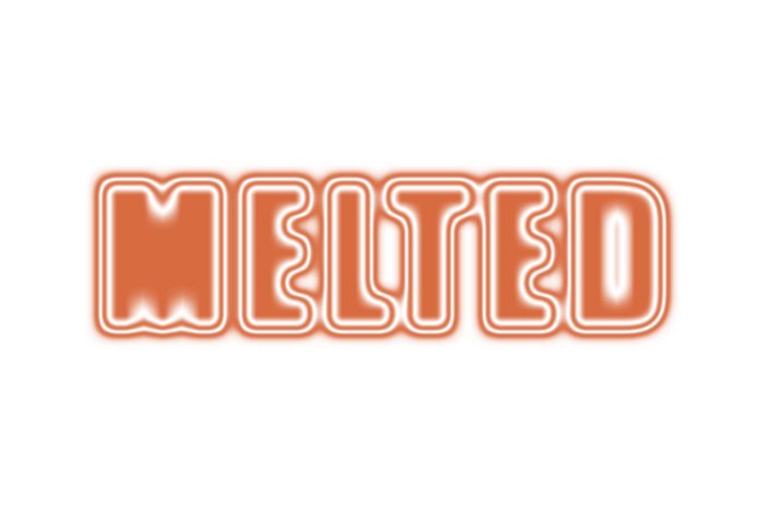
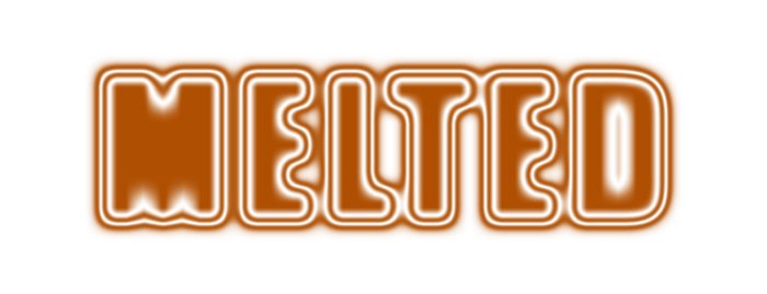
What I have right now is indeed the effect. A few minor adjustments need to be made though before it will actually look good. I’ll go ahead and change the color of the shadow to a darkish orange and then I’ll push the Size slider to the left a bit so its value is only 20px as opposed to 35px. That gives the text some clarity. Here’s the result.

orange-melted-text-effect.jpg

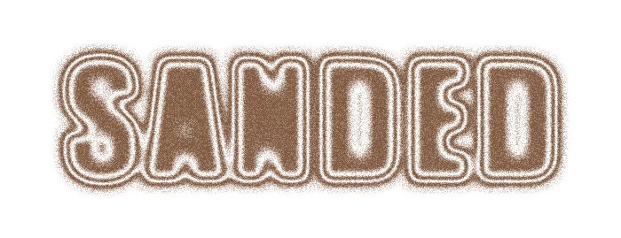
If I wanted to go even further, I could darken the orange a bit and add a 30% value for the Noise setting. This is what that looks like. It looks like a sandblaster hit the text, which could be neat in some cases.

sanded-effect.jpg

As you can see, I changed the text in the above example, just like I said I could in the top part of this post. It’s totally editable.

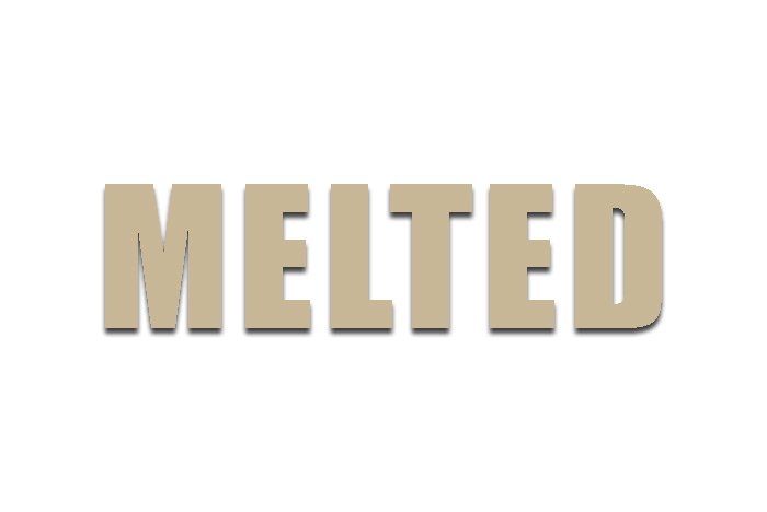
I hope you’re getting an idea of how flexible this area of editing in Photoshop can be. The sky really is the limit. I can sit here all day and make changes to this for a whole bunch of different effects, but I’ll leave that to you. I hope I clearly explained how to create this liquid or melted text effect as well as a sandblasted text effect inside of Adobe Photoshop. If you have any questions regarding this post, please ask in the comment section down below or in the Photoshop forum. Thanks for reading!
melted.jpg
 
JodyBuchanan

JodyBuchanan

Member
Joined
May 10, 2021
Messages
138
Reaction Score
0
Points
21
  • #6

How to Create a Static Text Effect in Photoshop​

I’ve got another cool Photoshop text effect for you today. This one is ultra simple and it shouldn’t take much time at all. All you need to do is write out some text with a text tool in Photoshop and then apply a layer style to it. I’ll show you how to do that below.

First, I’ll open a file and write some text. I’ll use the word “STATIC” for this demonstration. By the way, for best results, this technique is perfect for white text on a black background.

static-original-text.jpg

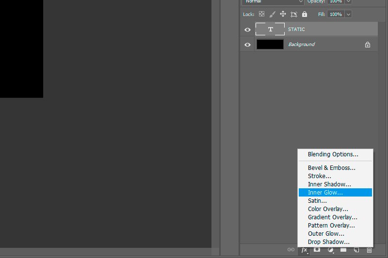
From here, I’ll head down to the bottom of the Layers panel and click on the Fx button and then click on the Inner Glow option.

inner-glow.jpg

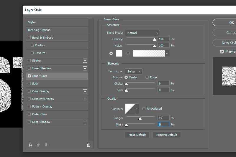
After I do that, the Layer Style palette will appear. Inside this palette, I’ll change a few different settings. Before I do that though, I’ll go into the Blending Options area in the same palette (left side menu) and I’ll push the Fill Opacity slider all the way to the left. Then, I’ll return to the Inner Glow area by clicking on that option in the left menu. At this point, I should see only a slight glow inside of the text. I’ve removed the color of the text and only the layer style remains.

inner-glow-layer-style.jpg

Next, I’ll change the following settings:

Source: Center
Blending Mode: Normal
Opacity: 100%
Noise: 100%
Size: 0px

This is what the Layer Style Palette looks like now.

static-layer-style.jpg

And this is what the effect looks like on the text.

text-static-effect.jpg

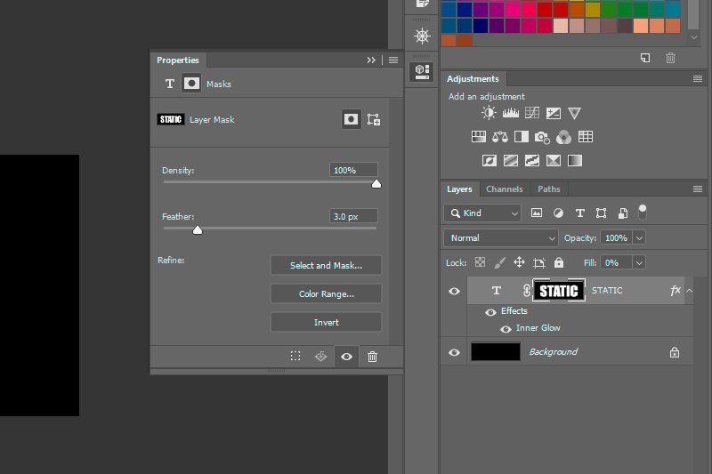
That’s fine if I wanted a simple static text effect. If I wanted something that’s more realistic looking, I could soften the edges of the text. To do that, I’ll need to add a mask. I’ll hold down my Ctrl (Command on Mac) button and click once on the type layer thumbnail in the Layers panel. Doing this will select the text. After that, I’ll click the Add Layer Mask button that’s located at the bottom of the Layers panel. This will add the mask. From there, I’ll double-click on the new mask thumbnail, which will open up the Properties panel for the mask. I’ll then push the Feather slider to the right until I see the soft edges I’m after.

layer-properties-panel.jpg

This is the final result. Not bad, right?

final-static-text-effect-photoshop.jpg

Let me know if you have any questions.
 
JodyBuchanan

JodyBuchanan

Member
Joined
May 10, 2021
Messages
138
Reaction Score
0
Points
21
  • #7

Another Text Effect with Blend Modes​

I’ve got a neat text effect for you today. You can create this right in Adobe Photoshop in about five minutes. All it takes is the use of the Horizontal Type Tool, some blending modes and some paragraph alignment. It’s so simple and I think it looks rather good.

Before I continue though, I’d like to mention that I’ve already written an entire post about this type effect here on this blog. Please go ahead and check that out as well because I’ve included lots of screenshots in that other post. They help explain things.

Okay, let’s get going. To create this type effect, I first wrote out some words. I typed one word and then hit the Enter key on my keyboard and continued typing in the same layer. This isn’t important, but it’s what I did. After the words were typed out, I assigned them a color.

After that, I duplicated the layer I just created and changed the paragraph alignment in the Paragraph panel to the opposite of whatever the first layer’s was. So, in my case, the first layer was left justified, so this next layer was set to right justified. Then, I nudged the new layer so it sat on top of the first layer as closely aligned as possible. I also set this top layer to a complementary color, which is only sort of important. You can set this to any color after you experiment with some different looks.

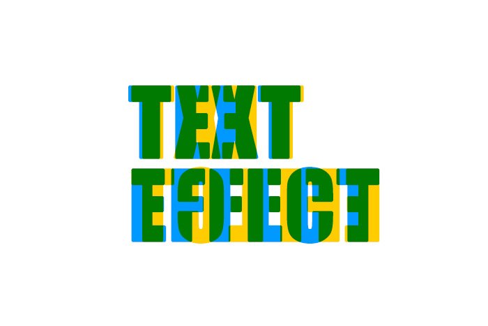
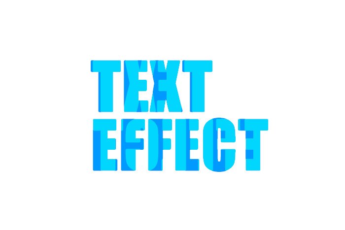
And finally, I went though some different blend modes that I applied to the top layer. Each mode gave the project an entirely new appearance. Some were good and some weren’t. In the example below, I ended up using the Multiply blending mode. Take a look.

text-effect.jpg

I could have just as easily used the Overlay blend mode for a different appearance. And again, I could also change the colors of the text for something entirely new.

overlay-type-effect.jpg

Give this a shot and let me know what you think. Also, if you have any input or questions, please comment below. Thanks!
 
Top