JodyBuchanan
Member
- Joined
- May 10, 2021
- Messages
- 138
- Reaction Score
- 0
- Points
- 21
- #1
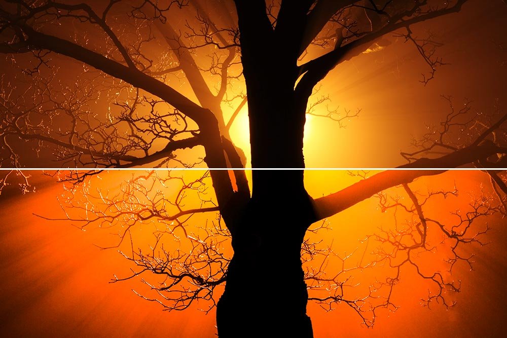
In Adobe Lightroom, there are a few tools that will help you quickly and easily adjust a photo’s exposure. Each of these tools is designed to assist with gaining as much benefit as possible, but without pushing things too far. If you increase or decrease exposure for a photo, the outcome may look good on your computer screen, but might not be suffice for print. With the use of the tools I’ll discuss below, you exponentially increase your chances for success.
In today’s post, I’ll work with a sample photo in Lightroom. I’ll show you how to edit the photo’s exposure and explain what clipping indicators are. Lastly, I’ll demonstrate how best to go about comparing the original photo with the modified one.
Choosing the Demo Photo
If you take a look at the screenshot below, you’ll see that I’ve launched Lightroom and have chosen the image that I’ll be working with.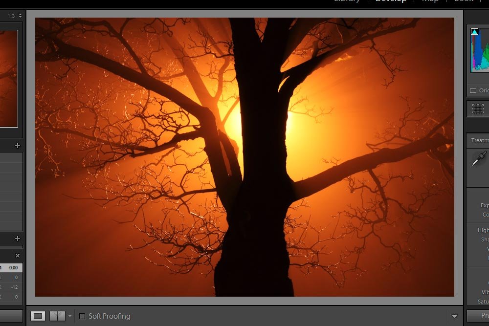
The reason I think this picture will be good to work with is because it’s got some very bright light that’s coupled with some dark, if not black, areas. As I go through the post and talk about the clipping indicators, you’ll see why this is beneficial.
What Are Clipping Indicators
When I refer to exposure in this post, I’ll be talking about a few different sliders in the Basic panel of Adobe Lightroom. Specifically, I’ll be referring to the Exposure, Highlights, Shadows, Whites and Blacks. The are the sliders that can affect what we consider to be too bright or too dark. When we go to the extreme in either of these areas, we lose what’s called “data.” If data is lost, we lose detail in a photo. So, instead of the photo displaying actual gradients and pixels that represent reality, they display solid white or black. Unless you’re going for that sort of look, that’s no good.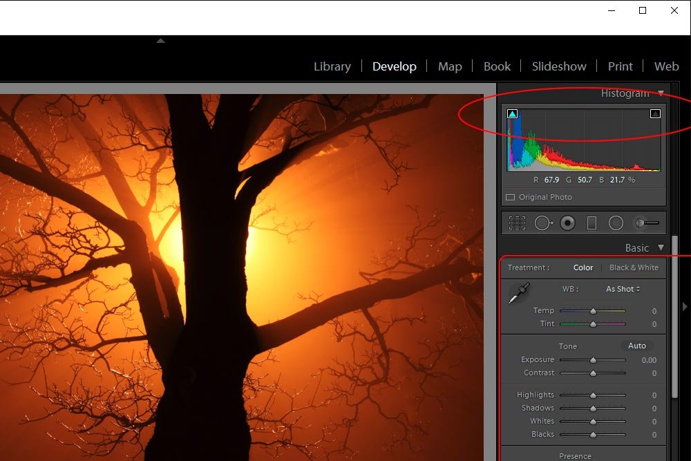
If you look at the above screenshot, you’ll see some areas that I enclosed in red. The first one I want you to look at is the lower Basic panel. In there are the sliders I was referring to above. Secondly, if you’ll notice in the red circle, you’ll see two triangles at the top of the histogram. Those triangles control whether or not the clipping indicators are turned on or off. The concept is very similar to one I already discussed inside of Adobe Camera Raw. If you’d like, you can read that post here:
Using the Histogram Clipping Warnings in Adobe Camera Raw
Basically, when the clipping indicators aren’t active (no white square around the triangle), you can adjust the aforementioned sliders without warning of going too far. I’ll show you an example below.
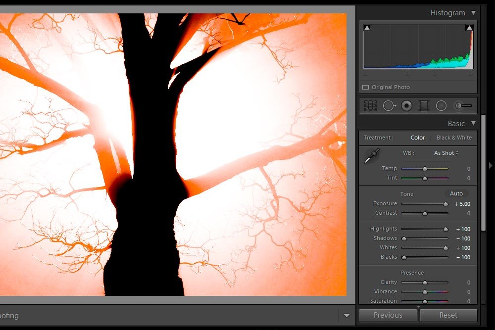
If you look at the photo above, you’ll certainly recognize that it’s wildly over and under exposed. And if you look at the slider in the Basic panel, you can see how I did this. I pushed each exposure slider as far as it would go, one way or another. Now, if I couldn’t see that well, I might think this looks good. I’d save the image and go off and print it or post it somewhere, only to become embarrassed later on when someone explained to me what I had done wrong.
The way clipping indicators work is this; if I push a slider to a point where the image begins to lose data or detail, an overlay of either red or blue will appear on the photo. These colors will cover the over or underexposed area. Red is for over-exposure and blue is for under-exposure. I’ll go ahead and click to activate the clipping indicators now. Let’s see what happens to the photo.
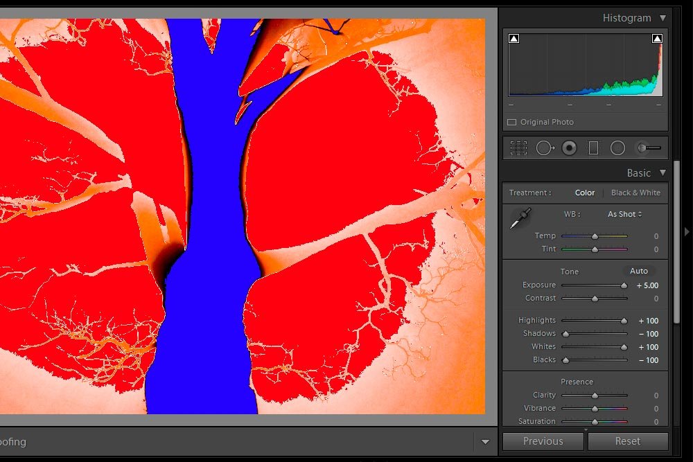
Wow – I’ve got some serious issues. I’ll go ahead and move the sliders so they’re only half-way pushed in either direction. Let’s see how the clipping indicators look after that. I’ll leave them on.
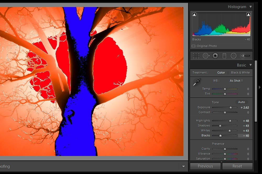
That’s looking a little better. Now, I’ll push the sliders so no clipping is showing at all.
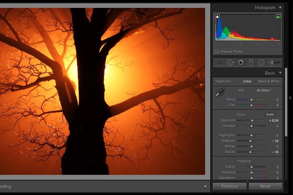
If you look very closely, you’ll see just a hint of red and blue. This isn’t bad at all. I’ll keep it like this. Apparently, this photo has had its dynamic range pushed as far as it can go. Aren’t familiar with dynamic range? Check out this post:
How To Use Your Camera Histogram For Awesome Photos
Checking the Before & After Versions
Earlier in this post, I mentioned that you may be after a certain look with your photos. Personally, I don’t really rely on the clipping indicators because I know I go too far. Sometimes, whites need to be white and blacks need to be black. I eyeball things quite frequently.When I do this, I find that comparing the before and after versions of whatever photo it is I’m working on is helpful. Because of this, I felt that it may be beneficial for me to explain how I go about this.
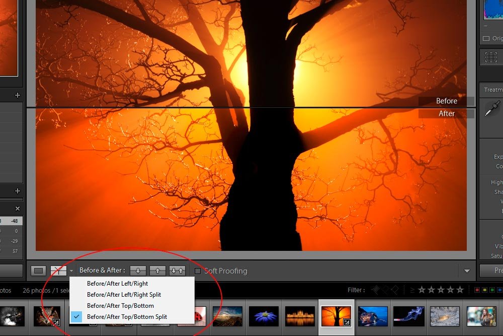
In the above screenshot, I circled the area I use to control which before and after view I’d like to use. As you can see, there are a few different alternatives. There are Before/After Left/Right, Before/After Left/Right Split, Before/After Top/Bottom and Before/After Top/Bottom Split. In general, I prefer the “split” options because they show the image in halves and they are closer to each other, giving me a more accurate view of things.
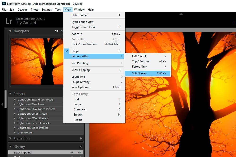
If you’re looking for some keyboard shortcuts to control these options, you can head up to the View > Before/After menu item and either select the options that appear or read the keyboard shortcuts to the right of the options.
