WendyMay
Member
- Joined
- May 11, 2021
- Messages
- 142
- Reaction Score
- 0
- Points
- 21
- #1
I’m sure you’ve seen what a Drop Shadow effect looks like when it comes to graphics. They’re everywhere. This effect was one of the very first ones I toyed with when I began using Adobe Photoshop and it’s still just as elegant today as it was back then. I’ll confess that I did have a very brief love affair with the Bevel & Emboss effect, but that was short lived. I abused that one and I had to give it up. When everything is embossed on a poster or postcard, it doesn’t look very good. Less is more in many cases. How embarrassing.
Anyway, the drop shadow effect is very cool. There’s a lot you can do with it and if applied correctly, it can completely transform whatever it is you’re working on to a multi-dimensional piece of art. Flat graphics have their place as do letters that seem as though they’re floating off the page.
In today’s post, I’d like to walk through a quick project that has to do with the creation and application of drop shadows in Adobe Photoshop. To do this, I’ll create some text on a solid background and then work inside of the Layer Style palette to adjust and apply the shadow. While this can be a very simple and straightforward process, I hope to dazzle you with a few additional tips and tricks. Read on below!
To apply the first drop shadow to the text in this project, I’ll double-click on the text layer in the Layers panel. This will open up the Layer Styles palette, where I’ll click on the check box to the left of the Drop Shadow option in the left column. Then, I’ll click on the words Drop Shadow themselves, which will reveal the options for this effect. Take a look.
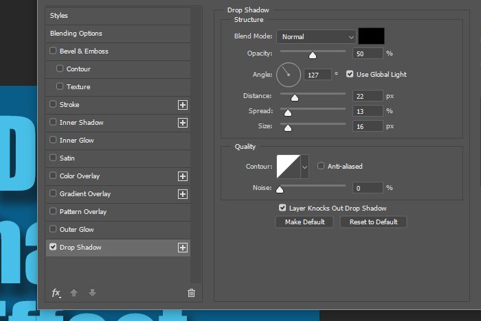
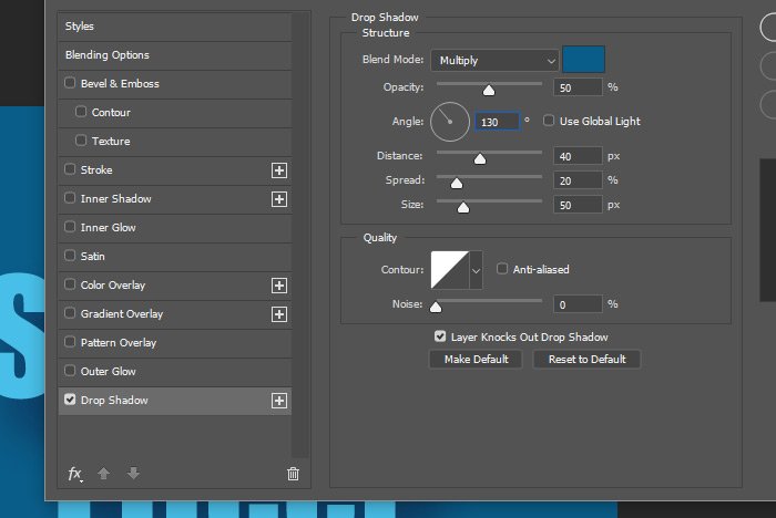
This first shadow I’m making can be considered somewhat of a base layer. It’s not going to be one of those distinct shadows that we see out there so frequently. To create the base shadow, I’ll make these settings:
Blend Mode: Multiply
Color: Same as background
Angle: 130 degrees (turn off global light)
Distance: 40px
Spread: 20%
Size: 50px
Here are the settings so you can see them.
And this is the output of that.
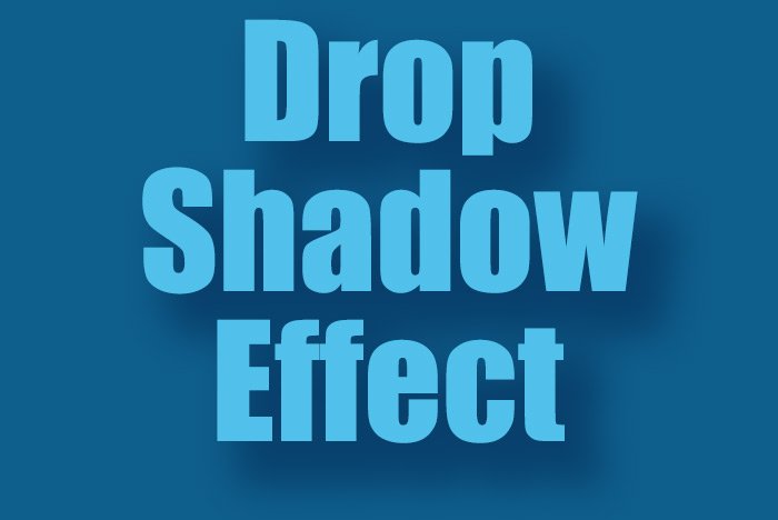
I’d say that’s pretty good. It really separates the text from the background and it looks like a shadow. I actually just looked at things again and decided to increase the Opacity to 75% from 50% and I also added some Noise at 20%. These weren’t huge changes and they’re actually barely noticeable, but I though they looked good.
Again, this new shadow effect was created with the same settings as the previous one I was just working on. I don’t necessarily want all those settings to be the same, but I will keep some. The settings for this shadow that I’ll change are:
Opacity: 85%
Angle: 140 degrees
Distance: 20px
Spread: 50%
Size: 20%
Noise: 0%
When I’m finished with this one, I’ll click the OK button to apply it. Let’s take a look at it.
Blend Mode: Multiply
Opacity: 25%
Gradient: Black to White
Angle: 40%
For the other settings, I’ll leave them as their defaults. Here is the settings area for this effect.
This is what the text looks like now. The gradient overlay is subtle, but very nice.
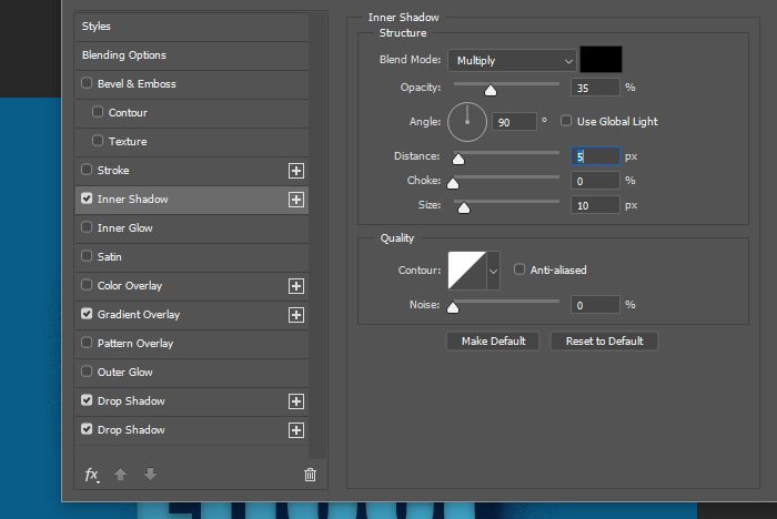
Blend Mode: Multiply
Color: Black
Opacity: 35%
Angle: 130 degrees (turn off global light)
Distance: 5px
Choke: 0%
Size: 10px
Here’s a visual of the settings I used for this one.
And finally, here is the resulting text.
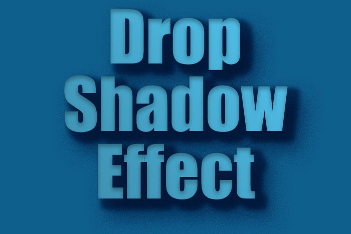
I actually like the text with just the two shadows applied to it the best because the text remains bright, but I wanted to show you some of the possibilities, especially as the text size changes. You can change the effects so they’re tighter or more spread out. For instance, if I double-clicked on the Inner Shadow effect in the Layers panel and and changed the Size attribute to a zero value, the soft shadow would turn hard. I could do the same thing with the second drop shadow I created to harden that one up as well.
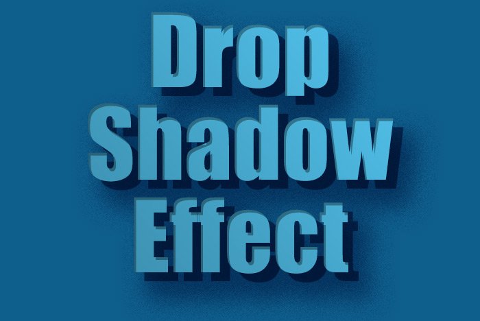
As you can see, the creative possibilities are there. If I removed the gradient overlay, but kept the hard shadows, this is what I’d end up with. Oh, I could go on all day.
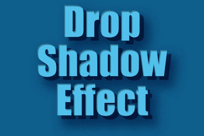
This one is my favorite. Okay, I have to stop there or I’ll never stop.
I hope I clearly explained how to apply different effects, such as Drop Shadow, Gradient Overlay and Inner Shadow, to text in Adobe Photoshop. If you have any questions regarding this post, please let me know in the comment section down below or in the discussion forum. Thanks for reading!
Anyway, the drop shadow effect is very cool. There’s a lot you can do with it and if applied correctly, it can completely transform whatever it is you’re working on to a multi-dimensional piece of art. Flat graphics have their place as do letters that seem as though they’re floating off the page.
In today’s post, I’d like to walk through a quick project that has to do with the creation and application of drop shadows in Adobe Photoshop. To do this, I’ll create some text on a solid background and then work inside of the Layer Style palette to adjust and apply the shadow. While this can be a very simple and straightforward process, I hope to dazzle you with a few additional tips and tricks. Read on below!
The Demo Text
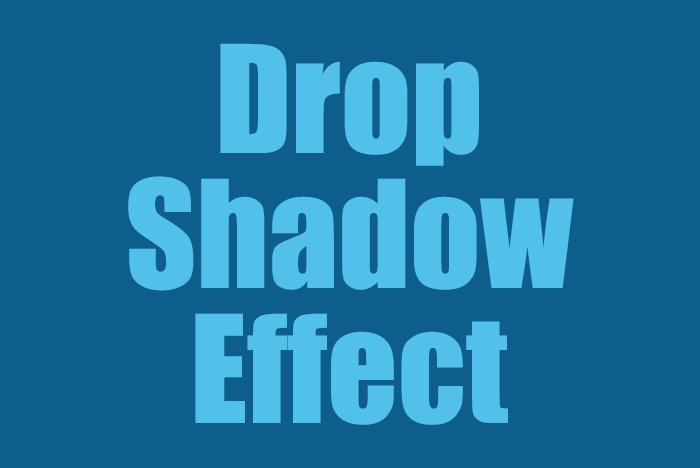
I wrote out some generic text and tried to accompany it with some basic colors that I felt a shadow would appear clearly on. This is what I came up with.
Adding the First Drop Shadow
Since I have already shared a post that has to do with applying layer styles in general here, I won’t go too far in depth with what I share below.To apply the first drop shadow to the text in this project, I’ll double-click on the text layer in the Layers panel. This will open up the Layer Styles palette, where I’ll click on the check box to the left of the Drop Shadow option in the left column. Then, I’ll click on the words Drop Shadow themselves, which will reveal the options for this effect. Take a look.

This first shadow I’m making can be considered somewhat of a base layer. It’s not going to be one of those distinct shadows that we see out there so frequently. To create the base shadow, I’ll make these settings:
Blend Mode: Multiply
Color: Same as background
Angle: 130 degrees (turn off global light)
Distance: 40px
Spread: 20%
Size: 50px
Here are the settings so you can see them.

And this is the output of that.

I’d say that’s pretty good. It really separates the text from the background and it looks like a shadow. I actually just looked at things again and decided to increase the Opacity to 75% from 50% and I also added some Noise at 20%. These weren’t huge changes and they’re actually barely noticeable, but I though they looked good.
Adding a Second Shadow
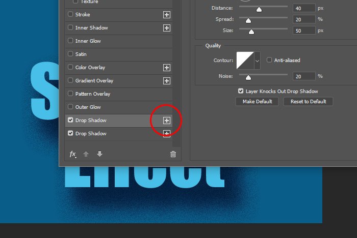
To make things interesting, I’m going to add on another shadow. I think you’ll appreciate this effect. To add another shadow with the same exact settings as the one I just added, I’ll simply click the small + symbol that sits to the right of the Drop Shadow title in the left column.
Again, this new shadow effect was created with the same settings as the previous one I was just working on. I don’t necessarily want all those settings to be the same, but I will keep some. The settings for this shadow that I’ll change are:
Opacity: 85%
Angle: 140 degrees
Distance: 20px
Spread: 50%
Size: 20%
Noise: 0%
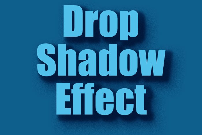
When I’m finished with this one, I’ll click the OK button to apply it. Let’s take a look at it.

Adding a Gradient Overlay
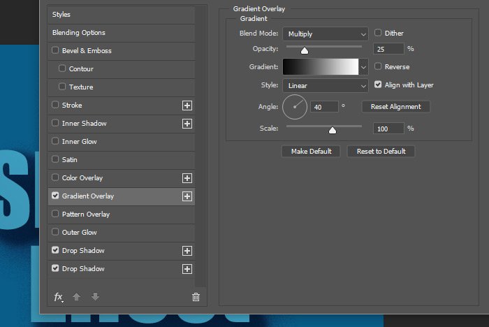
While I think this shadow couple is looking really nice and that it truly wakes this text up, I think I can go a bit further to add more flair to the text. I’d like to also add a Gradient Overlay. To do this, I’ll click on the check box to the left of the Gradient Overlay title in the left column of the Layer Style palette. Then, I’ll click on the title itself to show the settings area. Once that’s done, I’ll change these settings:Blend Mode: Multiply
Opacity: 25%
Gradient: Black to White
Angle: 40%
For the other settings, I’ll leave them as their defaults. Here is the settings area for this effect.

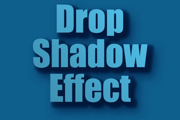
This is what the text looks like now. The gradient overlay is subtle, but very nice.

Adding an Inner Shadow
By now, you should be getting the hang of how to apply effects to text or an object. What I do is cruise around the Layer Style palette and play with things as experimentation. If I like something, I keep it. If I don’t, I leave it alone. In this case, an inner shadow adds to the depth of the text, so I decided to keep it. To add the Inner Shadow, I clicked on its check box and then on the text, just like I did with the others. Then, I changed a few of the default settings. Here they are:Blend Mode: Multiply
Color: Black
Opacity: 35%
Angle: 130 degrees (turn off global light)
Distance: 5px
Choke: 0%
Size: 10px
Here’s a visual of the settings I used for this one.

And finally, here is the resulting text.

I actually like the text with just the two shadows applied to it the best because the text remains bright, but I wanted to show you some of the possibilities, especially as the text size changes. You can change the effects so they’re tighter or more spread out. For instance, if I double-clicked on the Inner Shadow effect in the Layers panel and and changed the Size attribute to a zero value, the soft shadow would turn hard. I could do the same thing with the second drop shadow I created to harden that one up as well.

As you can see, the creative possibilities are there. If I removed the gradient overlay, but kept the hard shadows, this is what I’d end up with. Oh, I could go on all day.

This one is my favorite. Okay, I have to stop there or I’ll never stop.
I hope I clearly explained how to apply different effects, such as Drop Shadow, Gradient Overlay and Inner Shadow, to text in Adobe Photoshop. If you have any questions regarding this post, please let me know in the comment section down below or in the discussion forum. Thanks for reading!
