JodyBuchanan
Member
- Joined
- May 10, 2021
- Messages
- 138
- Reaction Score
- 0
- Points
- 21
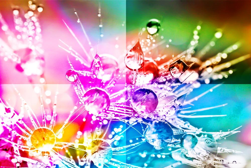
Back in the day – and I mean about 15 years ago – I used to do a lot of print work. I’d design advertisements for newspapers, magazines, bus backs, car wraps and billboards. Not to mention those really cool, UV coated cards that were perfect for promoting nightclubs, car shows and anything else that needed to be passed out by hand. Needless to say, I’ve designed with my fair share of using the CMYK color mode in Adobe Photoshop. These days though, I strictly use RGB mode. I only work online, so the days of using a color mode from print are over.
I used to think that once someone knew what the primary differences between RGB and CMYK were, that was it. They were finished. You just use one or the other. Right? I mean, open up a file in Photoshop, start working on it, if something looks weird, head up to the Image > Mode menu item and make sure you were using the correct settings. It’s really that simple. Or is it…
When I used to design all these different types of media, I talked to a lot of other designers and printers. As it turns out, the printers knew what they were talking about, but unfortunately, the designers oftentimes didn’t. Well, they sort of did. Many of them thought they were hot stuff and that they could whip up the latest and greatest look, but when it came time to print whatever it was they created, they fell flat. The reason this happened is because what looked really awesome on the screen didn’t translate all too well on paper.
What these folks needed to understand is more at the core of design work. They needed to understand what’s called the Color System. This is the system in which colors differentiate themselves among one another and define how to work with one another. It’s really an important piece of working with graphic design and has come to play a major part of photographic post-processing. It’s one of the pillars that’s necessary to understand in this line of work and once it’s understood, it can be used to anyone’s advantage, especially when it comes to working in Adobe Photoshop.
If you’d like to read a quick primer on color systems, please take a look at this page:
Color Systems – RGB & CMYK
In today’s post, I’m going to explore the differences between the most commonly used color modes in Photoshop. These are RGB, CMYK and Lab. While most people might recognize RGB and CMYK, they may have never heard of Lab, which is a shame because it’s quite interesting and is very useful for everyday photo editing. I’ll cover what each of these color modes are and why each one is important to understand and become familiar with. I’ll also talk about how they can enhance your workflow. If you’re not utilizing the tools Photoshop offers in the way of color modes and channels, you’re truly going to appreciate this post.
RGB – Red, Green, Blue
If you’ve ever taken a photo or worked inside a photo editing program, you’ve surely heard of RGB. RGB stands for red, blue, green and is an additive color system. All an additive color system means is that the more color you add to another color, the brighter the combination gets. Cameras and computer monitors use this type of color system because they employ light as a visual necessity. If you add red and green together, you get yellow. If you blue and green together, you get cyan and if you add red and blue together, you get magenta. If you add all three together; red, green and blue, you get white.I know this is difficult to get your head around by just reading these words. To help out, I’ll head into Photoshop to help clarify the idea.
Channels
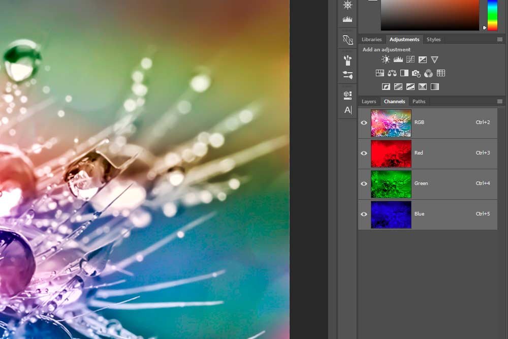
Let’s take a look at how Photoshop breaks down color inside the application. After all, images don’t just appear as one combined entity; rather they consist of pieces, or parts, of different colors.I’ll head into Photoshop, open a photo and click the Channels tab over in the Layers panel.
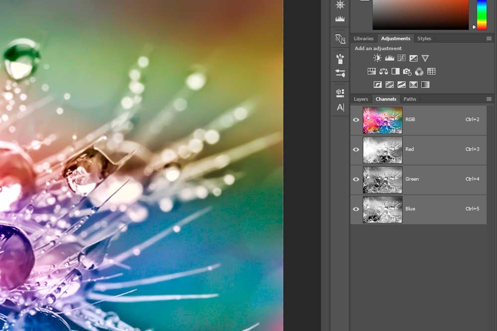
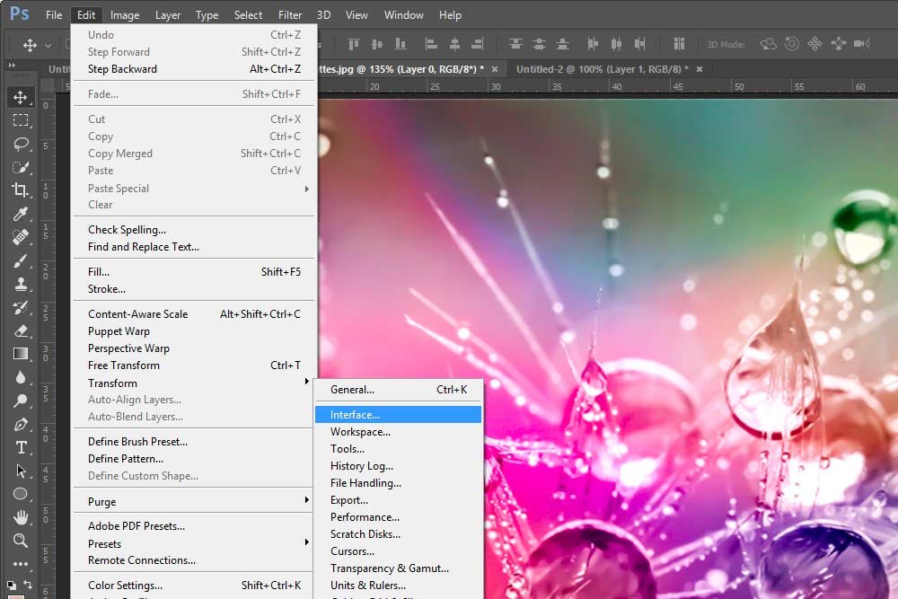
As you can see, we have the top, fully colored, image, along with a channel for each of the three colors that compose the photo. There’s a distinction for red, green and blue and right now, each one is represented in grayscale. Since looking at black and white images doesn’t really do us a lot of good, I’ll head up to the Edit > Preferences > Interface menu item and select it.
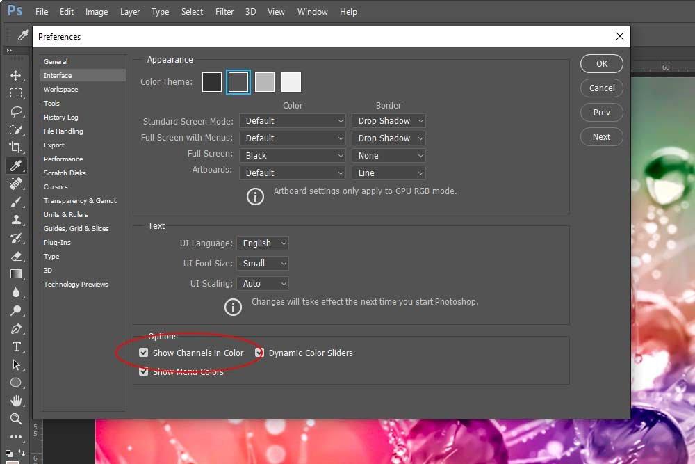
Once I do that, I can click the Show Channels in Color checkbox down in the Options area to change the look of the channels from grayscale to each of their respective colors.
Now when we look at the channels, their colors become much more apparent. This is going to help tremendously later on in this post.
Viewing Each Color Channel
Believe it or not, if you’ve read this far, you’ve already whizzed by more than 90% of people who have ever had the luxury of opening Photoshop. Most folks don’t even know the Channel tab is there and for those who may have clicked on it, things looked so foreign that they clicked right back to the more friendly Layers tab. This is a shame because a fair amount of the behind the scenes happens in the Channels area and to understand it can certainly help your post-processing.In this section, I’m going to show you what each, individual color channel that makes up this photo looks like. I’ll start with the red channel and then follow with the green and then the blue.
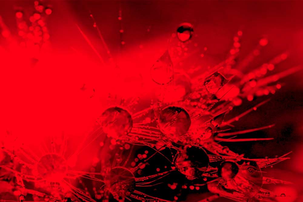


As you can see, by themselves, these channels don’t show much information and don’t really show us the photo with any sort of recognition. It’s not until we begin combining these colors that the photo we know begins to reveal itself.
By the way, to view each channel by color, I simply clicked on it. It’s just like clicking on a layer, but it’s, well, a channel. When a channel is clicked, the visibility of all other channels will be hidden. Only that one color will show. To continue viewing the different channel colors one by one, you can click on the little eye icon that sits to the left of each channel. By doing that, you’ll effectively turn that channel on and off. To combine color channels, click the eye icon for two channels and leave one unclicked.
Mixing Colors
The fun with channels truly begins when we start mixing colors. If we kept each one independent, it would be boring. Mixing each channel, one by one, will bring us back to our original, fully colored, photo.To illustrate how these channels can look when combined, I’ll create a graphic that shows, not only the individual channels themselves, but the combinations of the channels. Take a look below.
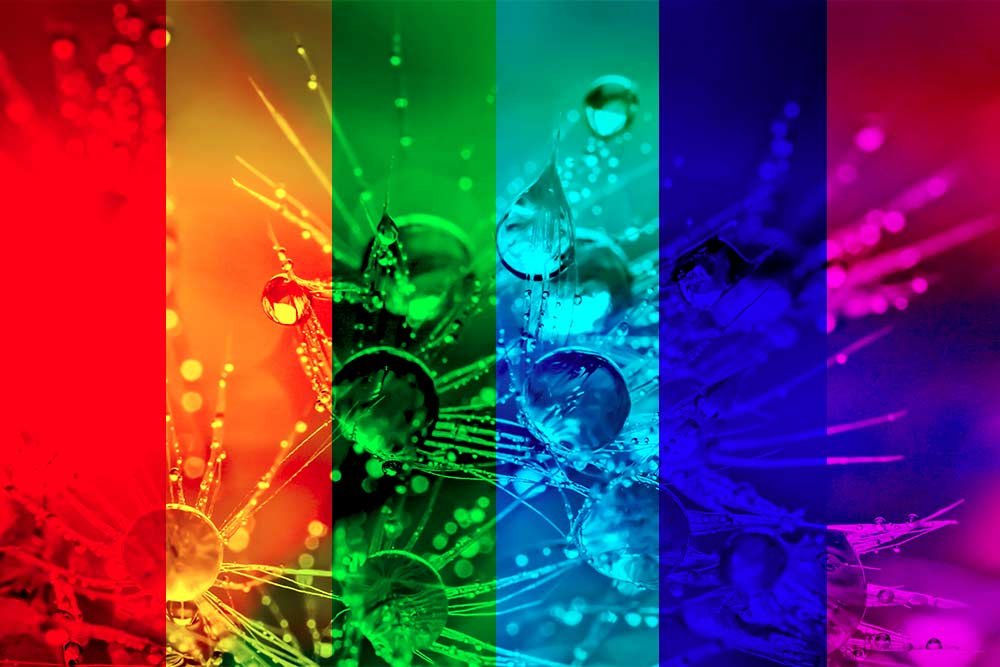
In the above graphic, there are six vertical stripes. Three of these stripes we’ve already seen. They are the first, third and the fifth (from the left). These three stripes represent the red, green and blue channels. The second stripe is the combination of red and green. The fourth stripe is the combination of green and blue and the sixth stripe is the combination of red and blue. If you’ll notice, each stripe that consists of two colors, as opposed to one, actually looks better then the lone color. This is because, as I stated above, when colors are combined in an additive color system, they become brighter and more representative of the actual image. In any of the combination stripes, all that’s missing is one last color to complete the photo.
CMYK – Cyan, Magenta, Yellow, Black
Let’s get one thing out of the way before I go any further. For the longest time, I wondered why the K in CMYK wasn’t B for black. I always assumed that someone, way back, chose K because, perhaps, B would be mistaken for blue. Well, as it turns out, the K stands for Key. In print, there is a key plate that controls the black ink that’s applied to a graphic. That black ink is what gives the graphic detail and contrast. When something is printed, the three previous colors will be applied and at the end of the process, the black. The black is applied via a key plate.Although, this is speculative and this web page describes an interesting alternative to this bit of history. Check it out if you’re interested in this sort of thing.
Anyway, let’s move on. In this section, I’d like to discuss the CMYK color system – the system that’s used in print.
To change color modes in Photoshop, I’ll head up to the Image > Mode > CMYK Color menu item and select it.
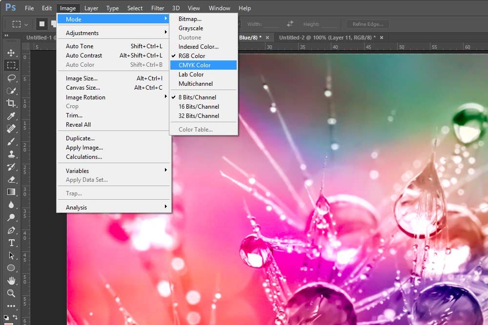
When I select that menu item, I receive a warning pop-up message. It says Changing modes can affect the appearance of layers. Flatten image before mode change? There are three options to choose from. One says Flatten, the next says Cancel and the last says Don’t Flatten. Since my image is only one layer, it doesn’t matter if I flatten or not. I clicked Flatten and this is what happened:
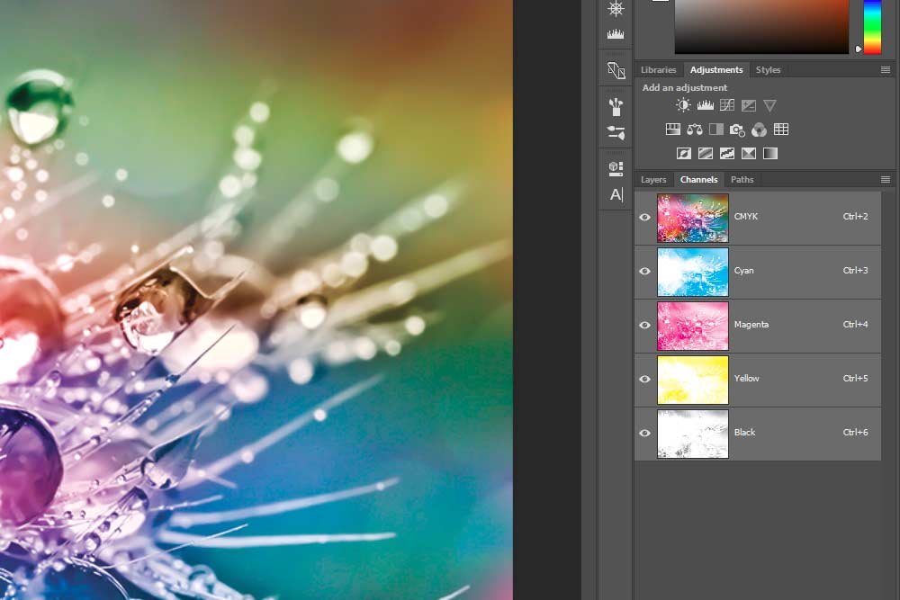
As you can see from looking at the channels in the Channels panel, things have changed a bit. The first thing that’s obvious is that there are now four channels as opposed to only three. If you haven’t guessed, these new channels represent cyan, magenta, yellow and black.
Another difference you may notice is that these channels are much lighter than those in the RGB color mode. This is because, instead of combining to create a lighter color, these new channels combine to create a different color. And where you see white in the world of CMYK is merely the absence of color.
Think of each channel as a screen. First, you lay the cyan screen down and add this color where it’s called for. Then, you move on and lay the magenta screen down and add magenta right on top of the cyan. If both of these screen have white areas, or the absence of color, nothing is laid down. It’s these layers that create a fully colored image.
If I wanted to, I could go through the same exact steps for the CMYK channels as I did for the RGB. Meaning, I could click on one channel to show only that color and then I could click the eye icon in each channel to combine them. I’ll let you play with this because if I did, I’d end up with far too many screenshot in this post. I push it as it is.
What I will do, however, is do create a graphic like I did for the RGB color mode above. This graphic shows each CMYK color channel and in between those channels, will show the combinations. Here it is.
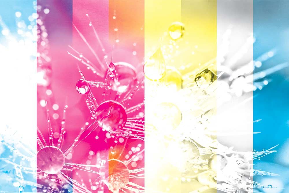
Since there are four channels in this color mode, there are a few more combinations I didn’t include here. This is what the ones I did include are:
Cyan
Cyan + Magenta
Magenta
Magenta + Yellow
Yellow
Yellow + Black
Black
Black + Cyan
Pretty interesting, if I don’t say so myself.
Lab – Lightness + A & B
While I’ve been familiar with RGB and CMYK for years, I’ll be honest with you when I say that I’ve never given the Lab color mode much thought throughout my career. The funny thing is, I find this color mode the most interesting of the three.Let me explain exactly what the Lab color mode is. In the most basic sense, the Lab color mode contains a lightness component that can range between 1 and 100. It also contains an a axis and a b axis. In the color picker inside of Photoshop, the a axis is vertical and the b axis is horizontal.
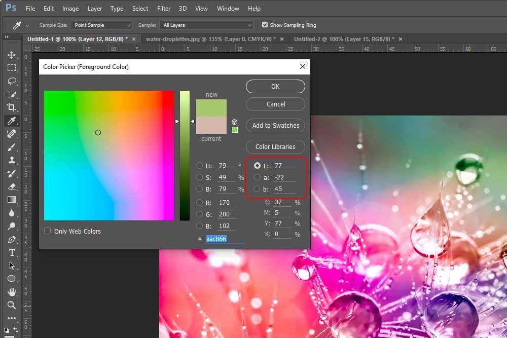
This color mode has a range of what the human eye can see, so its gamut is larger than either RGB or CMYK. Since this is a complex area, I’ll offer you two links that will allow you to read further, if you’re interested.
Lab Color Space at Wikipedia
Understanding Photoshop Color Modes – Adobe Support
What I’d like to show you in this post is how you can use the Lab color mode to your advantage while editing images.
To kick things off in this final section, I’m going to head back up to the Image > Mode > Lab Color menu item and click.
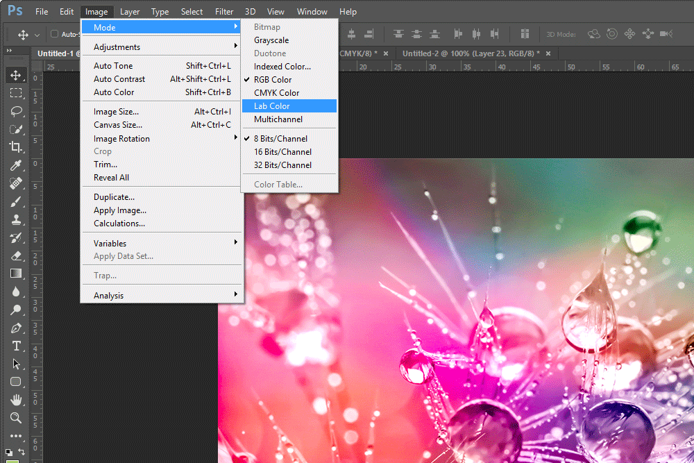
After I do that and I click on the Channels tab in the Layers panel, I’ll see the new channels.
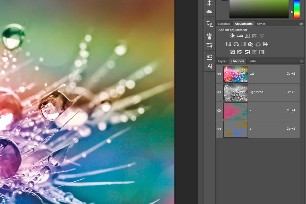
Now, as I did above, I’ll make a graphic that shows the available channel combinations. Below, I’ll explain which combinations are which.
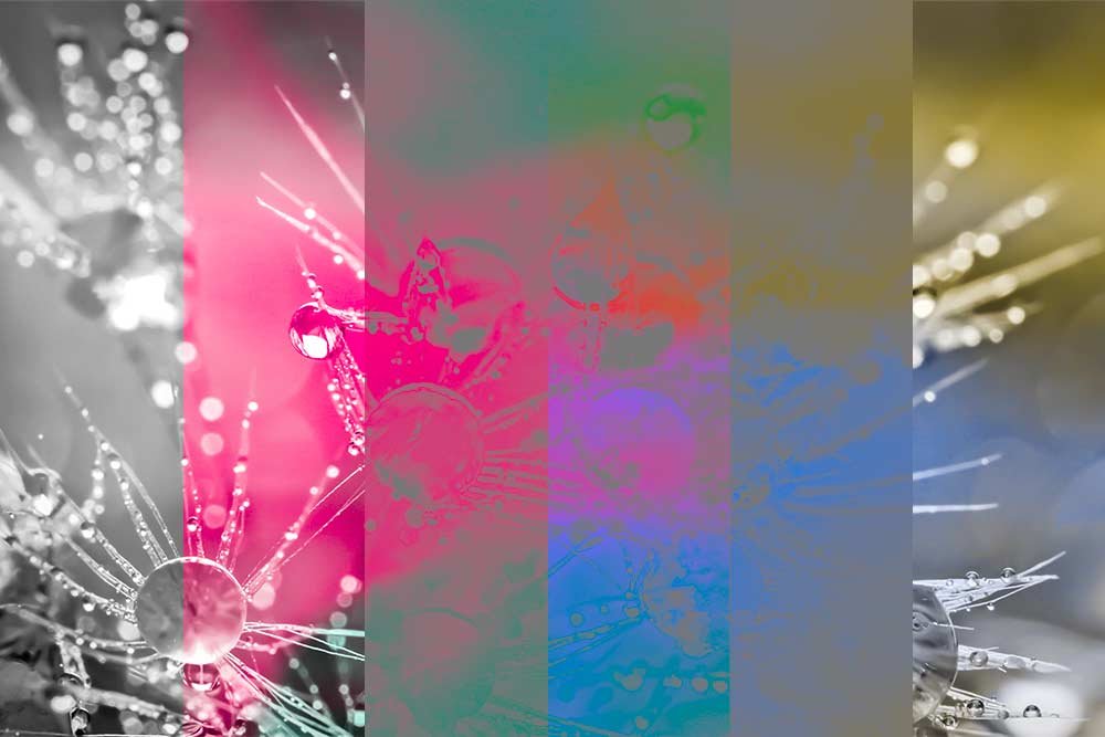
For the graphic above, these are the channels and channel combinations:
Lightness
Lightness + a
a
a + b
b
b + Lightness
Just as an FYI, without the lightness channel being included in the mix, the image is barely discernible. That channel truly is the backbone of this color mode.
I know, this mode is a bit more challenging to understand than the previous two. I’ll try to explain a bit better. But first, let me make you another graphic that will help explain things a bit.
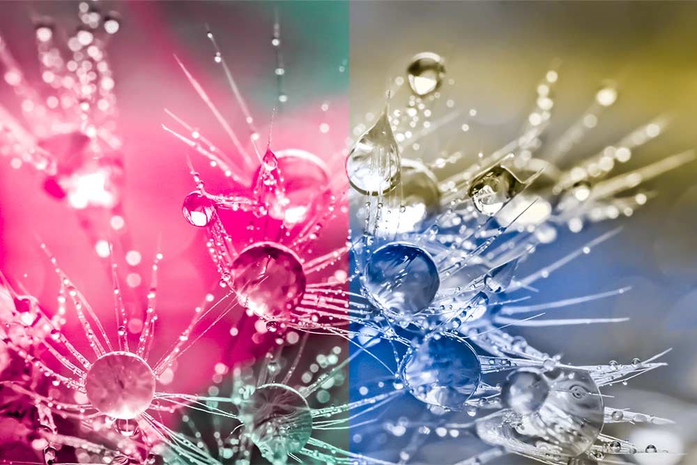
Let me ask you a question. If you look at the above graphic, do you notice anything? Look at the colors closely. The left half of the graphic shows green and magenta and the right half shows blue and yellow. If you use either Adobe Camera Raw or Adobe Lightroom, this should click right about now. If you haven’t guessed, the a channel controls tint and the b channel controls temperature. Those channels, combined with the lightness channel give us an awesome looking color range. Adobe has made it really easy for us to adjust these two color ranges of a photo by giving us some handy sliders. To check out those sliders, take a look at these posts I wrote a while back:
Adjusting White Balance in Adobe Lightroom
Can You Fix Photo White Balance With Adobe Camera Raw?
I hope you’re beginning to develop an appreciation for the Lab color mode. In case you aren’t yet, allow me to help out. I’ll help by way of a quick project that you may not have thought of before reading this post. I sure know I never knew about this type of thing before I dove head first into it.
Increasing Saturation & Contrast with Curves
I don’t know about you, but if someone asked me to increase the saturation and contrast of an image while adjusting the lightness, a and b channels of the Lab color mode inside the Curves adjustment in Adobe Photoshop a few years ago, I wouldn’t have had any idea what the heck they were talking about. Today though, it’s as easy as pie.We already know what the lightness, a and b channels control in the Lab color mode. Now, if we take that knowledge to an adjustment tool, we can tweak each area in a more educated way.
First, I’ll start off by making sure I’m using the Lab color space. I already changed that setting above. Next, I’ll make sure that the composite channel is selected in the Channels panel. This is merely a fancy way of saying that I’m going to click the top, full color, channel so the image is showing the way it was originally. After that, I’ll head up to the Image > Adjustments > Curves menu item and click.

This will open up the Curves adjustment dialog box.
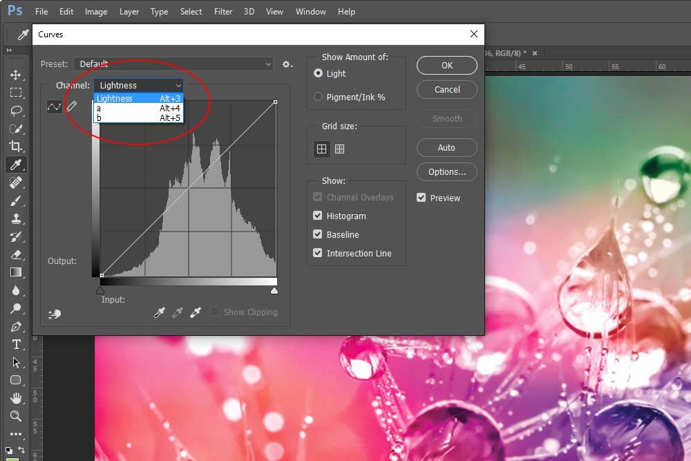
If you take a look at the screenshot above, you’ll see that I clicked the Channel drop-down box. Inside this drop-down are the lightness, a and b channel controls. If you’ve used the Curves adjustment before, this should start making sense right about now. If you haven’t, then let me tell you that by using this adjustment, we have the ability to manipulate each of these three channels. And the Curves adjustment is one of the best, most powerful methods you can take advantage of to really deepen the colors of an image.
First, I’ll select Lightness from the drop-down. I’ll click the small pointers below the graph and drag the left one in to the 10 mark and the right one in to the 90 mark. By doing this, I’m reducing the lightness range, which, in turn, increases the contrast of the image.
Next, I’ll select the a channel from the Channel drop-down. I’ll go back down to those two arrows and drag the left one in to the -80 mark and the right one in to the 100 mark.
Finally, I’ll select b from the Channel drop-down and make the same exact changes as I did directly above. What should happen is that, in addition to the contrast being enhanced above, the saturation should be enhanced by these two changes. In a very clear and precise way. After I click OK to apply and close out of the adjustment tool, I should be left with a rather stunning photo. Here, check it out:
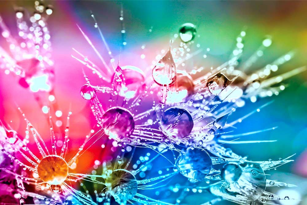
I think this is an interesting method for adjusting these characteristics of a photo. And it’s creative to boot.
I hope you enjoyed this post. It was rather long, but I think it was well worth it. It can open your eyes to a better understanding of color modes and what they mean and can accomplish. If you have any questions, please leave them in the comment section below. I’d be more than happy to help any way I can. Thanks!
