KristinaW
Member
- Joined
- May 7, 2021
- Messages
- 127
- Reaction Score
- 0
- Points
- 18
- #1
Working with Channels in Adobe Photoshop
In Adobe Photoshop, channels are sort of confusing. Before sitting down to write this post, I went back and forth for quite a while trying to reduce the amount of information into something that’s as easy to understand as possible. I think I have it, so I’ll begin writing about it. Be warned though, working with channels isn’t day-one stuff. It’s something you’ll likely get into as you progress through the intricacies of Photoshop.
I know what it’s like for someone who is new to this application. All they want to do is open an image, make some changes to it and get out. I get that. The thing is, there’s a lot to Photoshop that can greatly help you in your journey to become more proficient. Oftentimes, you’ll need to grasp the basics of a topic, simply to know it’s out there. You may never use it, but if you hear about it a few times and think it may be helpful later on, you’ll probably look into it in more depth as time goes on.
Photoshop has spent years building it’s tools in a way that allows the everyday user to avoid aspects that are complicated. I was watching a tutorial a few days ago that walked through the process of merging images together before Photoshop offered the ability to work with layers. This was back with Photoshop 2.5. Let me tell you, it was no easy task. If you’ve never heard of the Calculations command or the Apply Image command, consider yourself lucky. Fortunately, gaining an understanding of channels isn’t nearly as complex as the information in the video I sat through.
What are Channels?
In the most simple terms, channels are the building blocks of an image’s colors we see in Photoshop. If we limit this discussion to RGB images (there are many more topics, but I’ll tackle them in later posts), I can tell you that the three channels that make up a color image, Red, Green and Blue (RGB), consist of varying degrees of black, white and gray. When you combine the three grayscale channels, the result is a color image.Now, if you’re anything like me, you’re scratching your head at the explanation I just gave you. Don’t worry, I’m going to talk further below. For now, just try to follow along. I’ll even copy and paste a blurb from Adobe itself on channels:
Color information channels are created automatically when you open a new image. The image’s color mode determines the number of color channels created. For example, an RGB image has a channel for each color (red, green, and blue) plus a composite channel used for editing the image.
How Do I Access Channels?
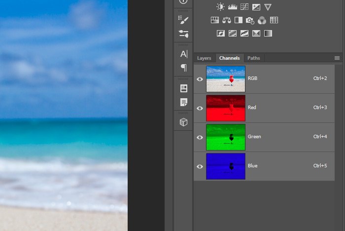
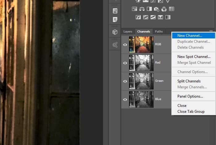
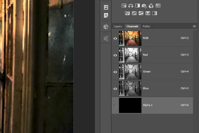
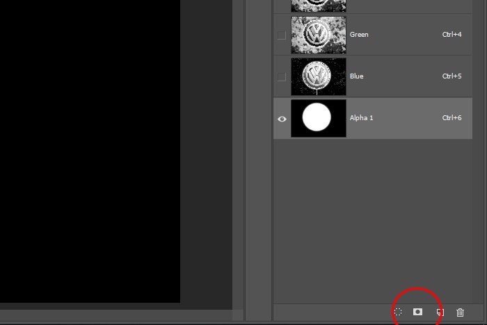
Accessing color channels is very simple. If you have the Layers panel open, you can click the Channels tab.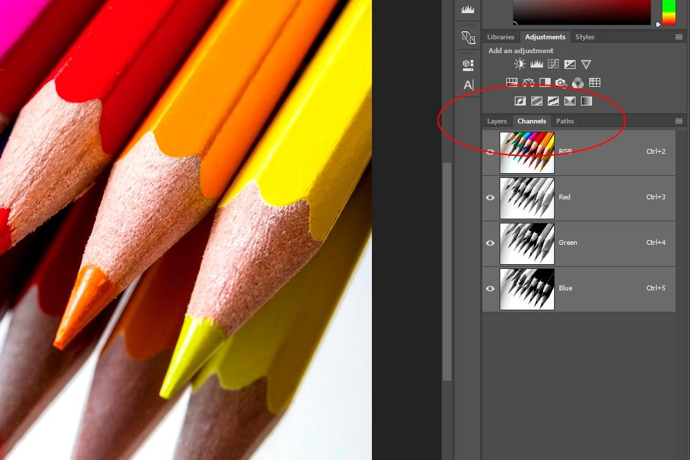
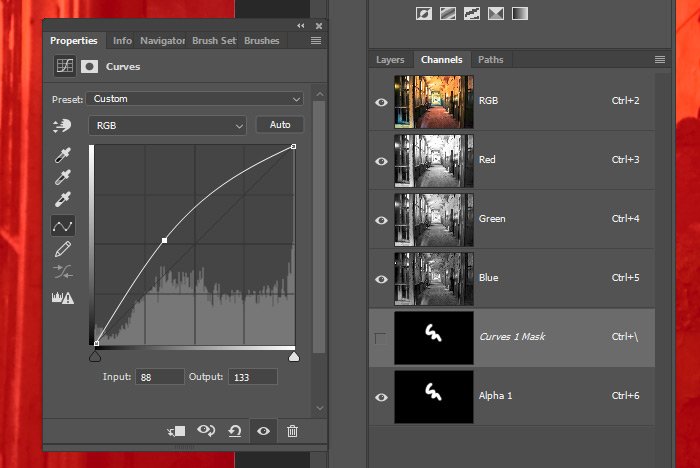
Inside the Channels panel, you’ll see a composite channel and the three color channels. As I mentioned above, each of the color channels appears in grayscale.
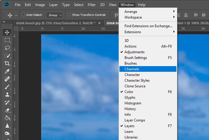
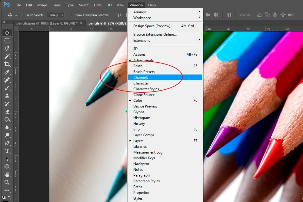
If, for some reason, you don’t have the Layers panel open or if the Channels tab isn’t available, you can head up to the Windows > Channels menu item and click. This will open the Channels panel.
A Closer Look at Each Color Channel
When you look at individual color channels in RGB mode, the lighter the shade, the more saturated that specific color is. For example, if we have a solid red image and we look at the Red channel for that image, it will appear white. The same goes for Blue and Green. If we select the Blue or the Green channels for blue and green images, respectively, they’ll appear white as well. For all the colors in between, they’ll appear different shades of gray. Let’s take a closer look now. I’ll go back into Photoshop and click once on the Red channel for the image I’m using for this post. By doing this, the Composite, Green and Blue channels will be deactivated. You can verify this by looking at the eye icon at the left side of those channels.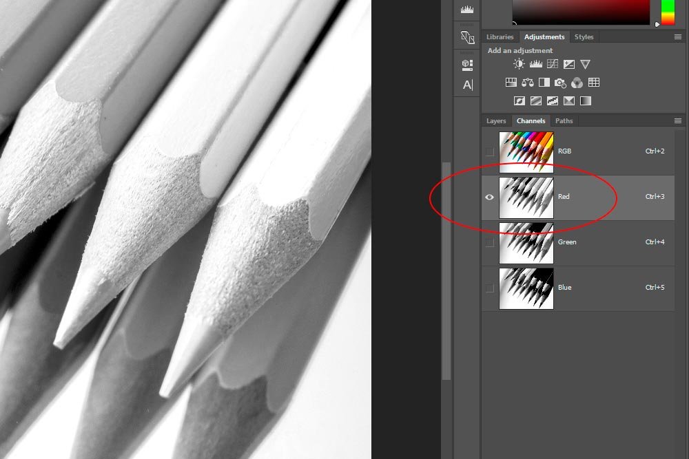
Now, if we take a look at the photo, we’ll notice that the areas that were most red are now white or whitish.

Let’s take a look at the Green channel. Notice how the whites, blacks and grays have shifted.

And finally, we’ll look at the Blue channel.

Determining the Exact Amount of Red, Green and Blue in an Image
Sometimes, when you look at images through the gray areas of their channels, you get thrown for a loop. What you thought was blue or green or red comes out looking a shade of gray. The method I use for checking the exact measurements of these colors is through the Color Picker. I launch the Color Picker and use the dropper to select an area. Then, I look at the RGB fields in the picker.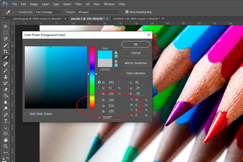
In this case, I clicked on, what I thought was, the blue pencil. As it turns out, the blue pencil is actually a combination of red, green and blue.
Editing Channels Through an Adjustment Layer
I’m going to tell you that there are many methods available for turning a color image into a black and white image inside of Photoshop. Each has their advantages and disadvantages. It’s healthy to explore all of the methods because you’ll never know when you’ll need one over another.If you look back to my post that covered creating a black and white photo in Adobe Camera Raw, things might look familiar here. Well, the concept is familiar, but the steps are slightly different. Below, I’ll explain how we can turn the above color image black and white and adjust each of the RGB channels to produce an image we can use.
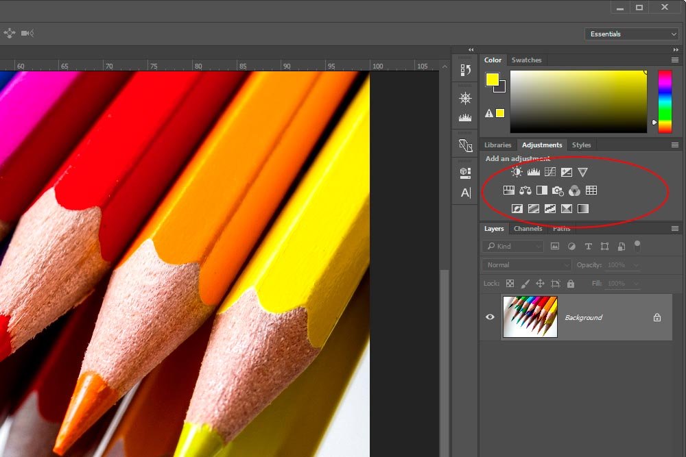
To edit the three channels in question, I’ll be using an adjustment layer. The specific tool I’ll be taking advantage of is called the Channel Mixer. I can access the Channel Mixer adjustment by either clicking the icon in the Adjustments panel or by heading up to the Layer > New Adjustment Layer > Channel Mixer menu item and clicking.
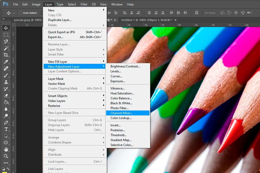
The benefit of using the top menu is that you’re able to name the adjustment layer via the New Layer dialog before creating the layer as opposed to naming it after it’s created.
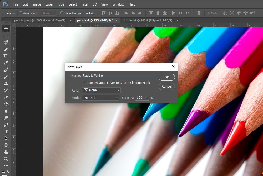
Whichever method you choose is up to you. Either way, the result will be a new adjustment layer. Also, once the layer is created, the Channel Mixer Properties panel will open.
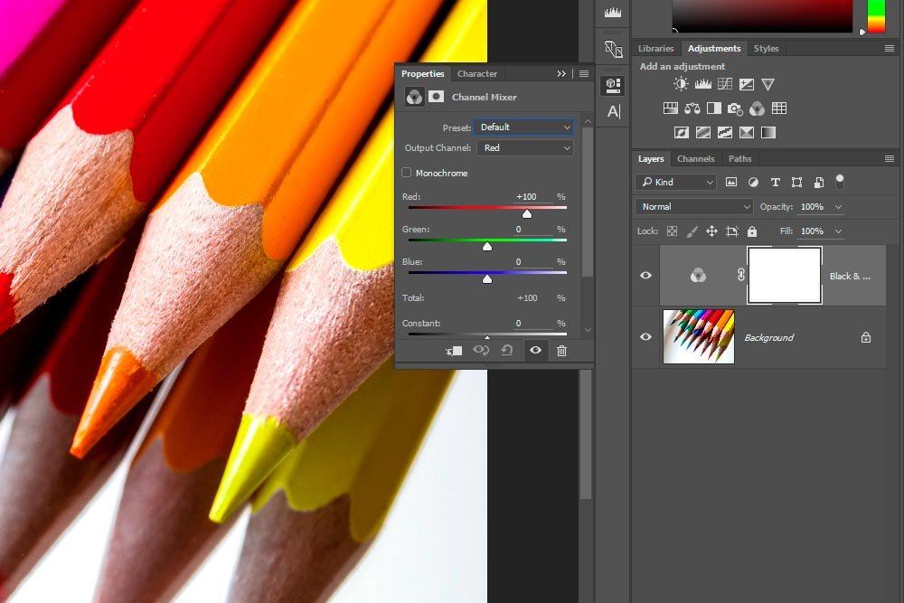
To convert the color image to black and white, I’ll click the Monochrome check box in the Properties panel.
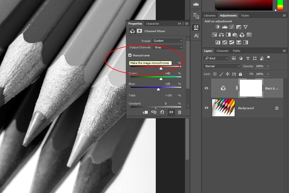
From here, I can adjust any of the sliders I want. Since I’m going for a bold look, I’ll simply move the Green slider to the right a bit and the Constant slider to the left. If I had a more interesting image, I might do more to it. For this demonstration, this is fine.
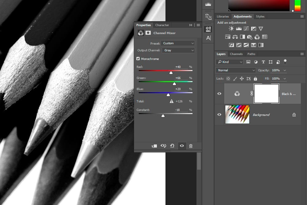
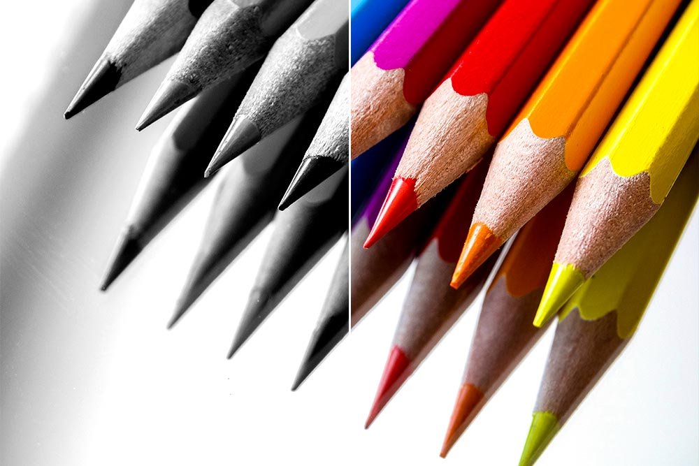
Here’s the image after adjustment.

Since I created this black and white image by using an adjustment layer, I could always turn the adjustment on and off by clicking on the eye icon in the color layer in the Layers panel. It’s a non-destructive edit, which is why we use adjustment layers in the first place.
I wrote this post to give you a background on channels. I wanted to offer a glimpse of what they are and what they are capable of doing. I also wanted to demonstrate their powers through a real world example. I’d say this is a job well done. If you have any questions, I’m always here and I’m always will to help where I can. Thanks!


